Gothux

Amy Redmond / Amada Press
2023

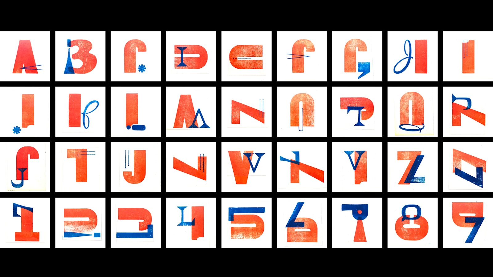
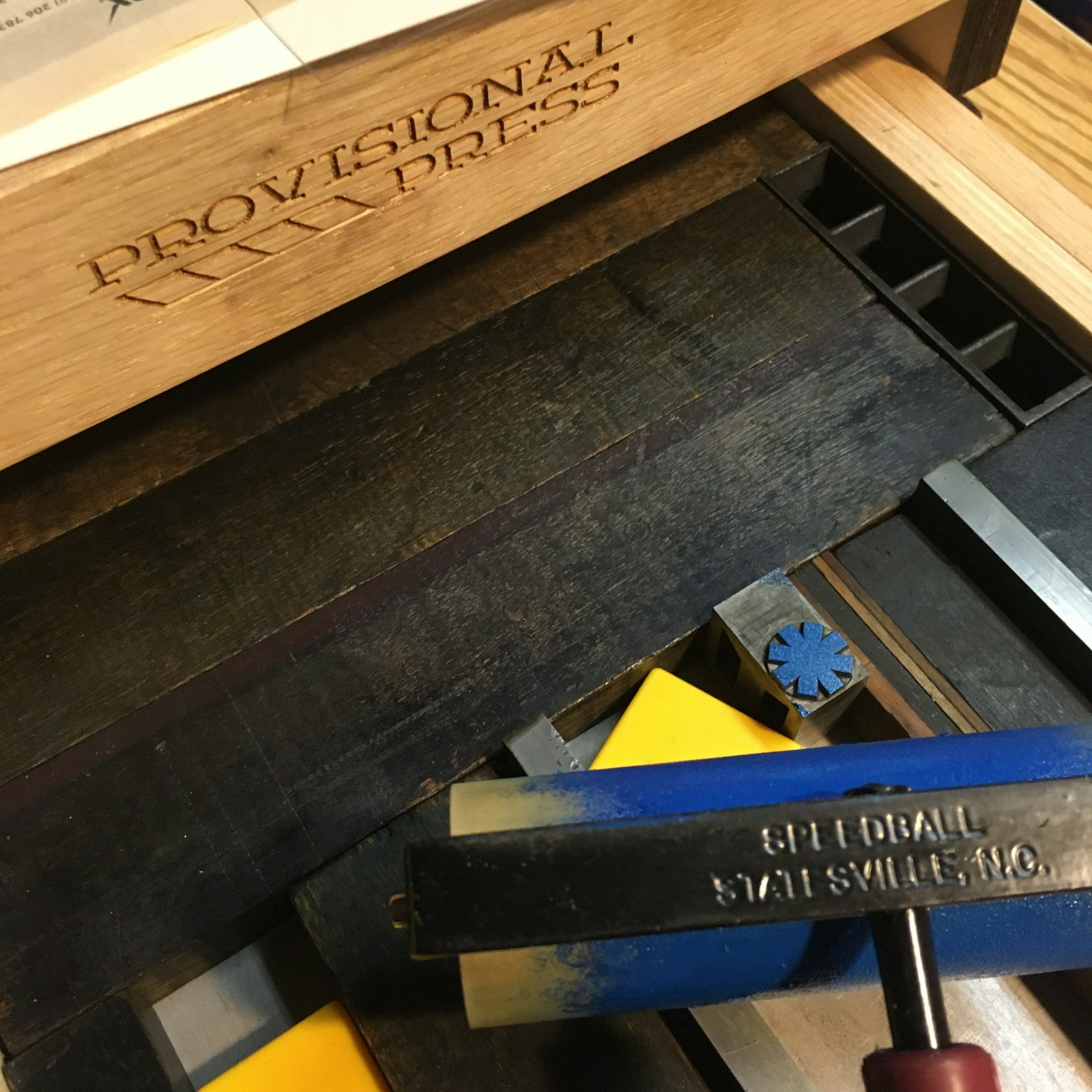
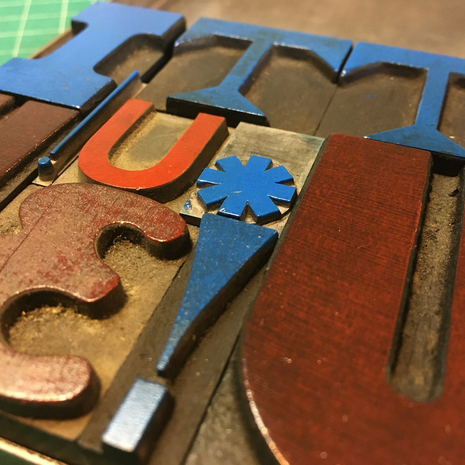
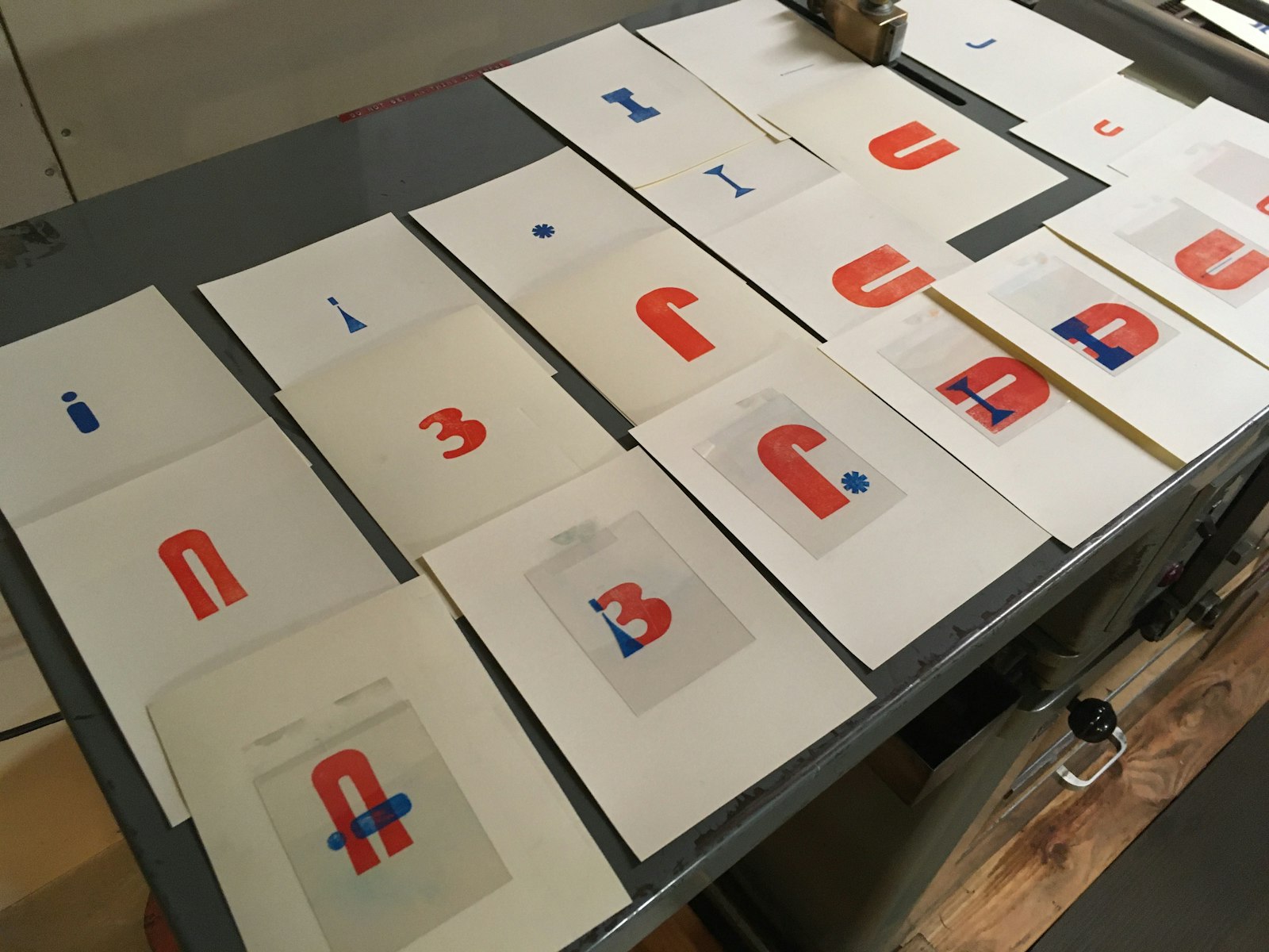
As each Gothux character was created, a short video was taken with the intent to reveal how it was built from existing physical wood and metal type.
Inking a piece of metal type in the bed of a Provisional Press.
Close up of galley holding some of the inked wood and metal type used to create the Gothux glyphs.
Press proof tests for Gothux, showing the letterforms used and their combined compositions.

Gothux is a 36-character chromatic alphabet that reimagines physical glyphs as building blocks for new letterforms. The handset wood and metal type is composed as two separate forms, each void of meaning until one is overprinted upon the other and the character is revealed. Gothux was designed using two typeface "ingredients" and is named for the two used to create its first letter, A: Gothic Black and Huxley Vertical. Gothic Black (printed in orange) is used in every character in Gothux, to create continuity throughout the alphabet's design. The second typeface "ingredient," printed in blue, varies. Each "ingredient" was letterpress printed on paper (in orange ink) or clear mylar (in blue ink) using a Provisional Press. Each Gothux letter was then composed by overlaying the mylar layer onto the paper, taking care to stay true to 90° angles so that the character can be recreated in a traditional letterpress lockup.

Design / Typesetting / Letterpress Printing
Amy E. Redmond (at Amada Press)
Video filming/editing
Amy E. Redmond
Project link