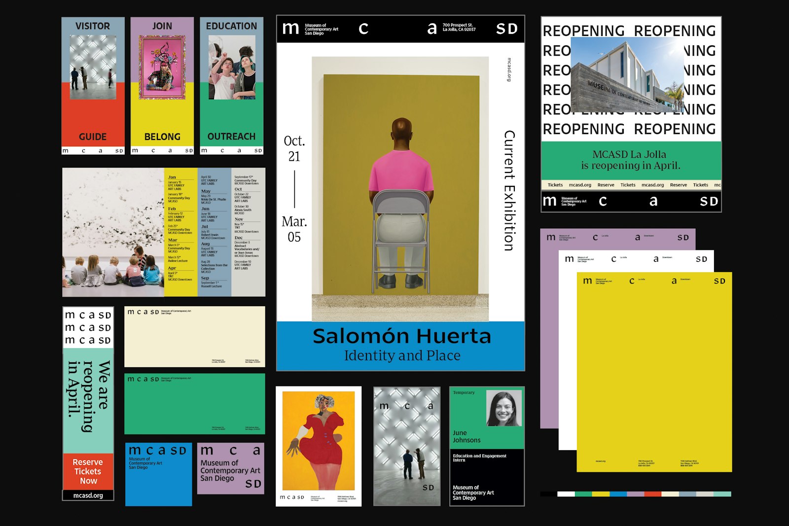
Happening Studio’s creation of the new brand identity for the Museum of Contemporary Art San Diego (MCASD) coincided with the unveiling of the institution’s redesigned oceanfront campus. Our goal was to develop a system that aligned with the museum’s updated mission, celebrated the constructed vision of Selldorf Architects, and welcomed the public back to the MCASD after its four-year construction project.
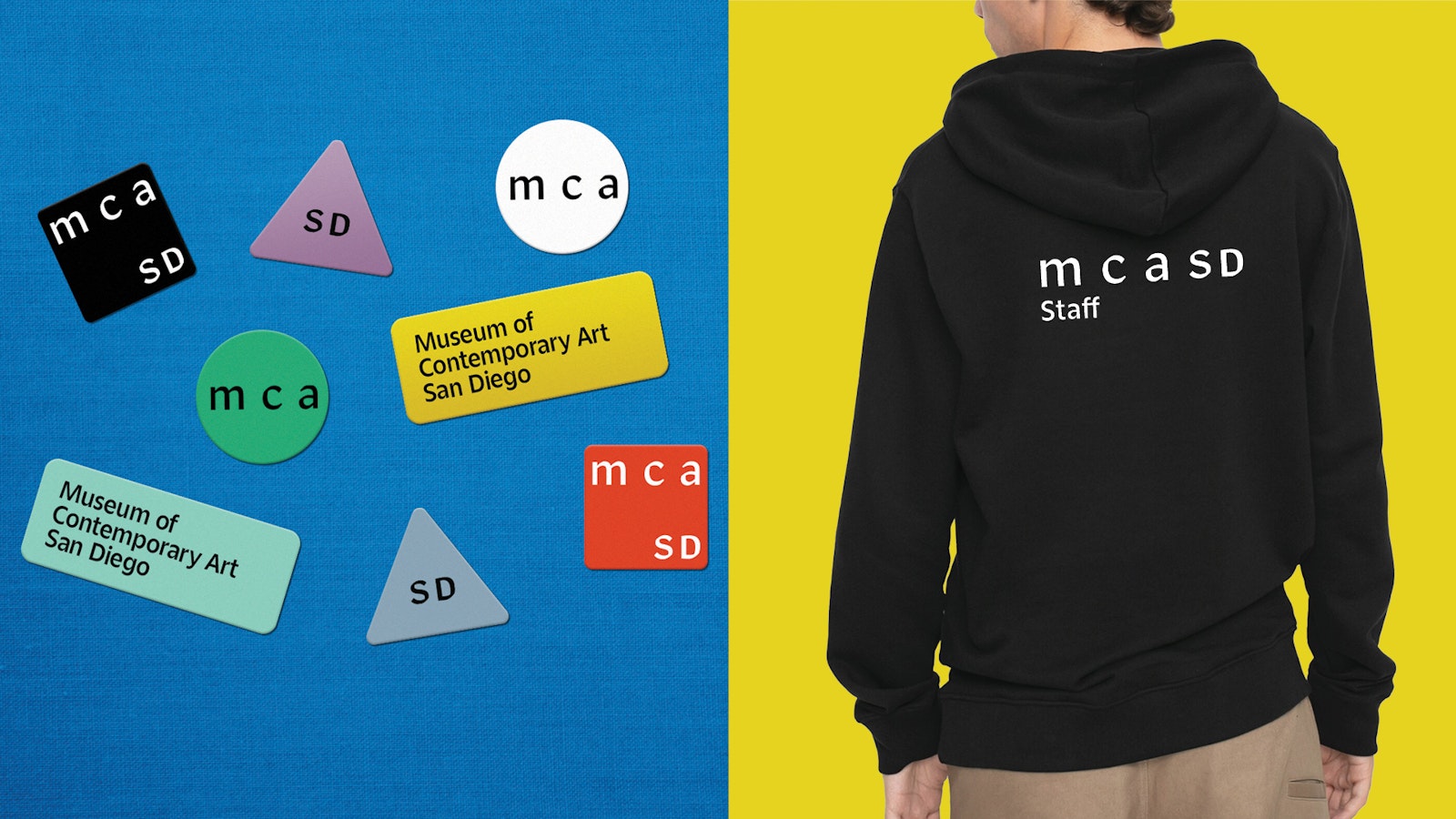
During our in-depth research process, it became clear that a single, static design would not be appropriate. Instead, we devised a cohesive, non-hierarchical identity that morphs to accommodate all types of information and adapts to each specific environment. Separating the “MCA” and the “SD” creates a pair of independent acronyms, which are more legible and more memorable to the general public. The visually decoupled “SD” strongly asserts the city of San Diego as the museum’s home. The fluid, in-between spacing of the “M,” “C,” and “A” mirrors the array of new skylights and windows that create inviting indoor-outdoor volumes and voids throughout the site.
The brand identity’s vibrant color scheme is inspired by the natural and built elements found at MCASD’s two locations. Palm trees are represented with a deep green. The beach is symbolized by blue and beige tones. San Diego’s light rail system, known as the Trolley, is expressed with a vivid red. The mix-and-match palette is organized into complementary groupings that provide an array of options that can boldly emphasize any narrative and activate all print and digital platforms.
- Creative Direction
- Happening Studio
- Director, Communications and Marketing
- Chris Cloud
- Manager, Content and Community
- Marina Grize
Project link
