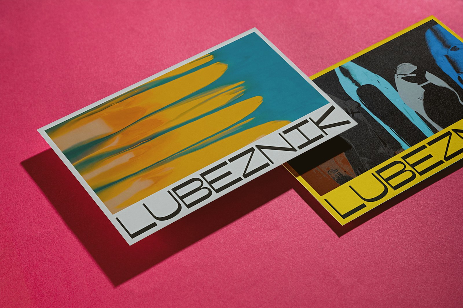
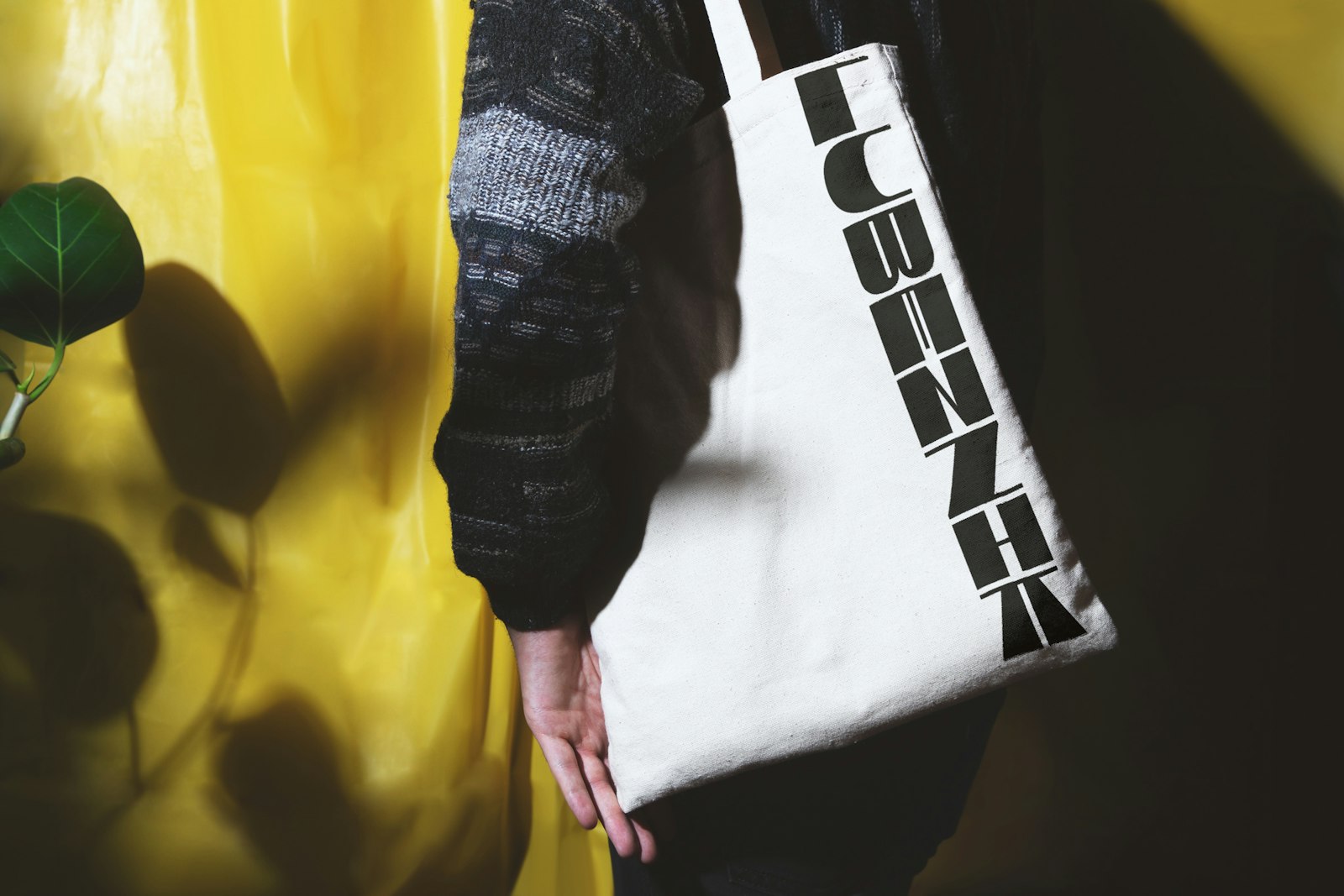
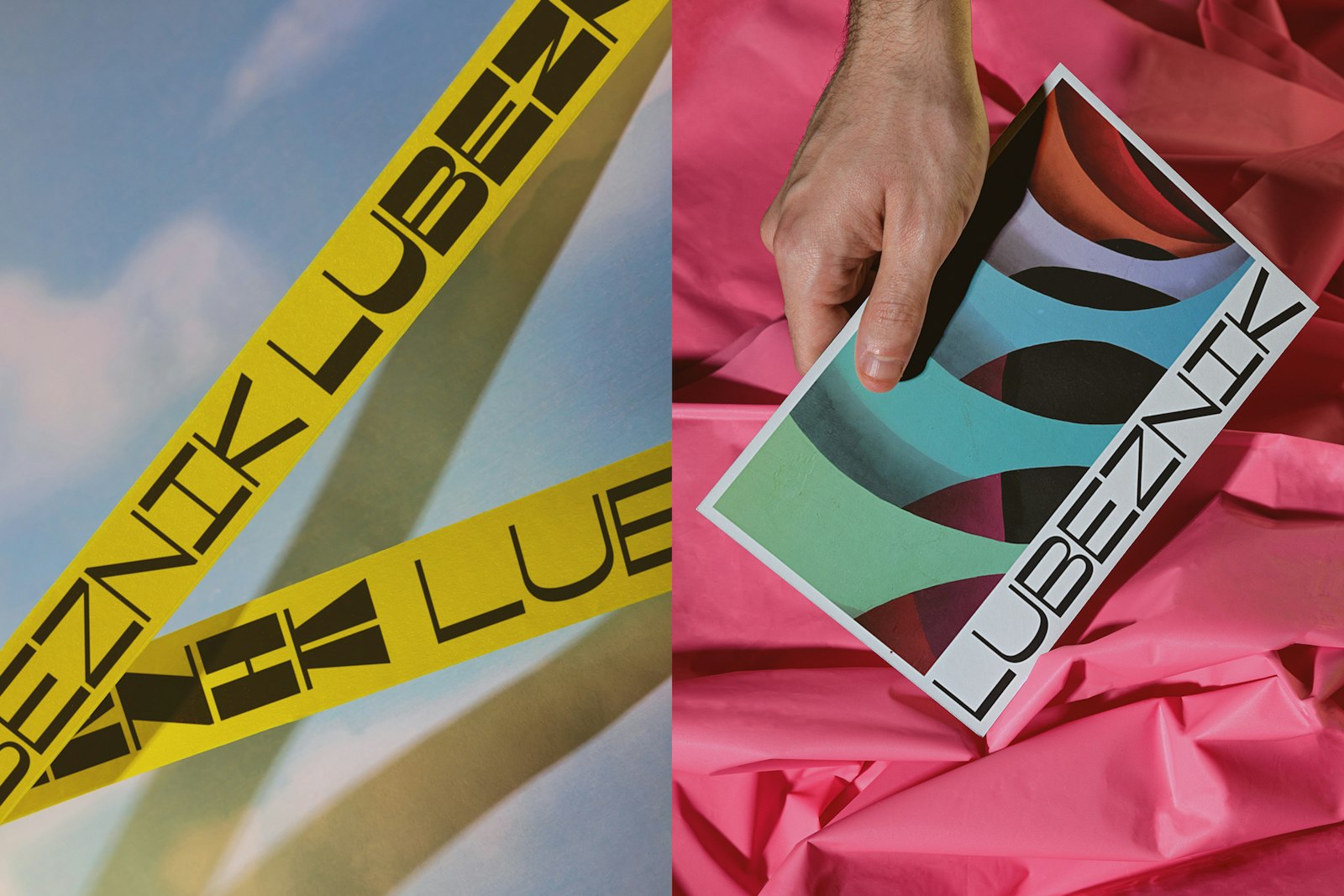
The Lubeznik Center for the Arts offers world-class art in the small lakeside town of Michigan City, Indiana. The hidden gem located an hour outside of Chicago offers lively programs, creative experiences and fosters meaningful, lasting community.Lubeznik's primary logo comes in two flavors, Formal and Playful. The formal lockup is the primary logotype, designed to represent the range of vibrant activity present within the center — from playful youth programming and classes, to more professionally toned donor events and world-class art exhibits.The letters are a monospaced, reverse-contrast, variable sans-serif that allows for flexible animations between the formal and playful states. The alphabet has been custom-made to reflect the architecture and persona of the Art Center. Each letter is built within a square, allowing geometry to become a core visual component of the Lubeznik brand.Representing the full expression of the visual identity, the website provides an interactive platform to learn more about the LCA. Dramatic floods of color shift as users scroll through content, and lightly playful animations are cued on rollover to highlight a variety of art and programs.
- Design Director
- Will Miller
- Designer
- Dean Sweetnich
Project link