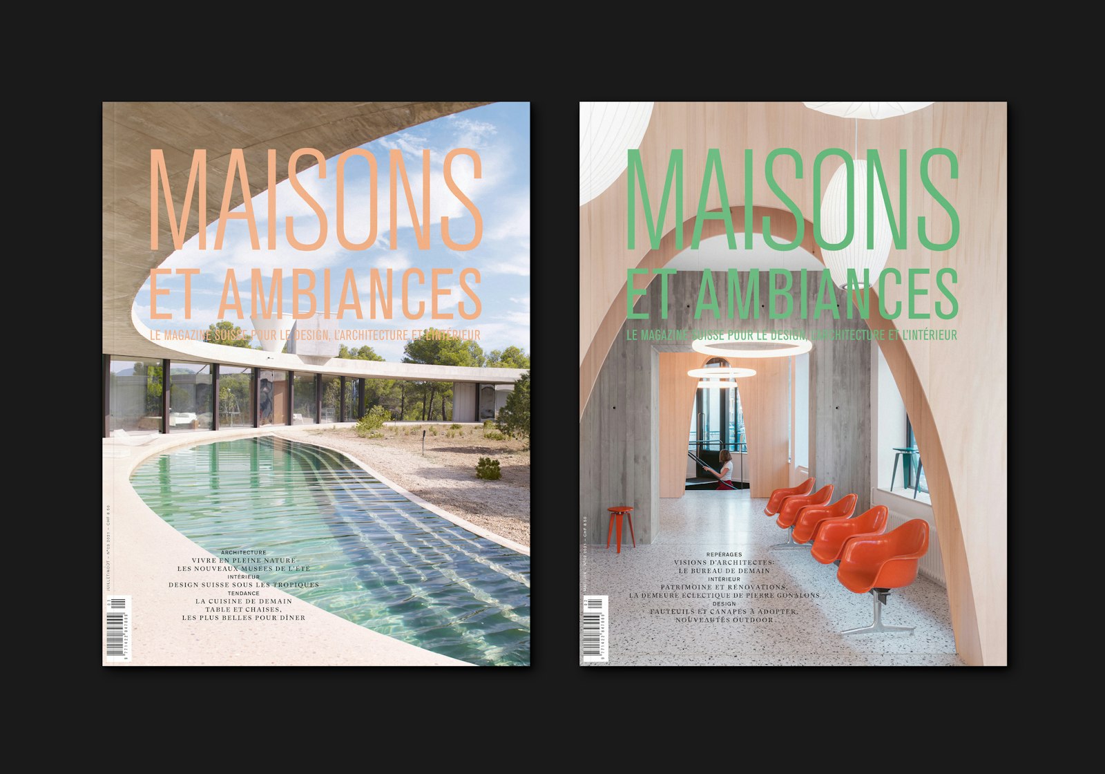
MAISONS ET AMBIANCES
Born in 1989, the Swiss magazine for design, architecture and interiors, Maisons et Ambiances, has had a new look. A new formula was designed under the artistic direction of the Lausanne studio Frédéric Held.
The watchwords "dream" and "luxury", which the publication aspires to, aim to give back to the magazine an aesthetic place in the home, in the same way as a beautiful book. The studio has worked in this direction; a quality of content for a quality of the layout.
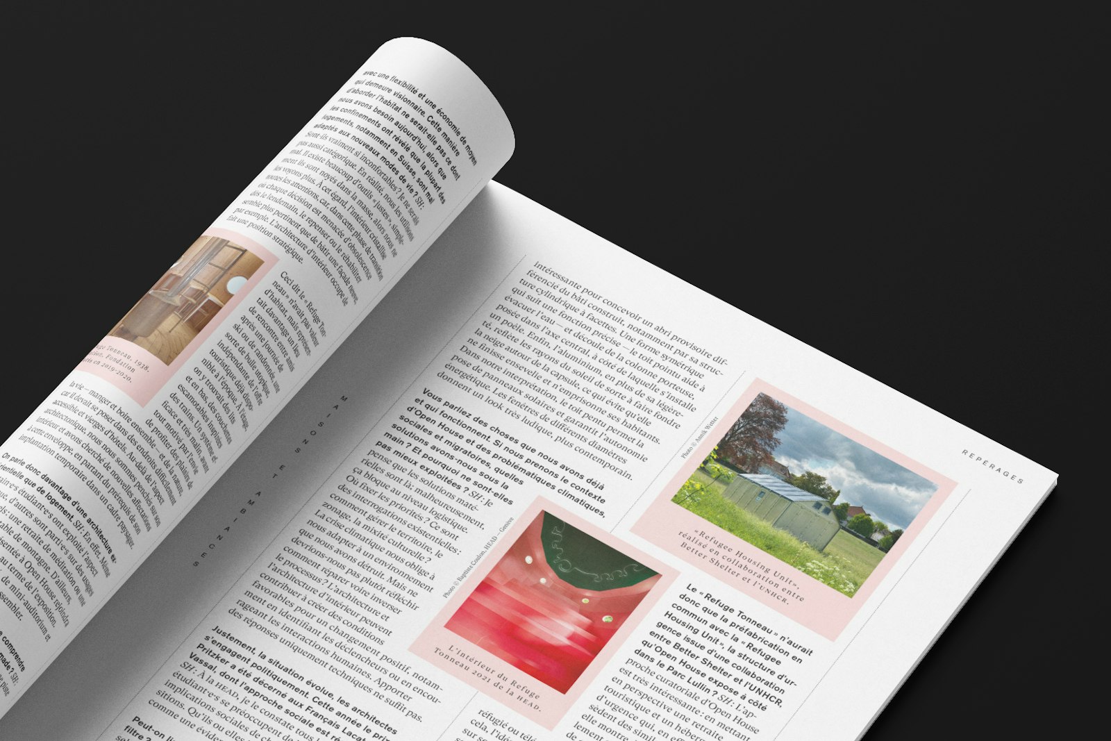
The railway was also revisited to welcome, interest and make the reader discover (or travel). "The reading rhythm has been designed to be more straightforward in order to provide a clear vision of where we are. To give the reader the "attitude" of the section, to have the impression that each page, each section has been tailor-made." — Frédéric Held
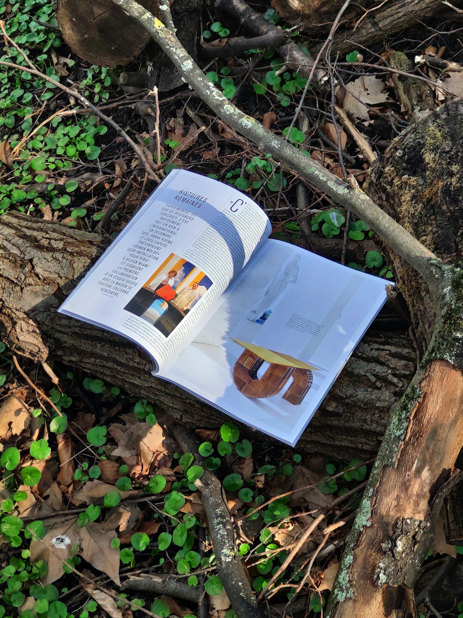
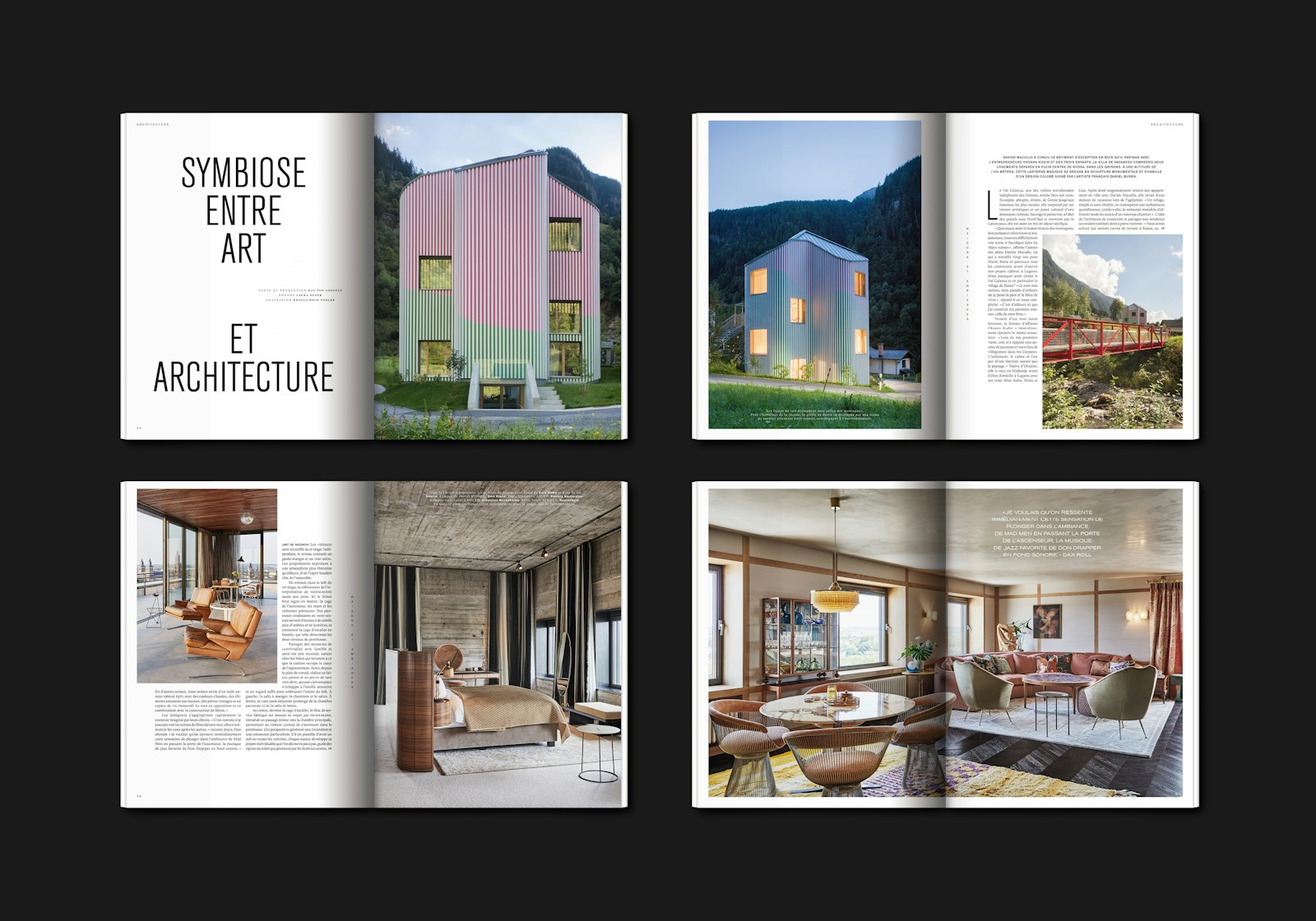
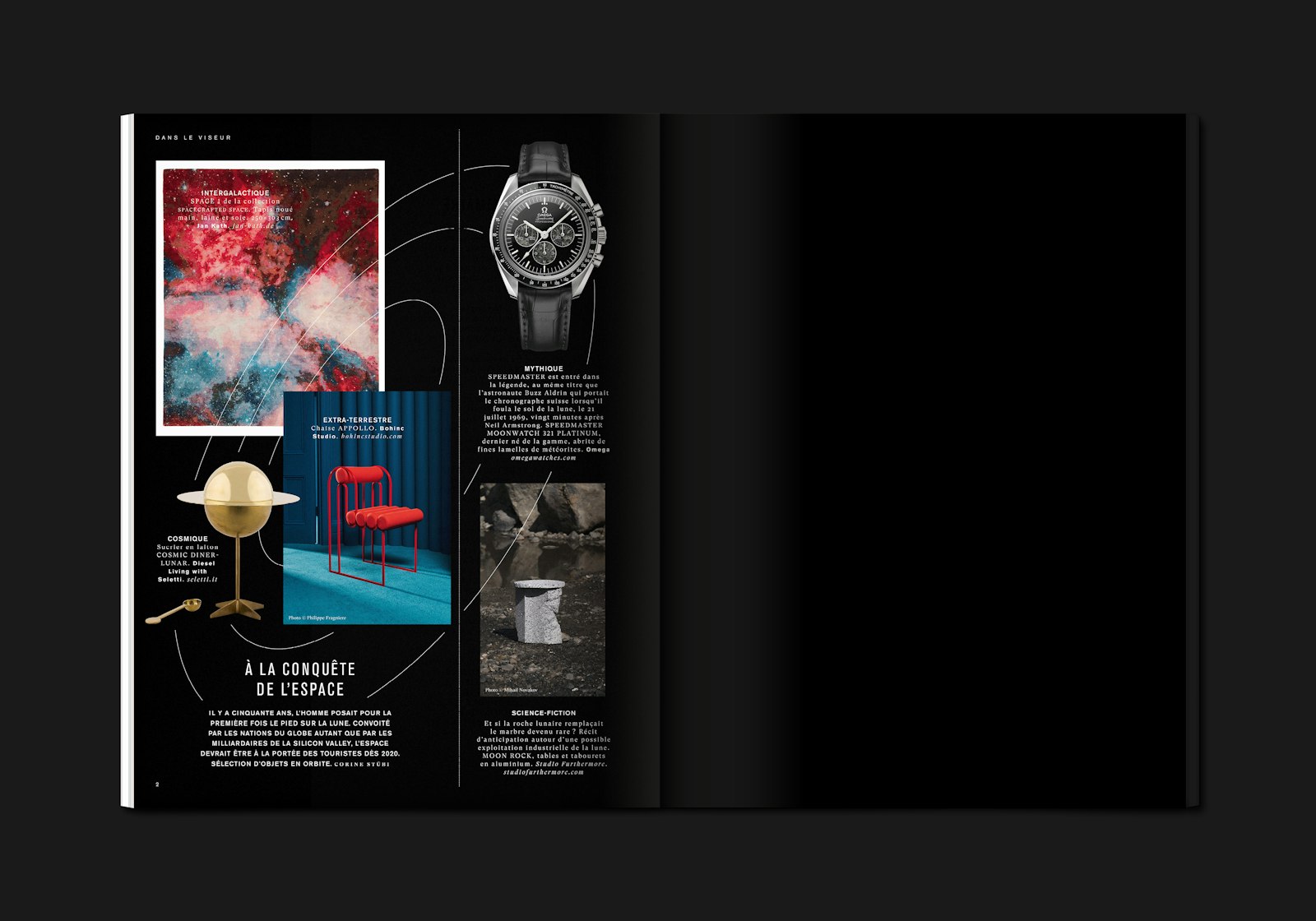
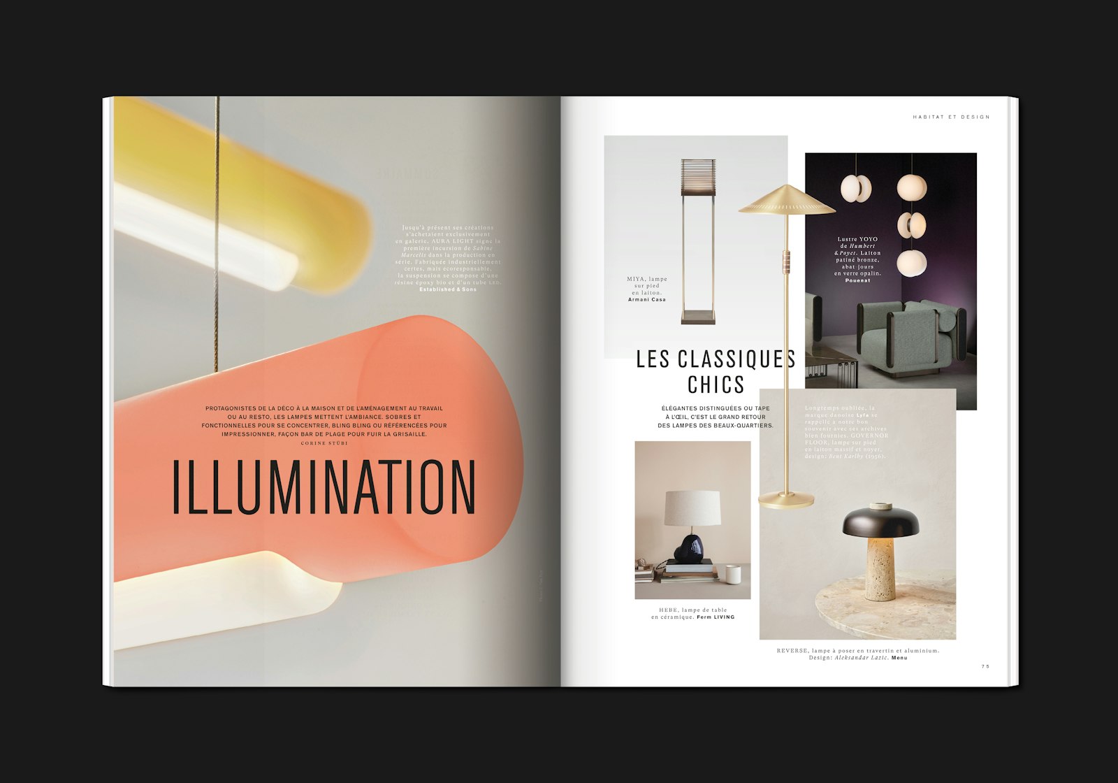
The impressive iconography and contemporary editorial style were important allies in the design of the various pages. The layout aims to magnify this richness with a certain subtlety and rigorous typographical treatment.
Frédéric Held decided to create a heterogeneous and cheerful structure, as well as a modular but "arranged" layout. "The idea that you can go from a photo report of a sumptuous interior to a selection of objects that you covet was very appealing to me. I wanted to mark this richness." — Frédéric Held. The striking contrast in the layout between the different sections is quickly apparent. A mixture of fluidity and control.
"Despite the fact that there is a page template for each section, we felt that the flexibility of the grid was very important. From one issue to the next, you have to be able to adapt in record time. Sometimes the number of photos or pages available varies considerably." — Frédéric Held. Several possibilities for margins, columns and alignments have therefore been implemented. The reader wanders around and is surprised by the variety of combinations forming a single whole. A modular typographic grid with the only restriction, or almost the only restriction, is the coherence between the headings in each issue.
The choice of typography was designed to be classic and timeless. The condensed look of the headlines (Berthold Akzidenz Grotesk Condensed) used generously and impressively set the tone of the magazine.
The GT Super serif of Grilli Type also plays a role in the visual balance and reading pleasure. It allows a subtle relationship with the various, often high-end, themes of the magazine.
- Art director, graphic designer
- Frédéric Held
Project link