The New Middles Graphic Identity System is the visual counterpart to the thematic created for the 2020-2021 cycle of Exhibit Columbus. The system evolved from a series of visual explorations attempting to define “newness” and “middles” in graphic form, translating the thematic text into a visual poem. The visual poem served as a visual vocabulary (or toolkit) from which the identity system was formed.
In developing a contemporary Graphic Identity System, Jeremiah Chiu engages audiences through digital applications, yet aims to deepen those encounters. The system adapts and evolves, as the programming and exhibition components evolve over the course of a yearlong event. Asking “How can an audience interact and collaborate with a visual system in a meaningful way?”, he explored opportunities for interaction of shape, color, and application, which might lead to unique interpretations and expressions of what a new middle might be.
Much consideration was given to approach the New Middles system as an evolution of—rather than a departure from—the previous iteration. The foundational research from Rick Valicenti and 3st’s system remains: references to the work of Paul Rand and Alexander Girard, the design artifacts from the Cummins Corporation, Columbus’s architectural landmarks, all play a distinct role in the New Middles visual identity.
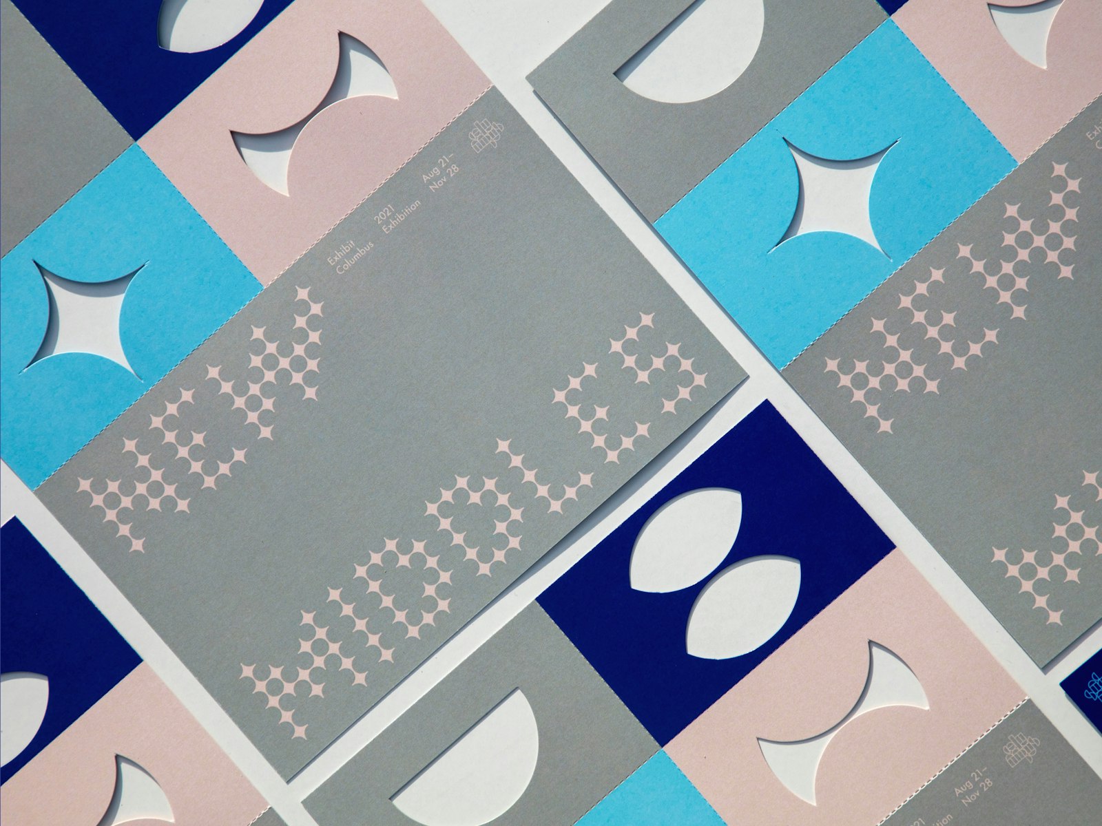
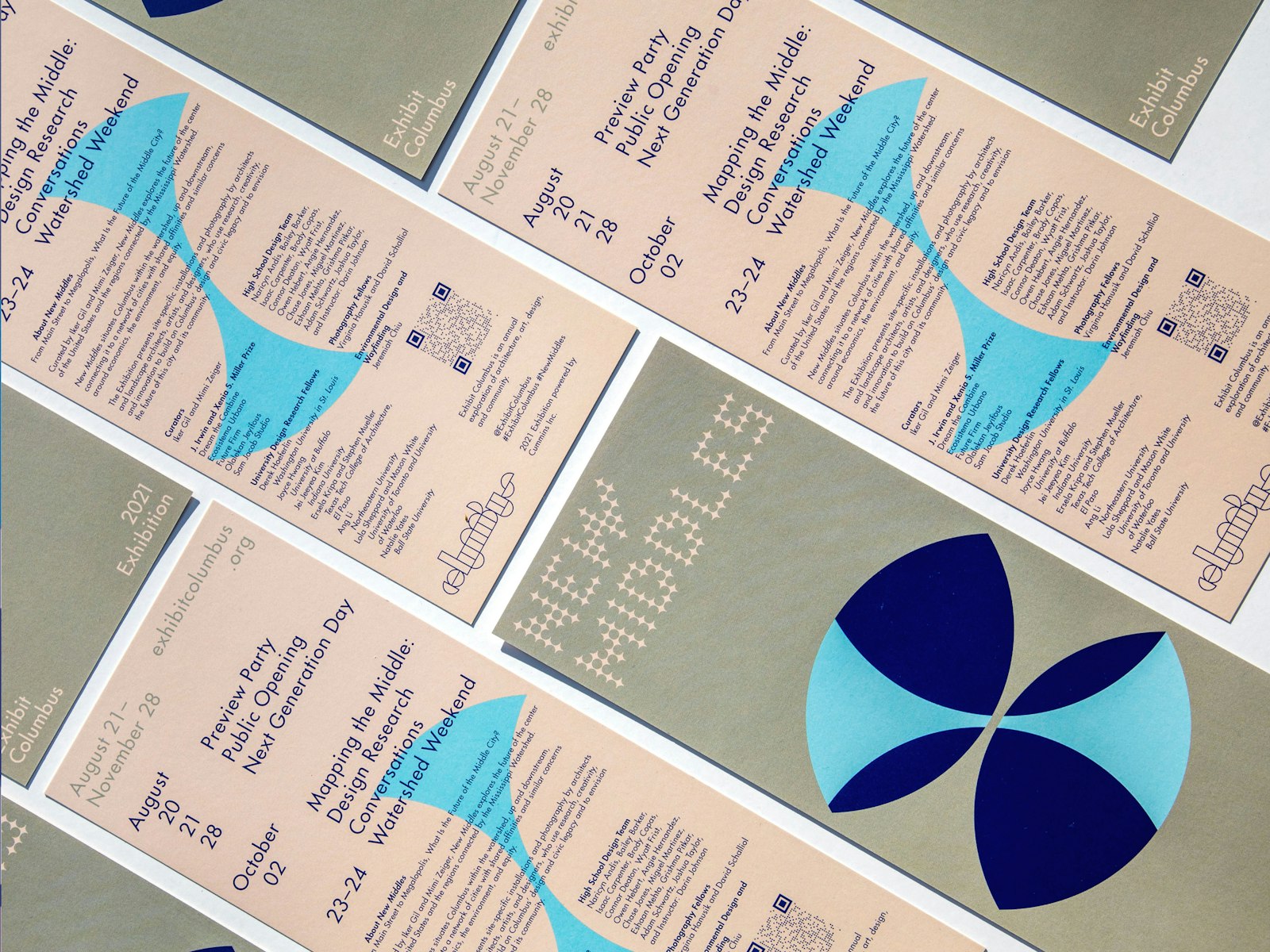
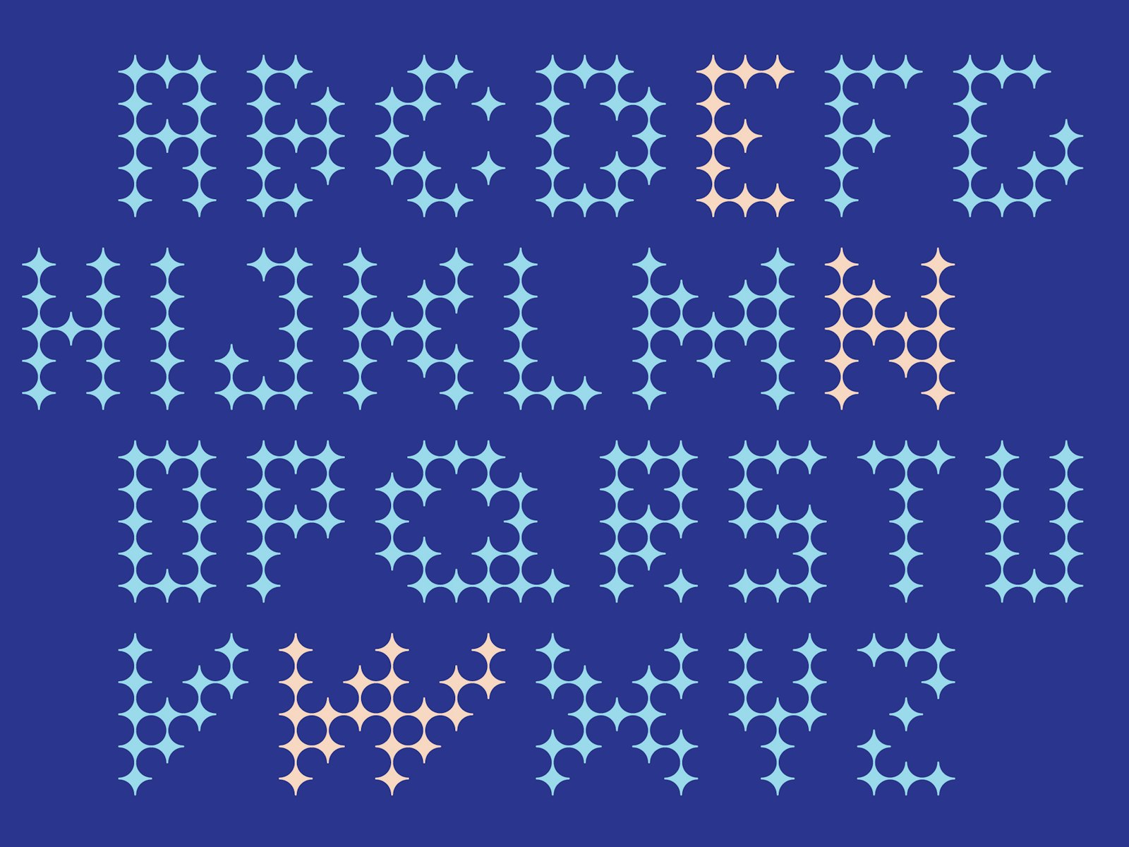
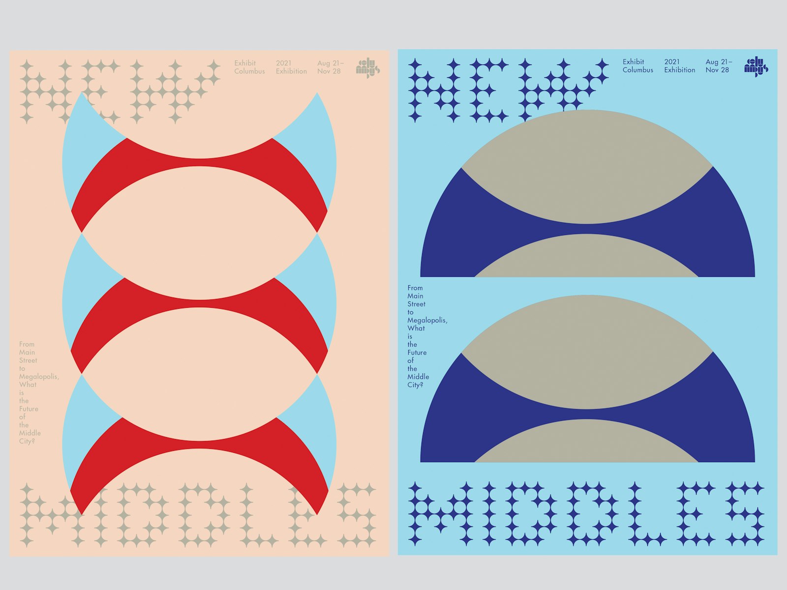
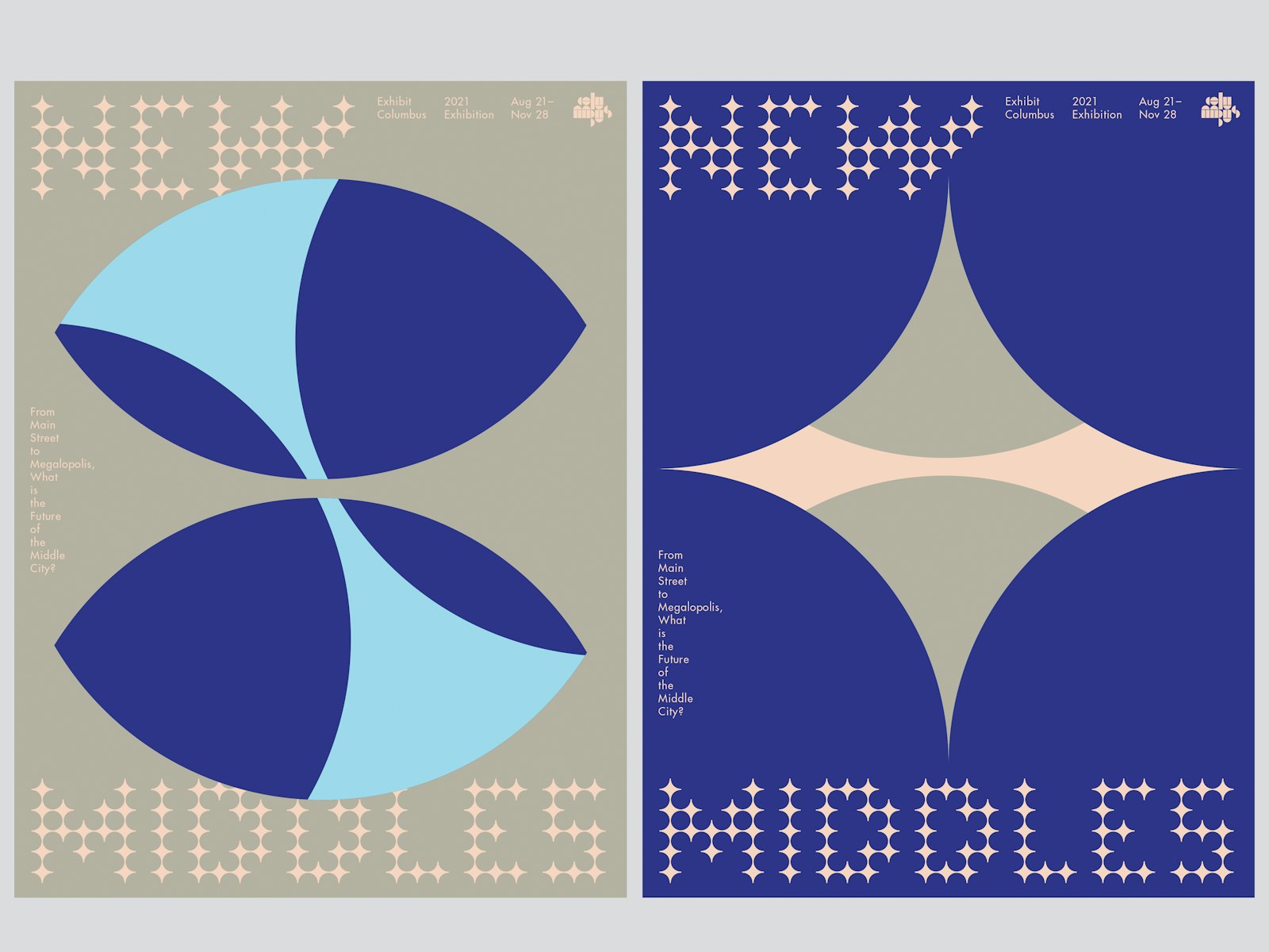
The primary typography spelling out New Middles is a custom alphabet derived from the counter-form (middle) of the geometric (circle/half circle) used in the Columbus wordmark. This base form (circle/half circle) becomes the primary building block (module) for all of the graphics. From the Symposium to the Exhibition, a distinct graphic treatment sets the events apart, though they exist within the same family.
The 2020 Symposium graphic treatment started from a bird’s-eye view, soaring above the horizon. The shapes formed from a complex arrangement of circles, half circles, and intersecting lines. For the 2021 Design Presentations, the graphic treatment zoomed to a cellular level, revealing singular, bold marks (formed from the same circular motif). As those marks pivot towards the 2021 Exhibition, including the catalog, activity guide, kiosks, and wayfinding, it is revealed that they are not marks, but instead masks, open shapes that reveal a form behind. The overlapping masks oscillate in infinite formations, creating endless new middles.
- Co-Curator & Project Lead
- Mimi Zeiger
- Co-Curator & Project Lead
- Iker Gil
- Director, Exhibit Columbus
- Anne Surak
- Creative Director & Designer
- Jeremiah Chiu / Some All None
- Designer
- Carina Huynh
- Additional Design
- Anna Mort
- Associate Director, Exhibit Columbus
- Janice Shimizu
- Project Manager
- Jamie Goldsborough
- Photographer
- Hadley Fruits