This project was an opportunity to explore making work within the category of necessary signage — a classification I'm enamored by.
Necessary signage makes up the majority of visual information in the world. It guides us about our day, yet it's rare that much consideration is given to its concept, form, execution, or placement. It is an under considered category of graphic design that makes up the majority of what we see.
Divided across the typologies of operational, way-finding, directorial, and safety, this encompasses everything from the Do Not Enter sign to the Open sign. Another range can be the Unisex sign at a hair salon to the For Sale sign in your neighbor's car. It is unlikely that anyone goes more than several-minutes without encountering a piece of necessary signage.
The visual ubiquity of necessary signage is based upon its often templated approach. Generally, these signs are not considered with heft nor intention by the business owner or the designer. Ubiquity, I argue, increases the general public's inability to consider the message as authentic, personal, or having meaning beyond a notice. This can be moderately effective at creating a tone of officialdom, however, the availability of these signs invalidates that feeling. It would seem, not only are most forms of necessary signage lacking meaning, they too can be viewed as plausibly phony or a last minute consideration.
Graphic design and it's product visual language is capable of comprehensive communication. Forms and formats that provide viewers all they need to know while awakening senses and provoking ideas. These all-around communications inspire deeper thought, intentional planning, and actions. Necessary signage can do this too if handled well on a case by case basis.
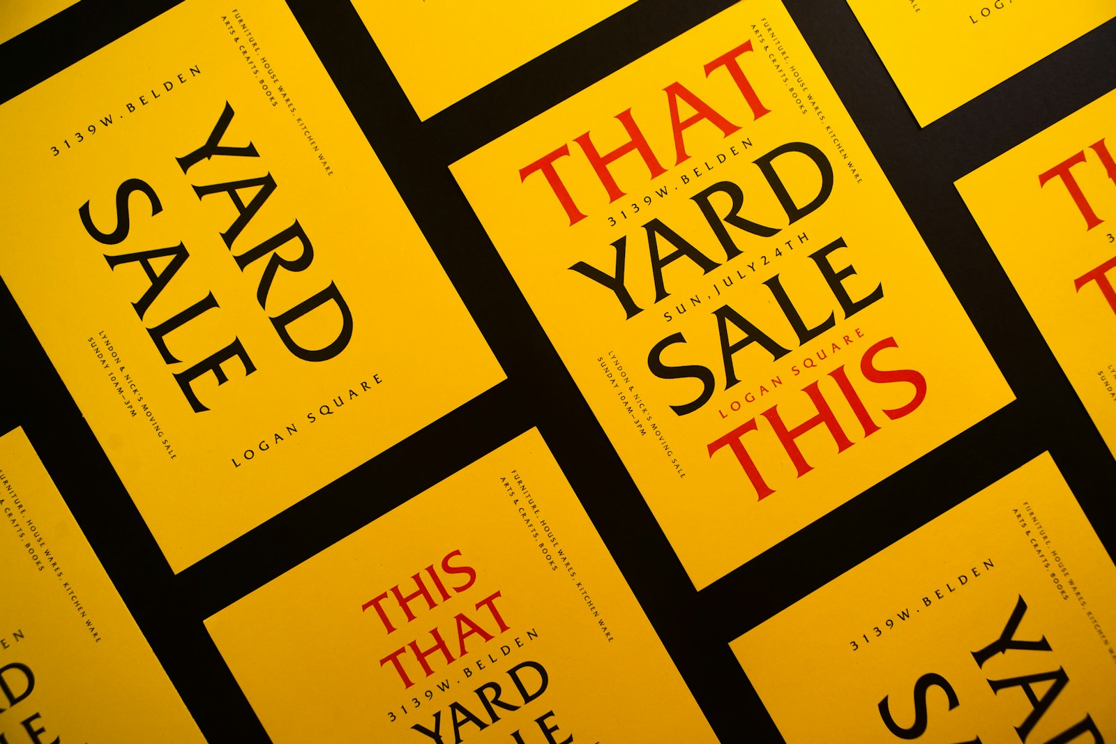
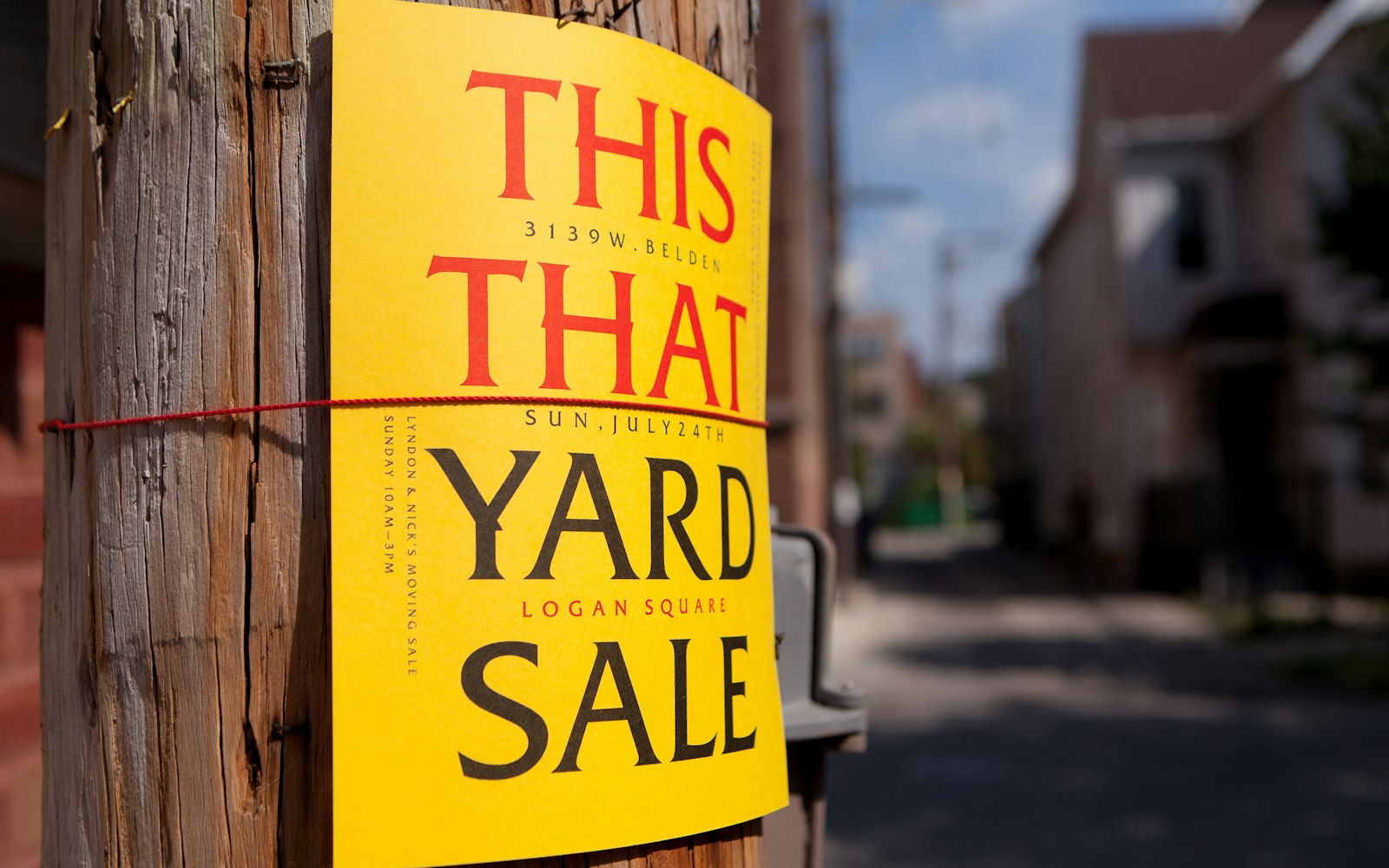
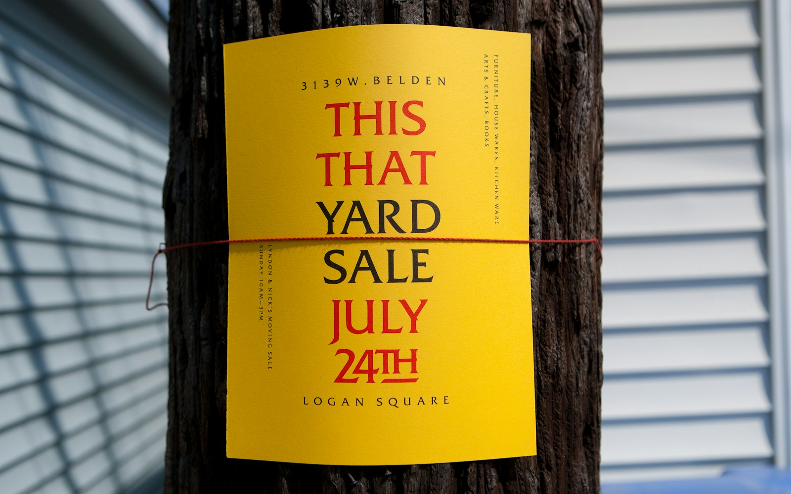
Along with the For Sale sign, the Yard Sale sign typically finds itself executed in neon-orange Helvetica on black, or the homemade markered approach. While the markered signs may have some humanistic intent, it often fails in legibility and distinctiveness. Both approaches also lack the ability to portray qualities of the good(s) being sold.
The issue here is two-fold. Lack of an idea and the formal execution not aligning with experience.
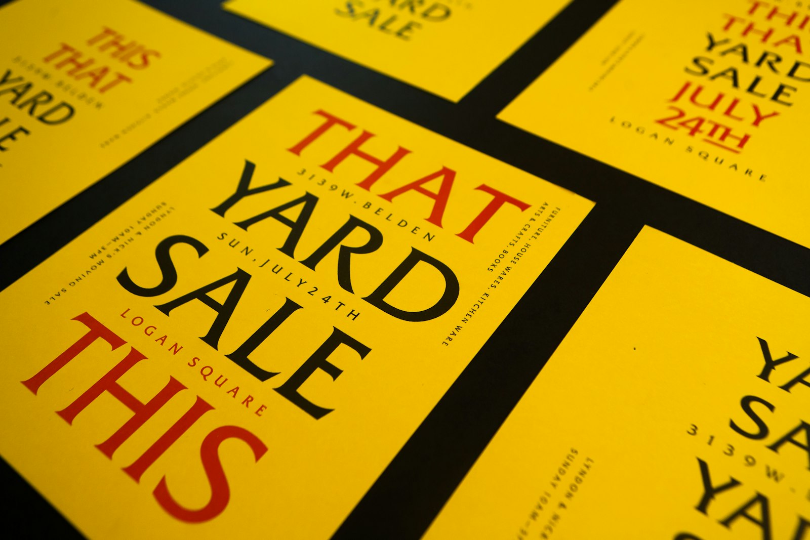
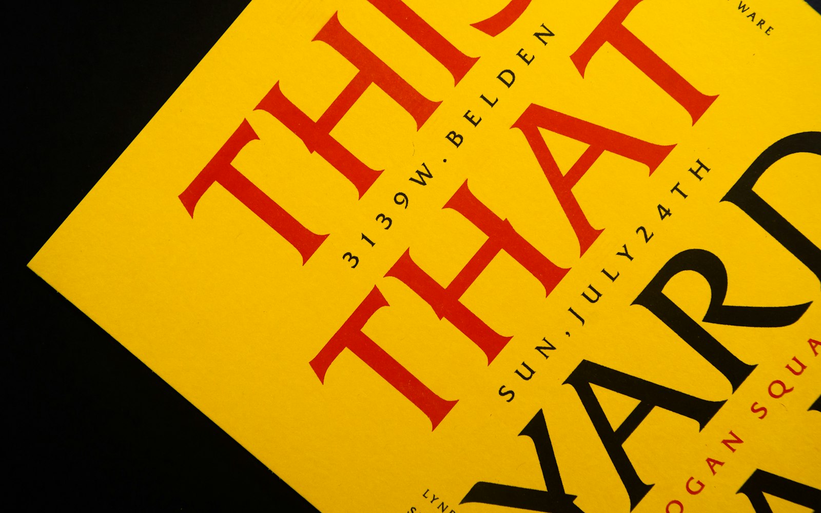
The design and execution of these Yard Sale signs were approached under a systems-based, identity lens. Here, variation is a tactic towards dynamism helping grab and increase attention. Lettering seemed like a great formal starting place, however, within the designer-fraught neighborhood of Logan Square and contemporary graphic design's endless amount of hand-lettering the signs could potentially melt into the other things seen through out the day.
Fritz Quadrata was chosen for it's precision and attention to detail without losing its hand-crafted appearance. The historical usages of Friz Quadrata in Black Flag's logo, the titling of Scarface and Law and Order were nods that I too enjoyed and felt my ideal yard sale customer might unconsciously identify based on plausible past experiences.
Wanting this use of Friz Quadrata to work uniquely several characters were modified with multiple variations to align closer to hand rendered form. Several characters were completely redrawn for optimal horizontal and vertical relationships. With the majority of items for sale being furniture, books, art, and art supplies, the style needed to target people near demographics that might be interested in these pieces. The personas we were looking to attract were both the hipster, and the more extreme, hipster doofus.
Compositionally, the poster is set minimally where the same cut of type operates in three sizes. Line-height, and letter-spacing defined the three type styles based on each being one-third smaller then the other. Headline copy was defined by four-letter words capable of raging well when centered. The idea of This That, was in jest at consumption as culture, related to ideas of I want this or I need that. The subheads were written as 12 character lines that could justify hard to contrast the ragged edge.
- Designer
- Nick Adam