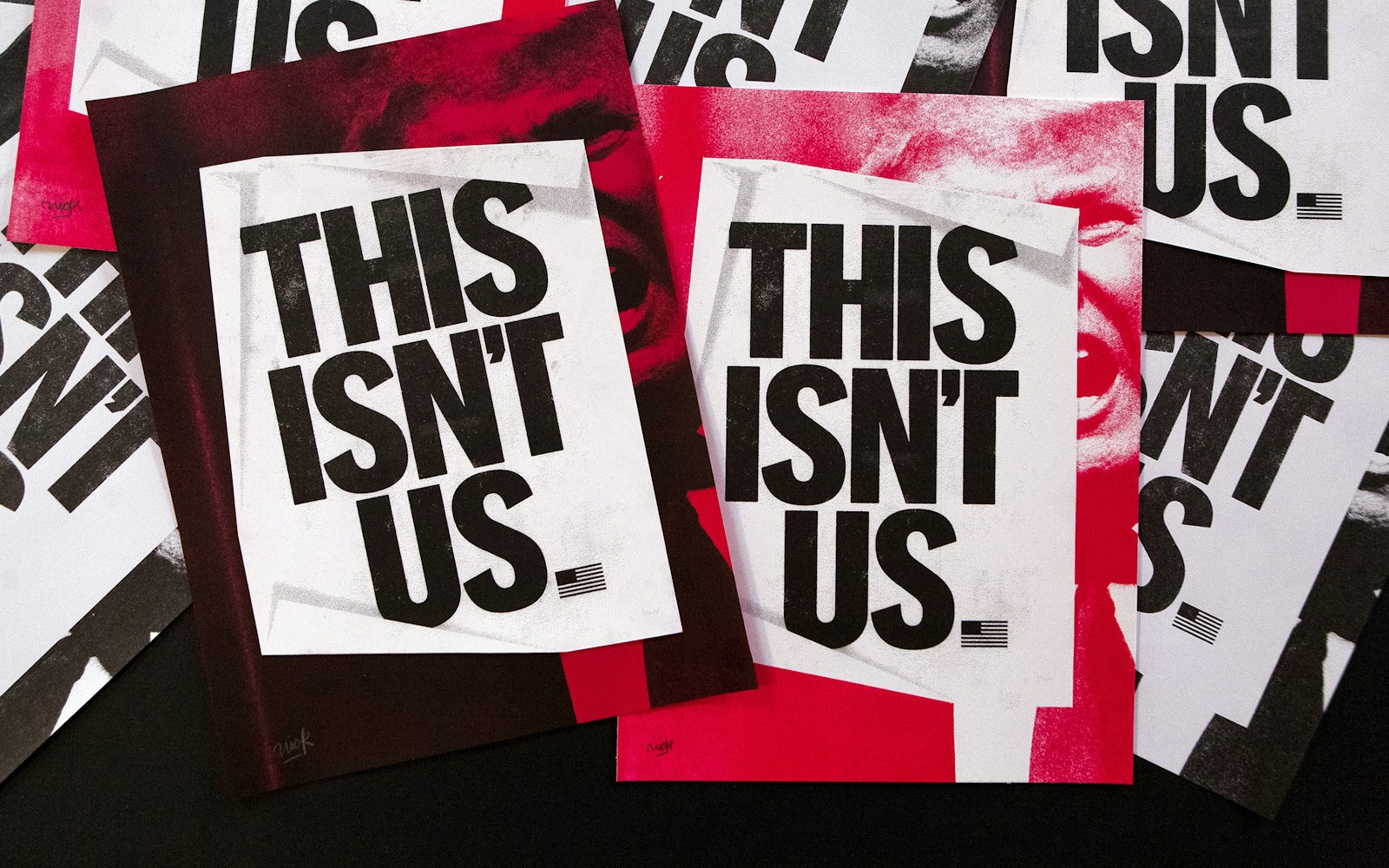
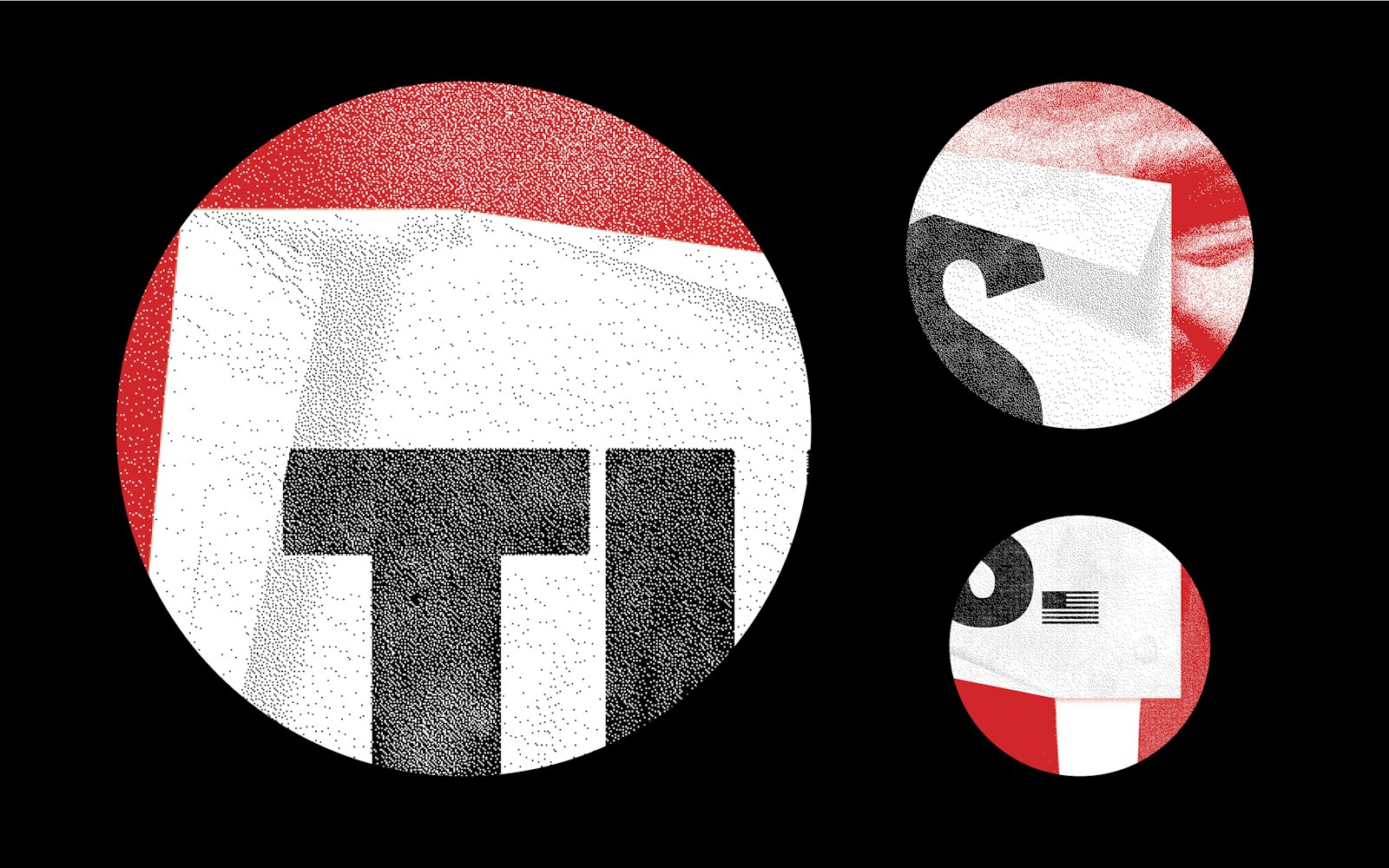
This project is a reaction to the Trump administration — ground swell of hate, bigotry, racism, sexual abuse, and anti-intellectualism. It’s important that those that disagree with what is being said and done, takes action themselves — not solely to push back, but to reassure our neighbors nationally and internationally that they are not alone.
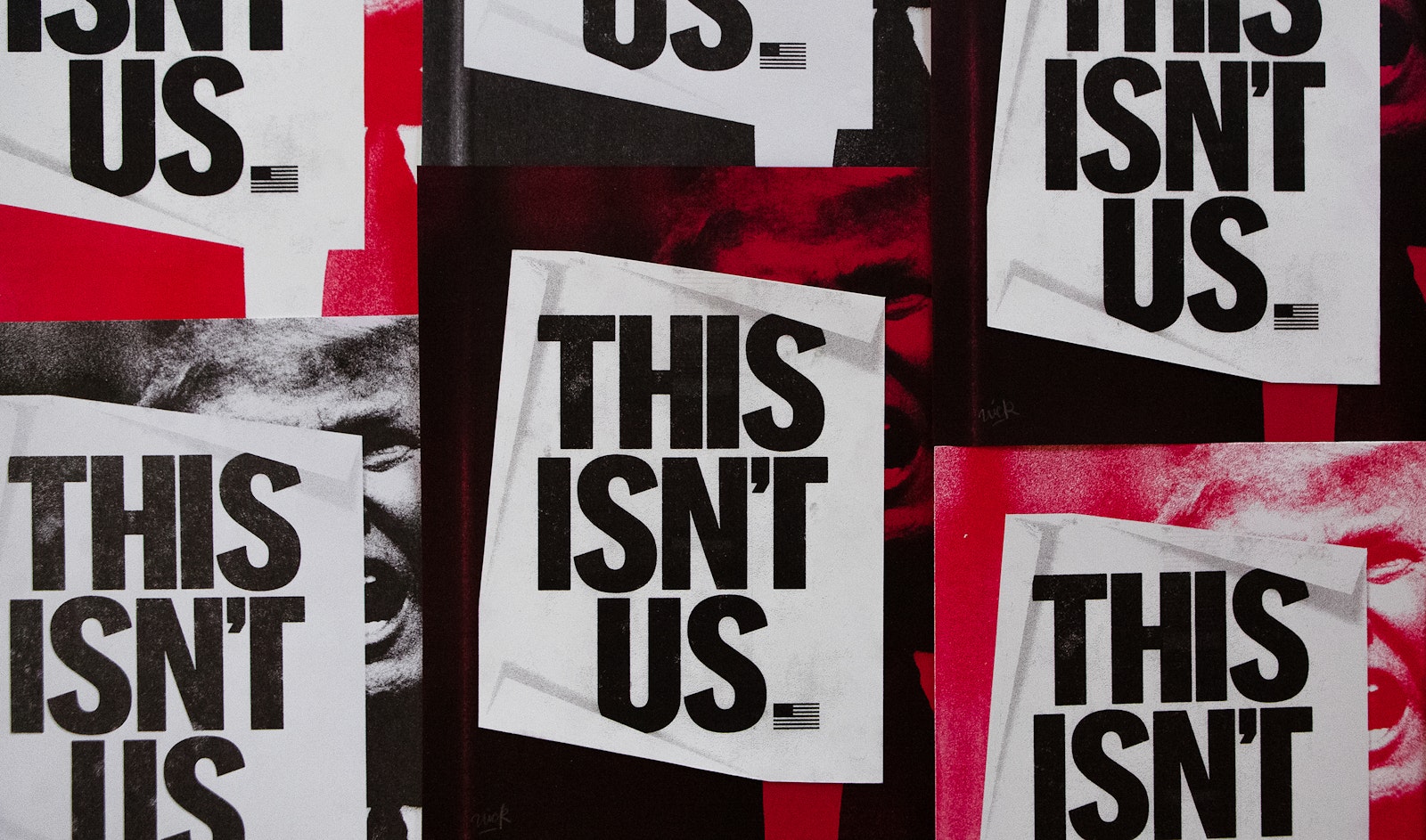
The poster within a poster simply demonstrates a civilian protest against ideals that are not representative of the United States. In a manner, here we question his motives and tactics by meeting inflammatory speech with a strong actions, thus countering the aggression with action.
In a critical design fashion, the piece balances aesthetics with conceptual merit uniting the worlds of the formalist and theorist. This occurs through being built in accordance to technical, formal harmonies while consciously responding and creating dialogue on our cultural context.
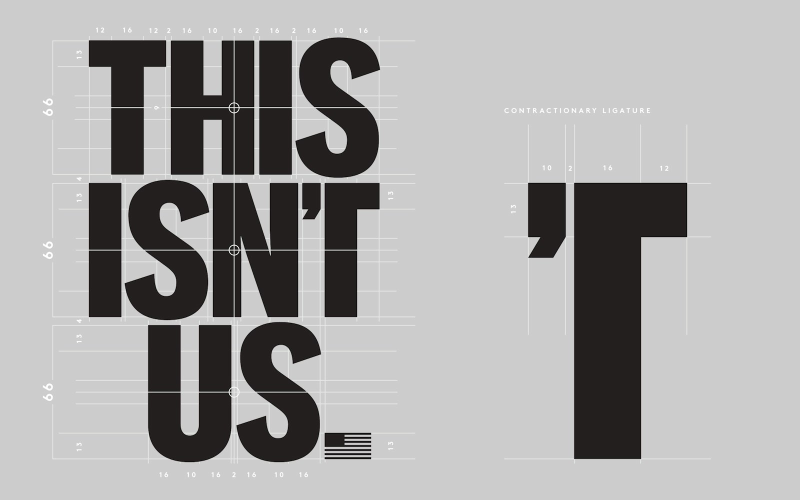
The T form is a new category of typographic glyphs created for this lock-up that might best be termed as a contractionary ligature. This maneuver is both stylistic and conceptual to help match the tone of the word. Contractions as negative statements tend to be spoken with a confident quickness. The idea behind the ligature is to save on word-space, to remove the visual breath that occurs in traditional contractions. With optimal word-spacing the contraction’s form visually matches that of the audible statement — without hesitation.
Typographically, the letter style is based on semi-condensed, American Gothics that were cut from wood. Here the letters have been drawn in a contemporary fashion of metrically equal weights, this favors iconoclasm setting over optically readable an approach that benefits all-caps lock-ups.
The poster within a poster design was created in April of 2016. It has been installed in over 10,000 placements across Chicago, Los Angeles, San Fransisco, Boston, New York City, Providence, Washington DC.
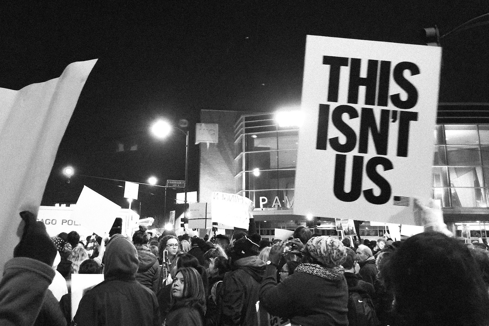
The protest sign was designed and produced to be held at the Trump presidential campaign rally planned for March 11, 2016, at the University of Illinois at Chicago (UIC). After canceling the Chicago protest, Trump was quoted saying 'these guys, they had professional signs'. As if a well produced sign is something beyond that of citizenry.
The sign was captured on Fox News, MSNBC, ABC NEWS, as well, Senior Washington correspondent, Jeffrey Zeleny tweeted the image to his 83,000 followers then spoke to it's presence live on CNN.
POPPY HARLOW: Very powerful image last night. Talk to me about it.
JEFFREY ZELENY: I was struck just by the diversity of the crowd outside, Poppy. I mean, Donald Trump says that they were all organized thugs. That's not what I saw at all. You saw black and white, young and old, Hispanic and Latino, and this picture here of a young white man holding up a sign. "This isn't us."
This work connects to design theorist Abram Game’s thoughts on successful posters, as documented in the History of Graphic Design from Phillip Meggs, chapter 14—Post Cubist Pictorial Modernist. "A poster with a measure of intrigue engages the mind of the spectator and (they) look again. You have to take (them) along with you so (they) follow your line of thought. The best way I can describe what happens is to say that as the designer you wind the spring, and it is released in the mind of the viewer." — Abram Game
The Trump photograph was taken by Gage Skidmore, it was used and modified with permission, it's licenced under Creative Commons License 2.0.
- Designer
- Nick Adam
