Brian Thompson Financial is an independent fiduciary advisor, focusing on Generation X and Y LGBTQ households, that aims to take the anxiety and ambiguity out of financial planning. In this new era of marriage equality, BTF exists to give underrepresented groups the measured, strategic and judgement-free advice they need to secure their futures—on their terms, at their pace.
Firebelly came on board to help develop a minimal, highly differentiated brand and friendly messaging to help BTF find its place in a field crowded by powerhouse firms and UX-savvy roboadvisors. Our research focused on understanding not only the competitive landscape, but the personal motivation and passion behind the practice, as well as the depth of anxiety it seeks to relieve. Our solution was to balance humanity with flexibility and create a visual brand that invites personalization, conveys forward momentum and builds trust every step of the way. The visual identity system was built specifically with high-end print collateral and web executions in mind, appropriate to the industry and to users’ known needs and behaviors.
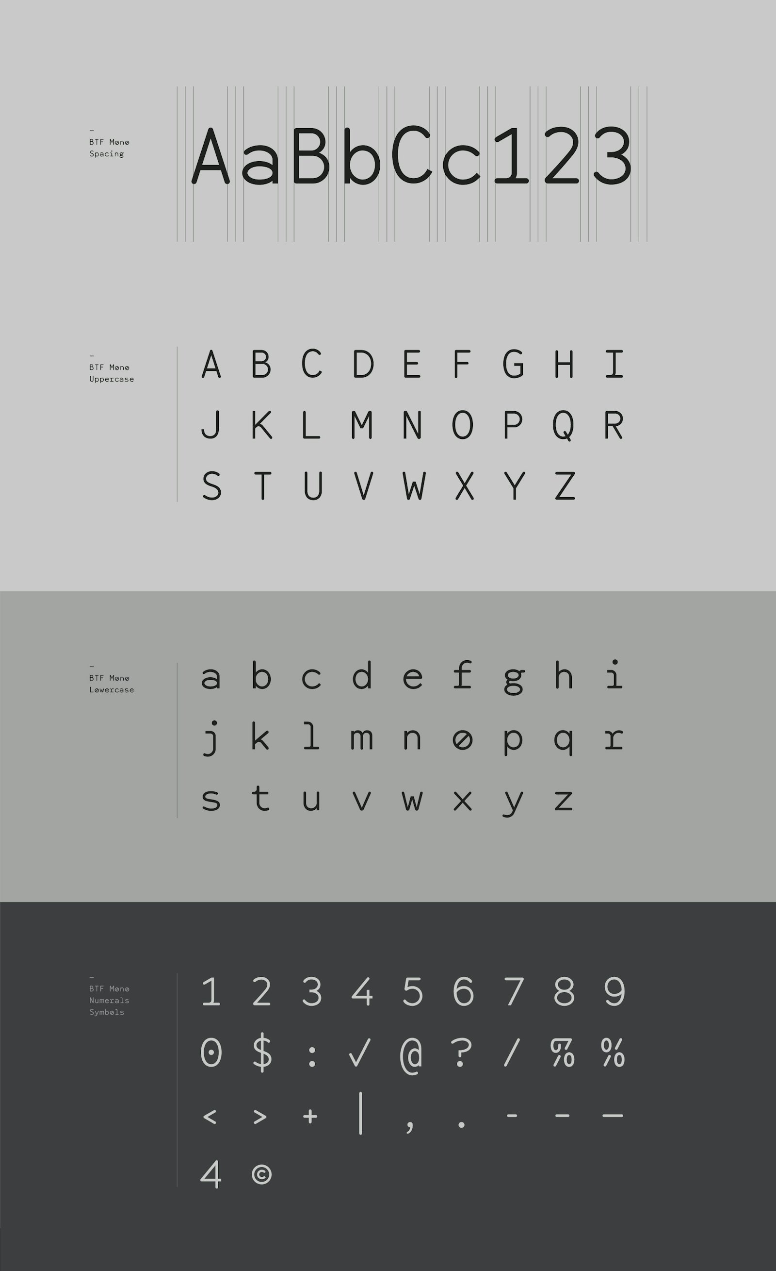
The BTF identity evolved from humble beginnings. We began by developing a personable, yet professional custom font, BTF Mono, a monospace alphabet that draws from tabular data and even-handed spacing. Quite simply, the font is the brand. It sidesteps many of the visual tropes seen in the competitive landscape; nary a stately serif or uber-modern sans serif to be found here. Numerically-friendly by design, BTF Mono is the common element that unites look, feel and function. It translates seamlessly across both print and web—appropriate for a business that prioritizes meeting clients where they are.
The primary wordmark streamlines into a concise, lightweight form—|B|T|F|—that is subtle enough to exist anywhere and everywhere, providing quiet, confident reassurance at every touchpoint, without ever becoming overbearing. The font is also flexible enough to feature prominently in high level messaging—when put to work, it supports encouraging, unignorable calls to action, building trust through legibility and familiarity.
Building further from these basic elements, the system employs clean linework, inviting users to literally read between the lines, where they can find their own value and pathways forward. In the digital realm, simple animations, imagery and interactions emphasize the firm’s commitment to planning without fear, prioritizing with pride and making continuous progress. Financial planning never looked so friendly.
- Designer
- Will Miller
- Web Developer
- Matt Soria
- Content Strategist + Copywriter
- Kristin Lueke
Project link