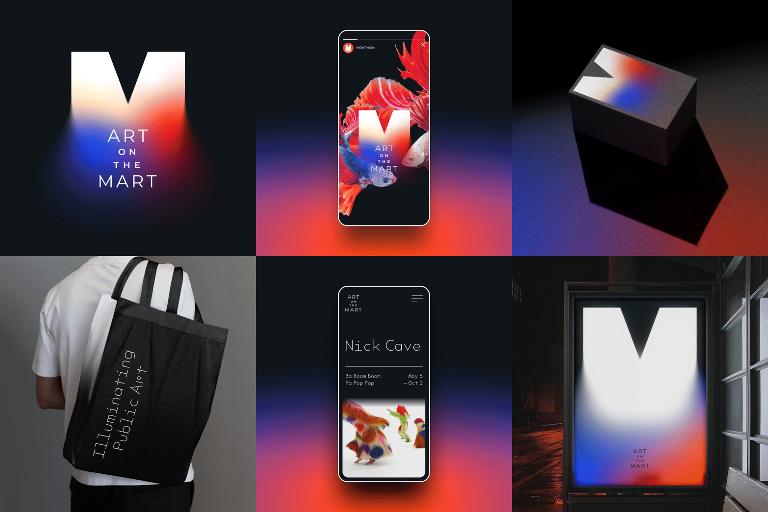
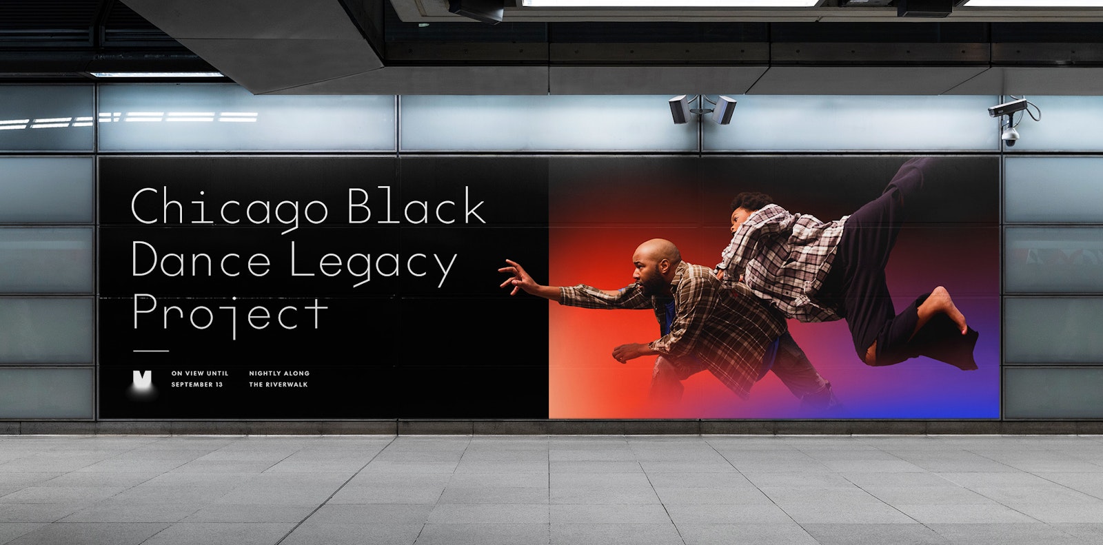
ART on THE MART is one of the world’s largest digital art platforms that transforms the surface of an iconic Chicago architectural landmark into a permanent, larger-than-life canvas. Using advanced video mapping technology, ART on THE MART showcases bespoke projections by contemporary artists such as Nick Cave, Yiyun Kang, and Charles Atlas.
To develop a fresh visual identity for ART on THE MART, we aimed to expand upon established Mart branding while ensuring the identity had a uniquely recognizable and memorable look of its own.
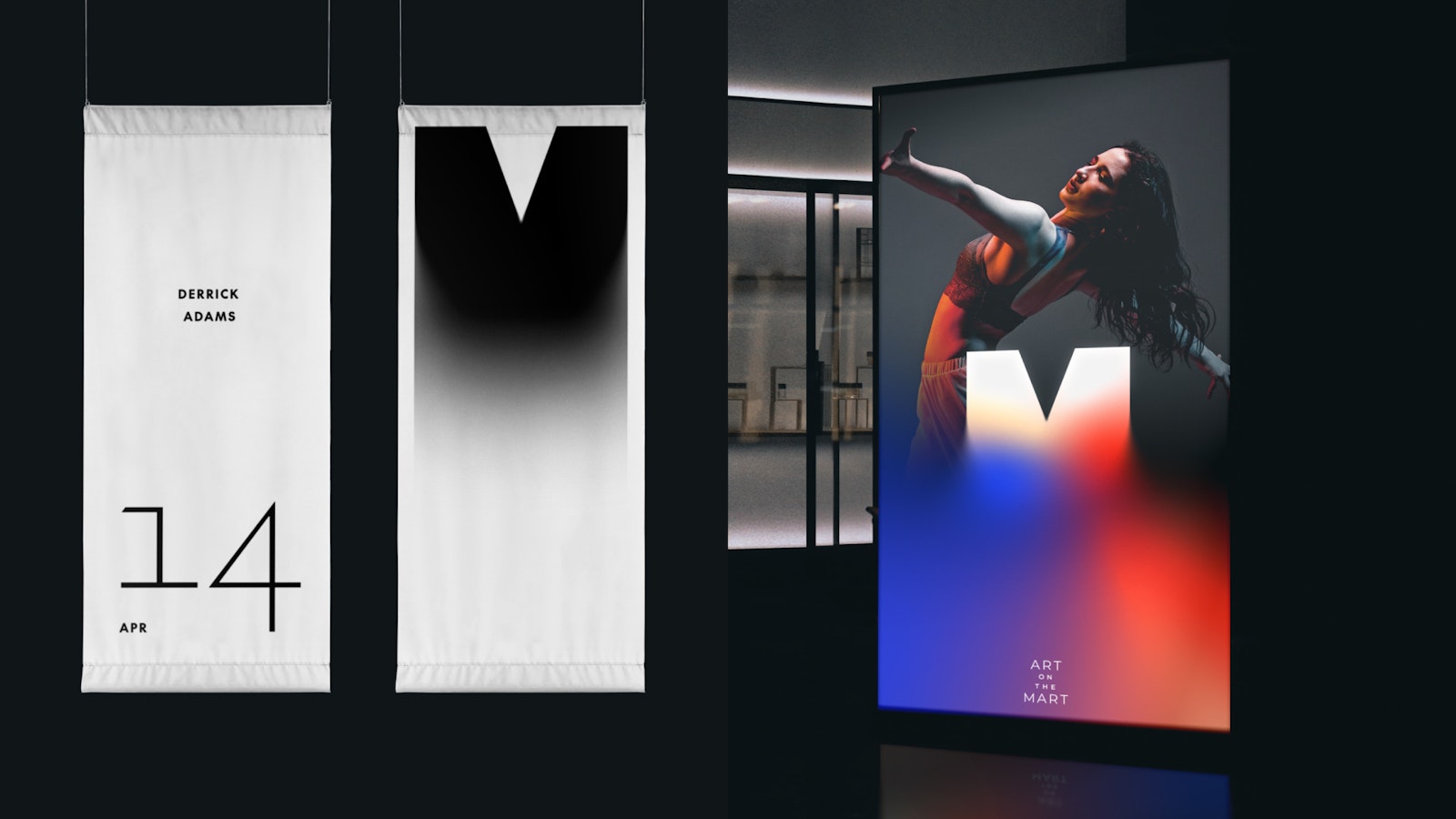
The identity is designed to be a luminous, kinetic system that draws inspiration from viewers’ experiences on site. Inspirational characteristics include the dancing light of the Chicago River, the soft movement of projected video, subtle reflections on surrounding glass, and the art deco style of the Mart itself. In channeling these elements, the identity aspires to evoke a sense of motion and radiance roused by the location, history, and innovative technology of projecting digital art onto an architectural icon.
Layouts are crafted to interact with imagery and video through three approaches we refer to as “silhouette,” “freeze frame,” and “bending light,” and adapt to each artist’s work through seasonal campaigns.
The primary brand typefaces, The Future and The Future Mono by Klim Type Foundry, pay homage to Paul Renner’s 1927 classic Futura and are prominently featured throughout projection campaigns, email newsletters, social media, and the fully redesigned ART on THE MART website.
Design Direction + Design: Will Miller
Design + Production: Ruth Lin
Animation: Will Miller, Ruth Lin
Typefaces: The Future + The Future Mono, Klim Type Foundry
Client: ART on THE MART
- Design Director
- Will Miller
- Designer
- Ruth Lin
Project link
