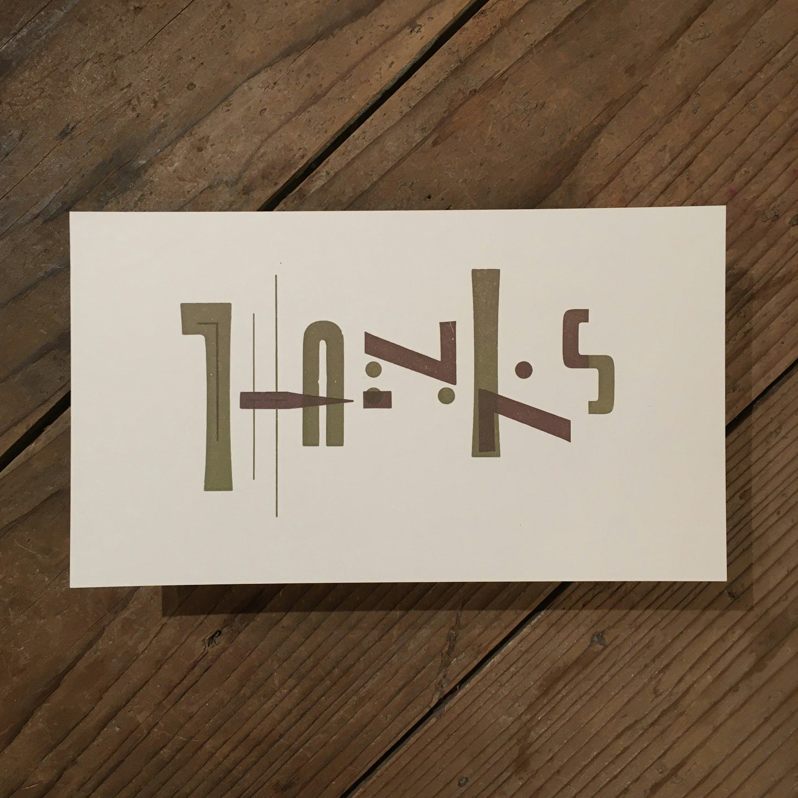
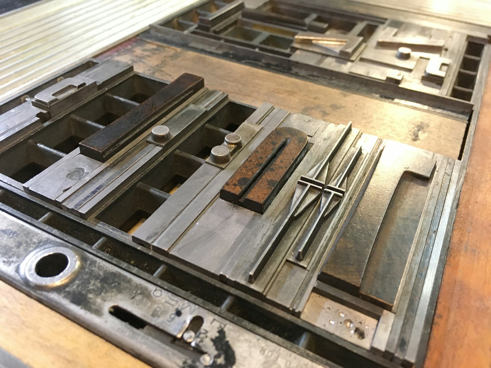
THANKS is a chromatic composition that reimagines glyphs as building blocks for new letterforms. The handset metal type is composed as two separate forms, each void of meaning until one is overprinted upon the other and the message is revealed.
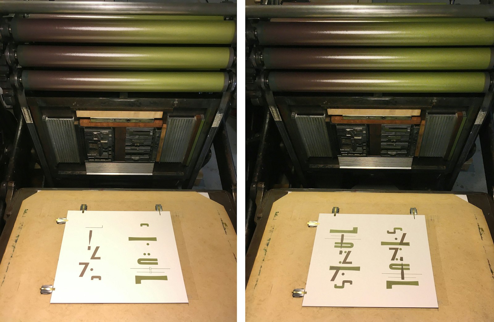
The forms were locked up together in the press bed as a “work & turn” layout so that once a page went through the press it could immediately be rotated 180 degrees and run through the press again — creating two copies of the same design at once. A split fountain allows for the simultaneous inking of both forms in complementary hues, creating a nuanced chromatic print that emphasizes the underlying structure without sacrificing unity. Once dry, the pages were cut in half, yielding two prints per page.
Production Notes: Letterpress printed in a limited edition using wood and metal type on a 1903 Colt’s Armory platen press. The typefaces used are No. 510, Huxley Vertical, Gothic Condensed, and Bernhard Gothic.
- Design / Typesetting / Letterpress Printing
- Amy E. Redmond
Project link
