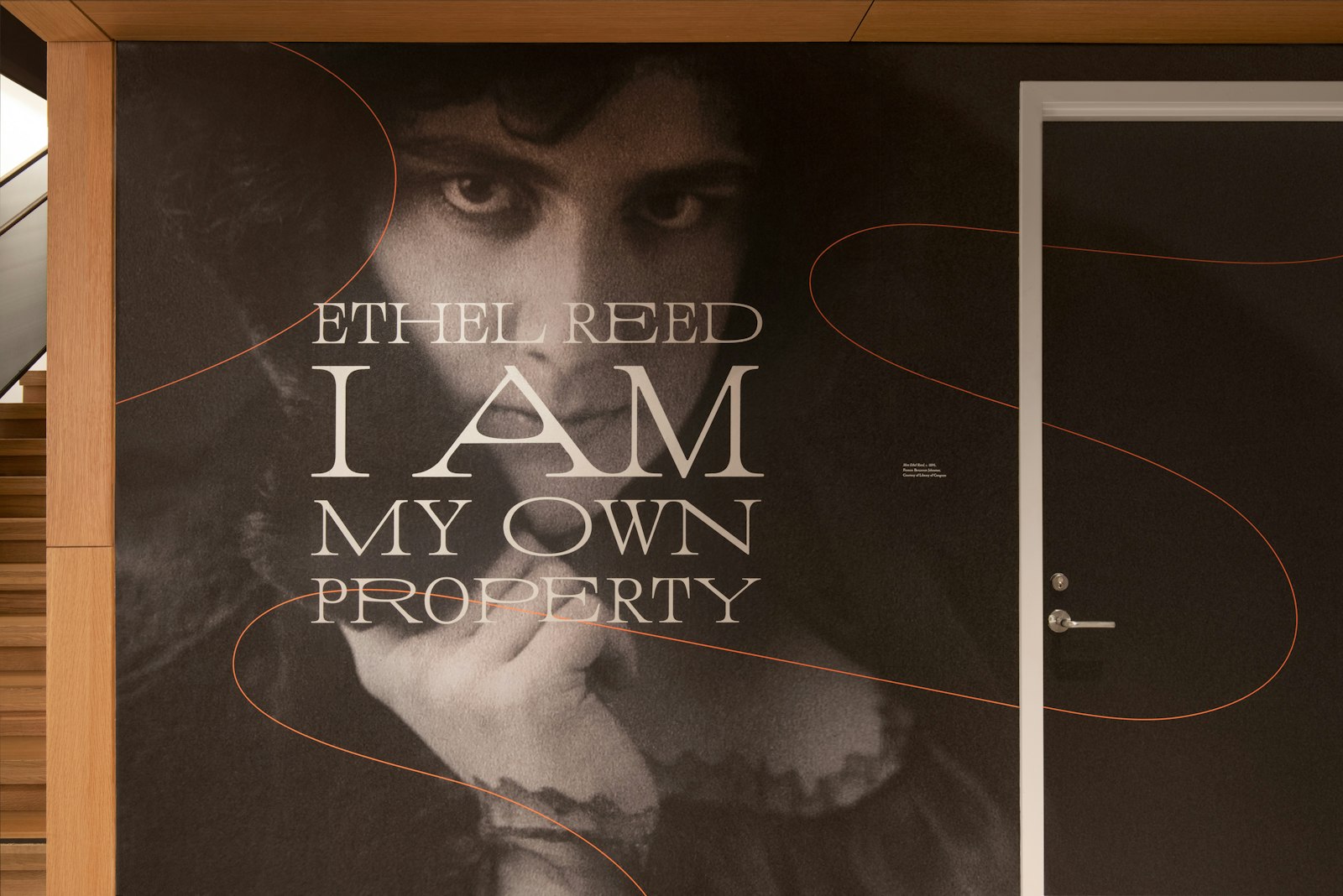
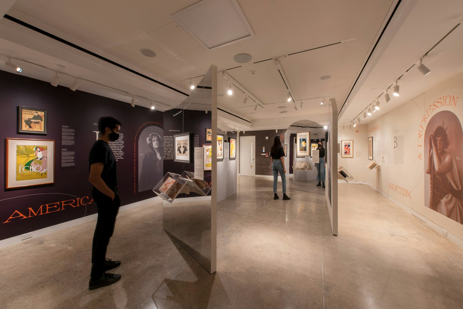
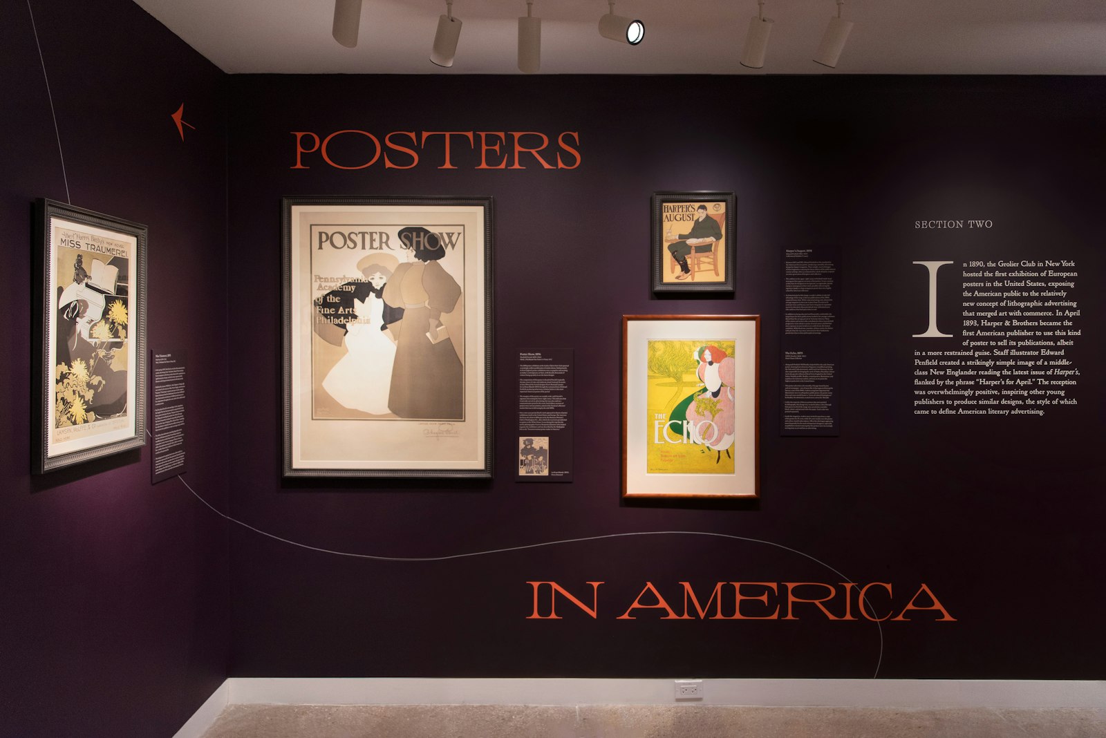
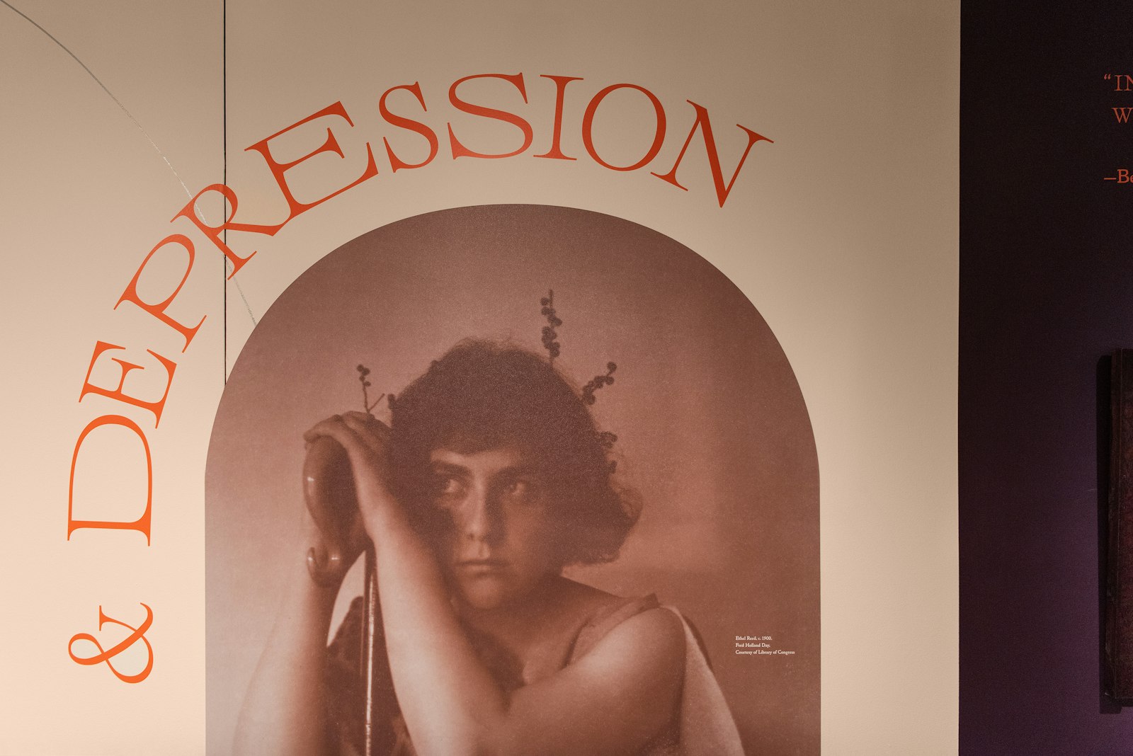
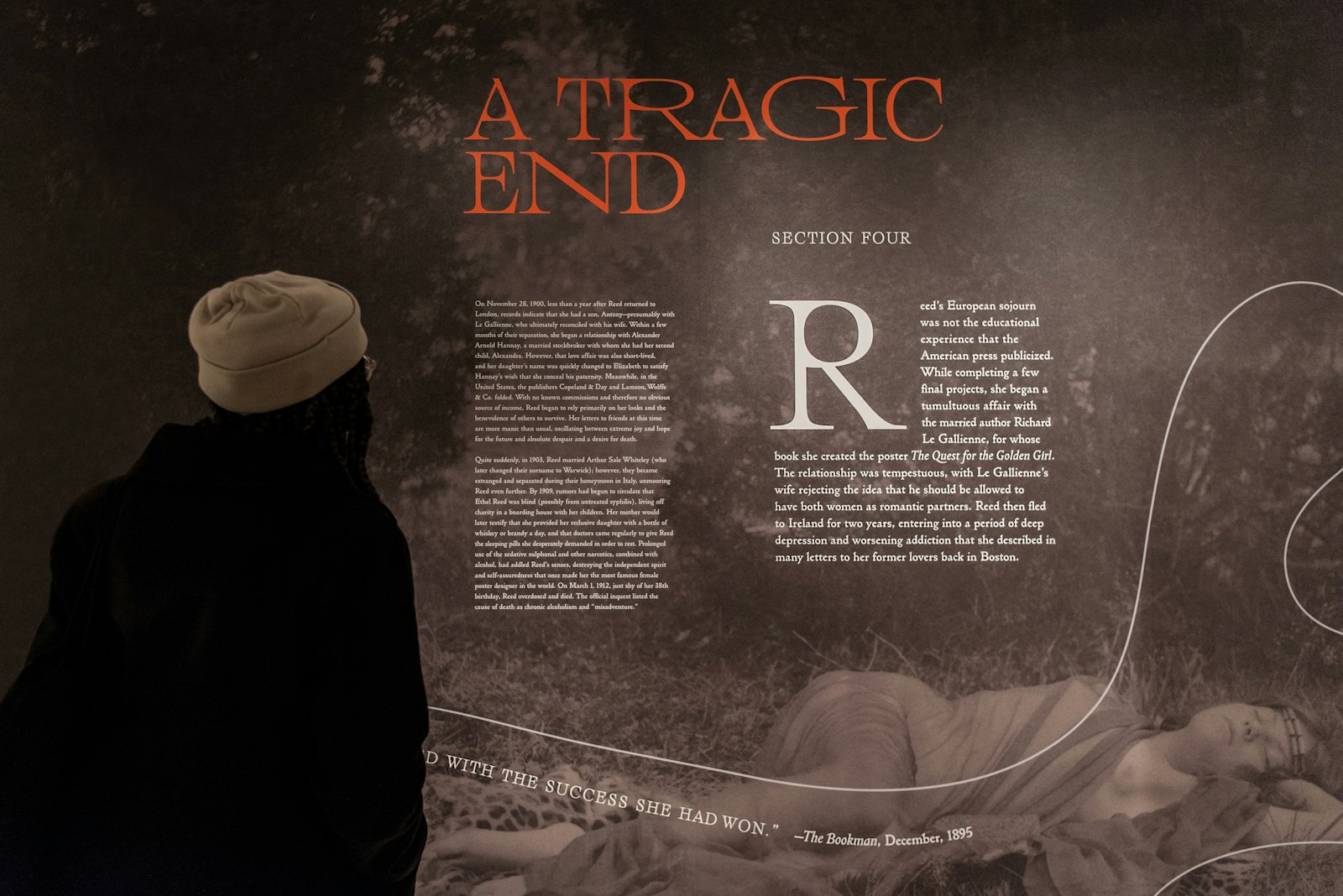
Isometric collaborated with Poster House to design the dream-like exhibition Ethel Reed: I Am My Own Property. The exhibition explores the life and work of the wunderkind poster designer who shot to brief, ecstatic fame in the late 19th century and whose legacy was then largely forgotten. Cascading, curvilinear mirrors form a privacy screen, representing the claustrophobic interiority of the domestic space, which for Ethel Reed also became a space of limitless imagination and creativity. Isometric created a custom variable typeface, Ethel, that expands and contracts to capture the distortion and change the artist experienced throughout her brief career. The type design evokes the curvilinear Art Nouveau period, while asserting a contemporary, geometric quality in its counterforms. The typography and hand-painted linework weave throughout, swelling and curving alongside the exhibition design.
- Partner
- Andy Chen
- Partner
- Waqas Jawaid
- Design Director
- Maria Loes
- Type Designer
- Corinne Ang
- Graphic Designer
- Ingrid Schmaedecke
- Architectural Designer
- Abhishek Thakkar
- Director of Design & Exhibits, Poster House
- Ola Baldych
- Chief Curator, Poster House
- Angelina Lippert
- Associate Director of Exhibits, Poster House
- John F. Lynch