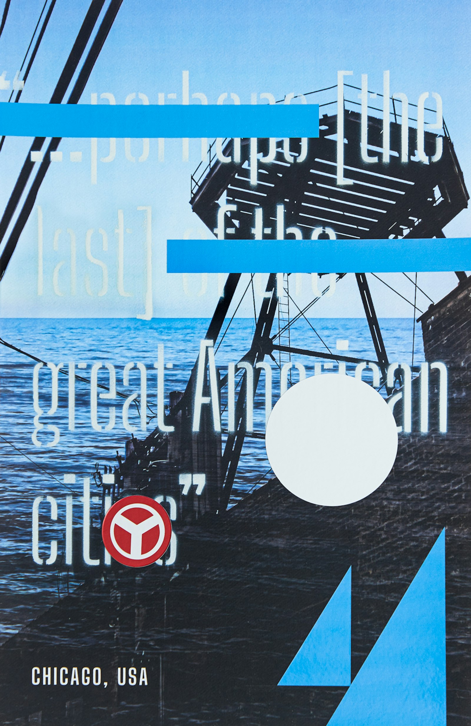
The Chicago Graphic Design Club sought submissions for a poster using the official Chicago typeface, Big Shoulders, that communicates what Chicago means to you. This poster was partially hand assembled, using layered Chicago imagery and historic symbolism to create a poster that feels truly Chicago in a personal and abstract way.
The base layer photomontage is composed of two photos taken by the designer of locations Chicagoans are very familiar with—the lake and an alley—representing the dichotomy of the Chicago living experience.
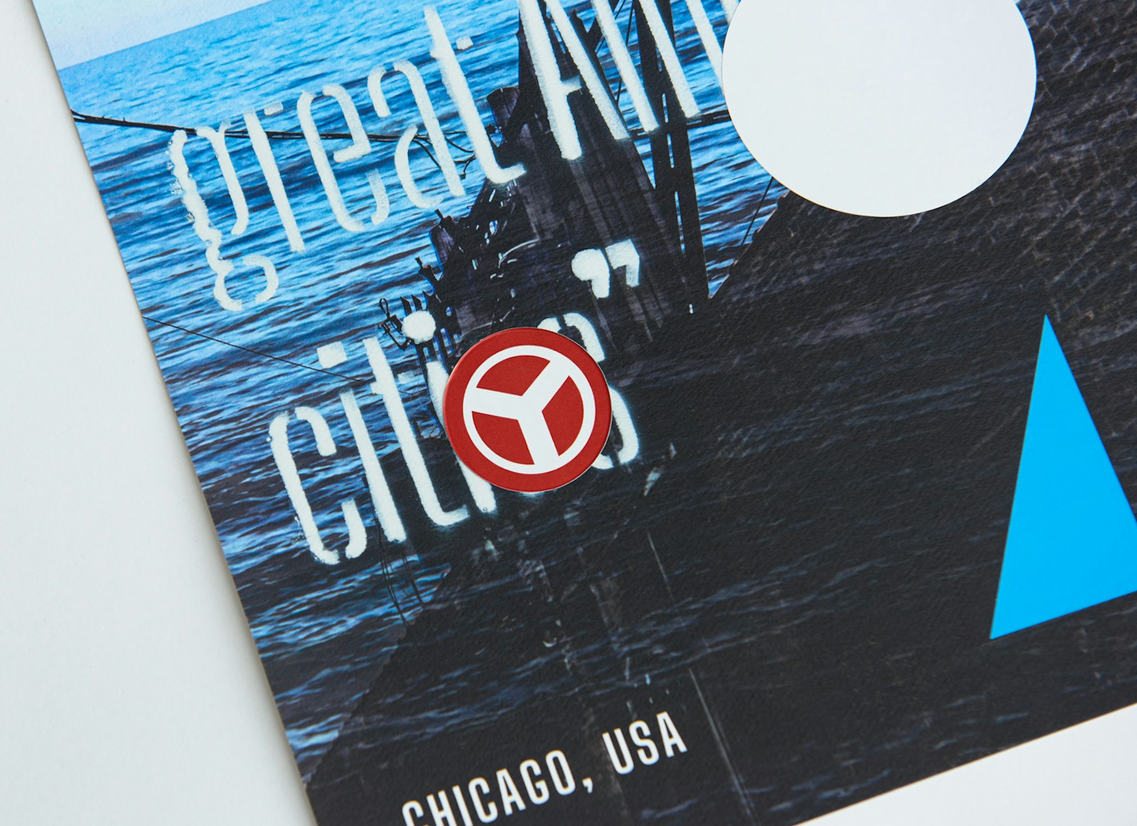
The text is a reinterpretation of a famous Norman Mailer quote “But Chicago is a great American city. Perhaps it is the last of the great American cities.” The typeface Big Shoulders Stencil Display was first laser cut into a stencil, and then applied to the poster with spray paint for the second layer.
The top layer, applied by hand as stickers, consists of a formal deconstruction of the Flag of Chicago. To edit the word “cities” to “city”, the 1892 Chicago Municipal Device Y symbol is used. “The Y symbol is meant to be used unofficially by citizens, businesses and other organizations to promote pride in the city. Users are free to color and design it however they wish.” The Municipal Device is Chicago flag red, continuing the deconstruction of the flag. There is also reference to the great John Massey’s “Chicago Has a Great Lake” 1966 poster. Series of 5 prints.
- Designer
- Dan McManus
- Creative Advisor
- Sofya Karash
- Technical Assistant
- Isabela Viazzi
- Technical Assistant
- Derrick McCormick
- Photographer
- Nathanael Filbert
- Muse
- Mae Mae


