By creating space for community activism and expression, the Silverroom is a boutique store that goes far beyond retail. Since 1997, the Silverroom has been a Chicago institution whose mission is: to create a global community through art and culture.
When the Silverroom approached us to create the store’s first-ever campaign — we knew we could be inspired directly by their culture. Working closely with Founder Eric Williams we set out to create a style that reflected the life and pride of the Silverroom. The outcome? A collaboration centered on community and inspired by the actions of the store’s supporters.
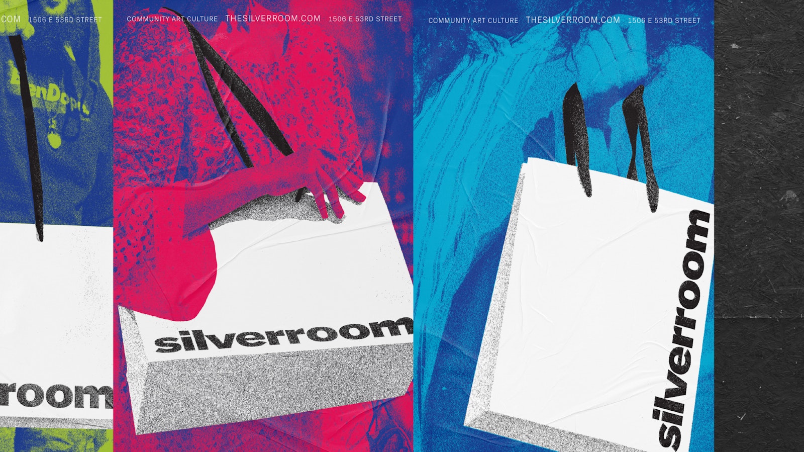
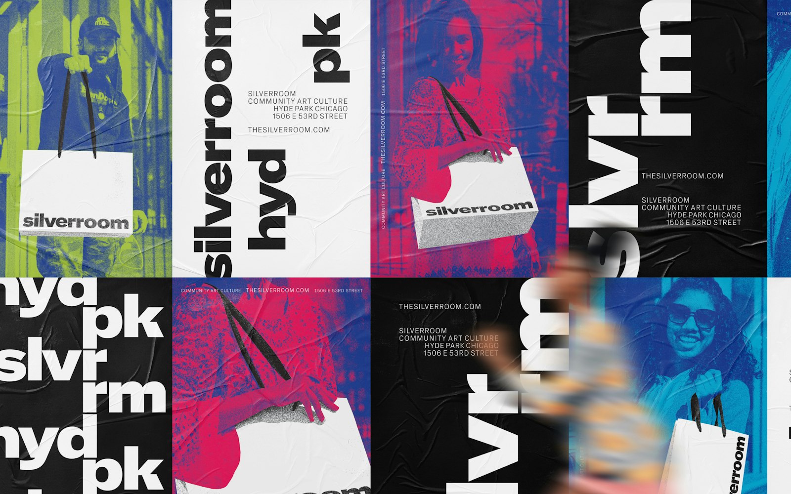
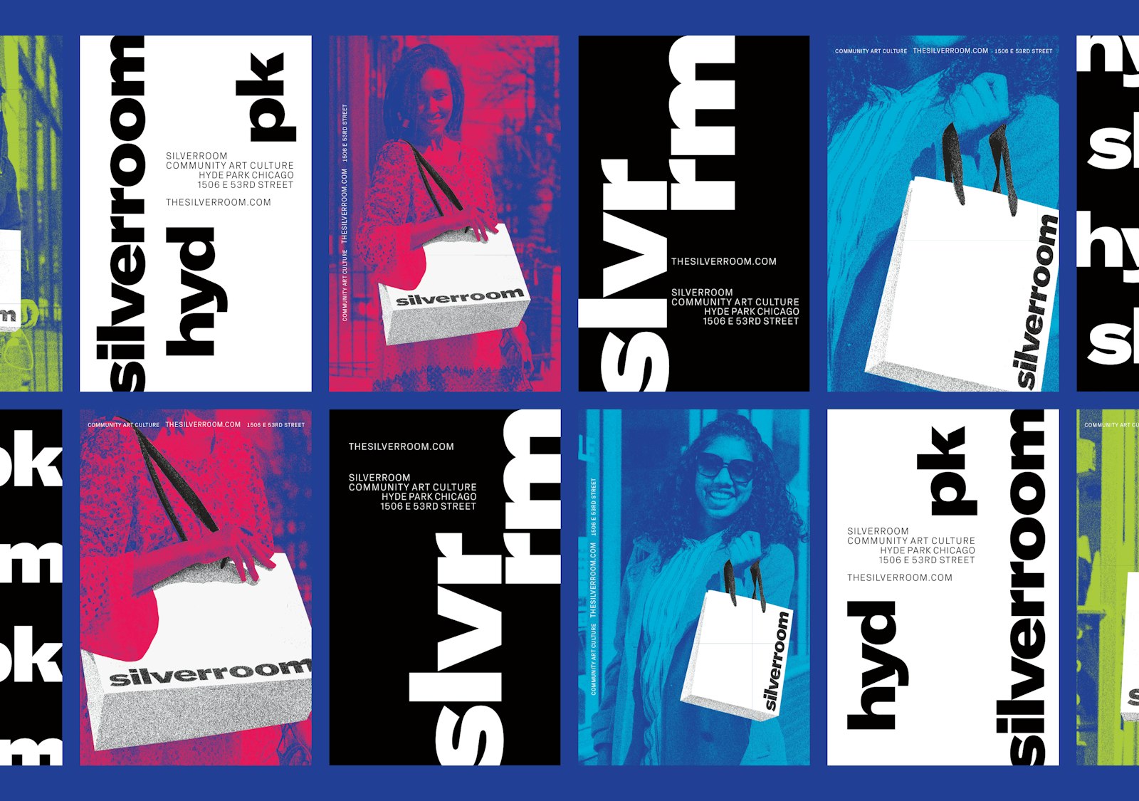
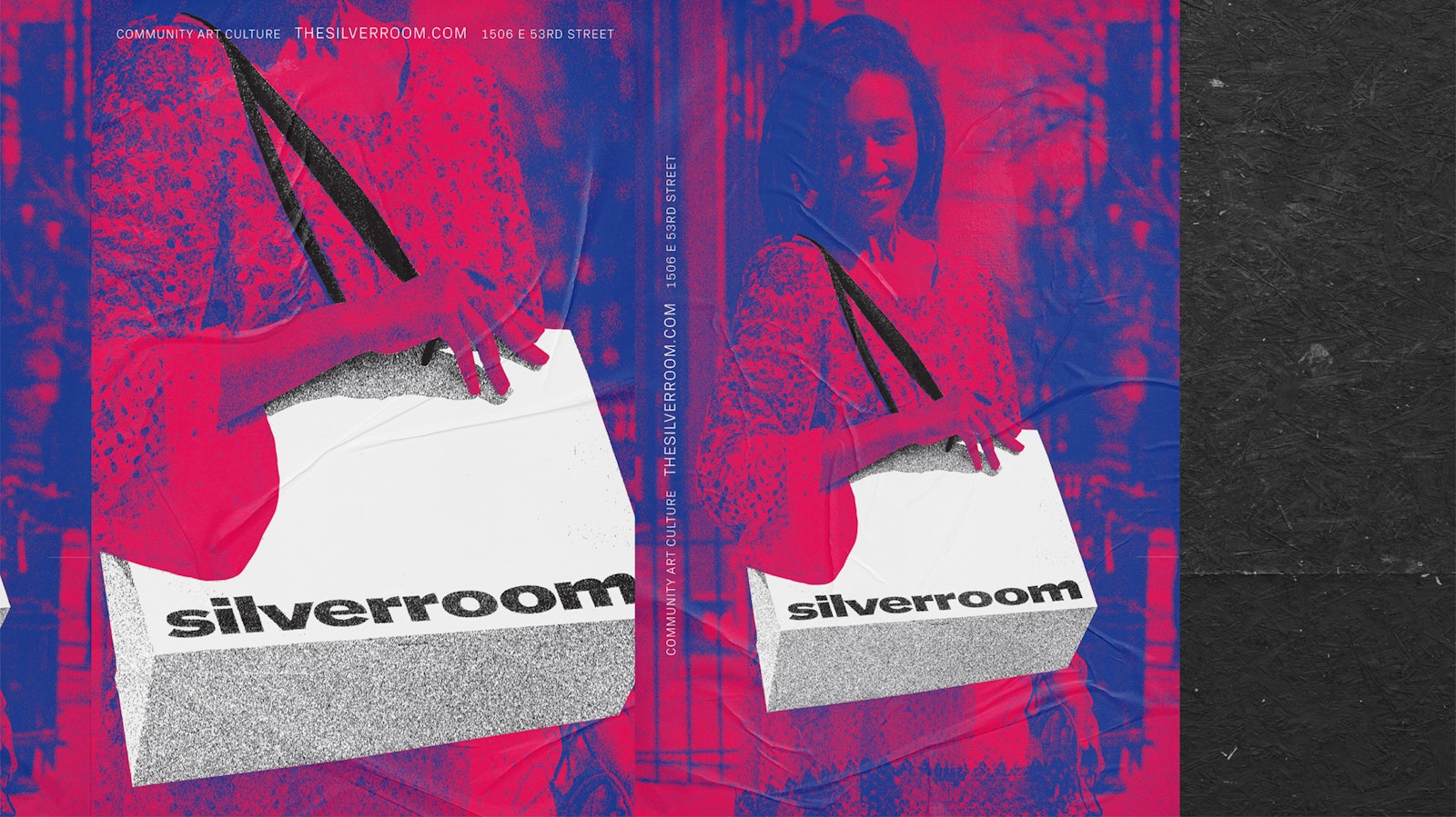
In Chicago, the Silverroom bag is a point of pride. One look at the store’s social media and you will find their supporters proudly tagging selfies while holding the bag. We worked with photographer and Silverroom’s Marketing Manager Angela Estrella Mejía to create a photo series capturing this act. These photos underwent a simple treatment resulting in a bright, iconic, graphic approach that introduces Silverroom and its culture to a wider audience. The typographic posters build off the identity and custom type we designed inspired by the pulse of Reid Miles’ Blue Note album covers.
- Design Direction, Design
- Nick Adam
- Photography
- Angela Estrella Mejía
- Design
- Avery Branen
- Model
- Weléla Mar Kindred
- Model
- Stephan Scendsei Steciw
- Media Placement
- Zeb