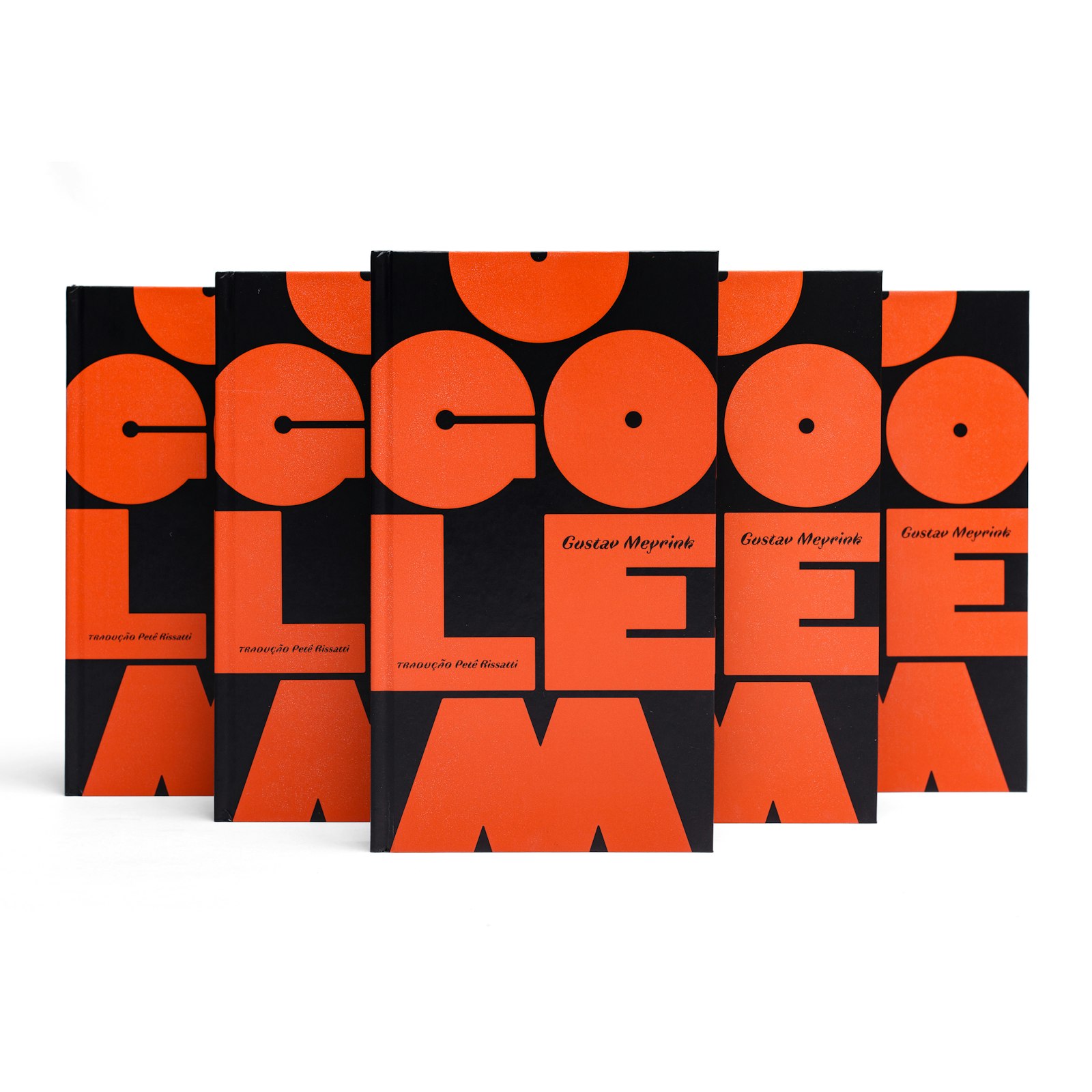
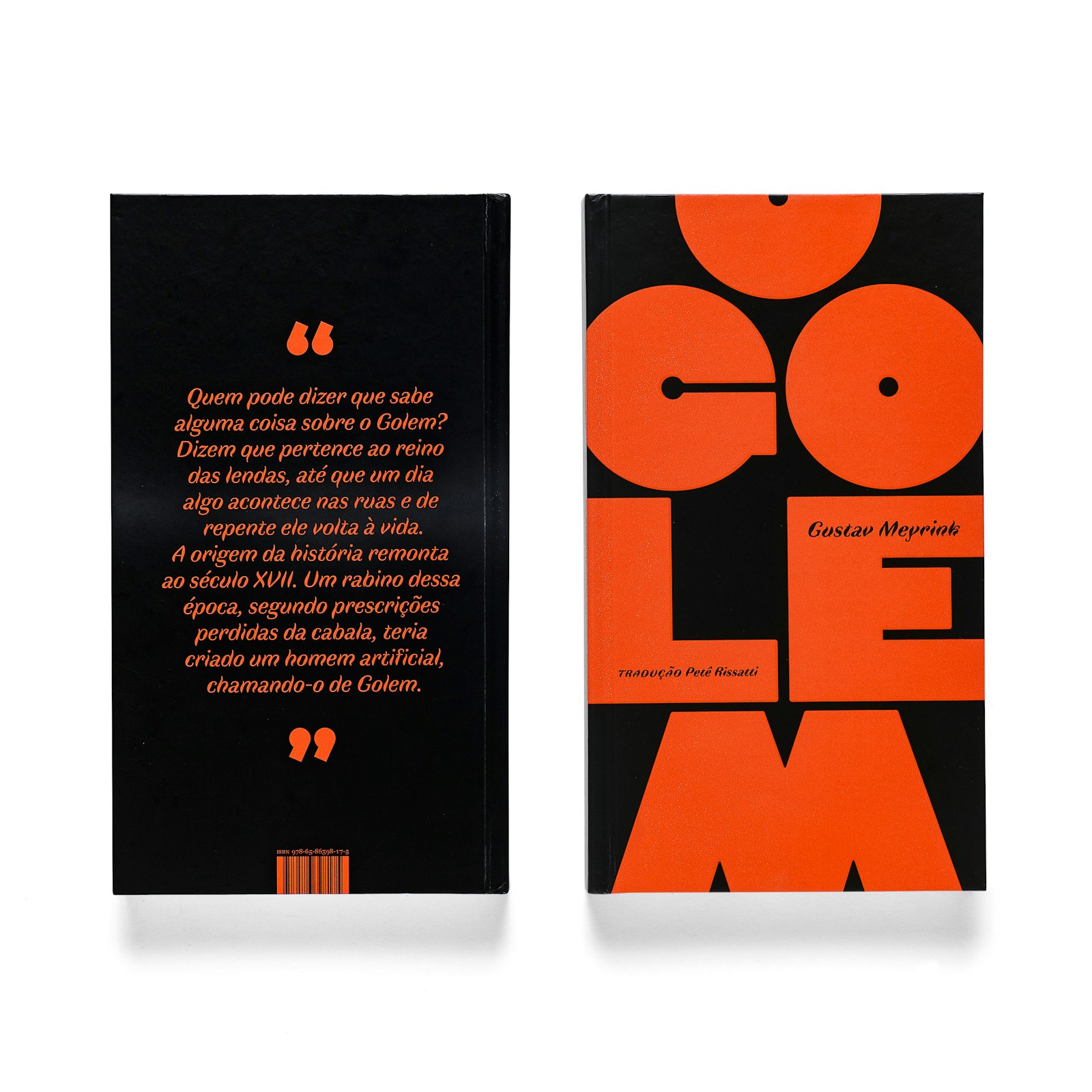
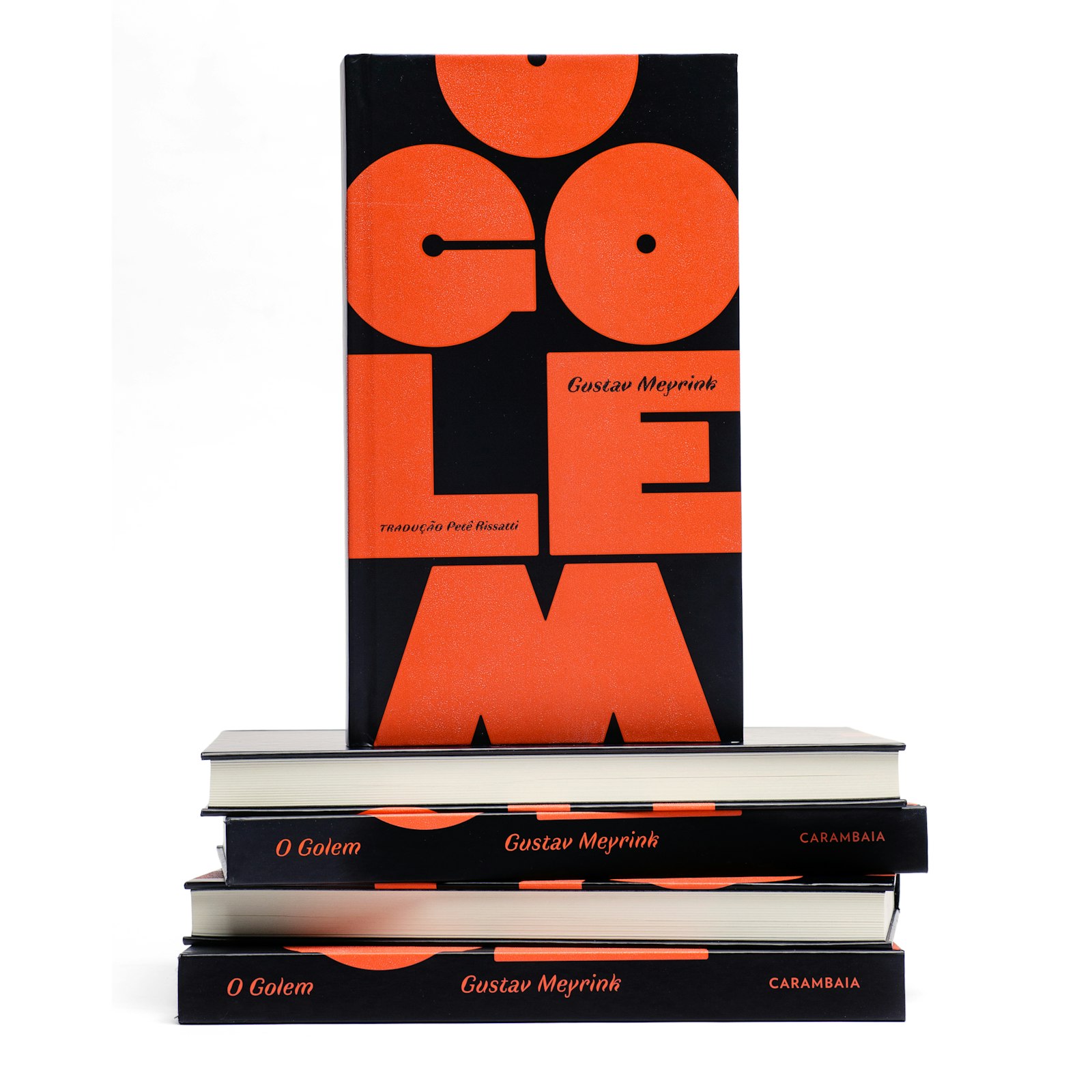
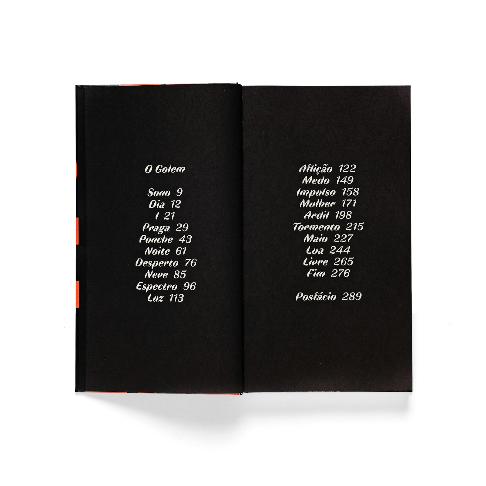
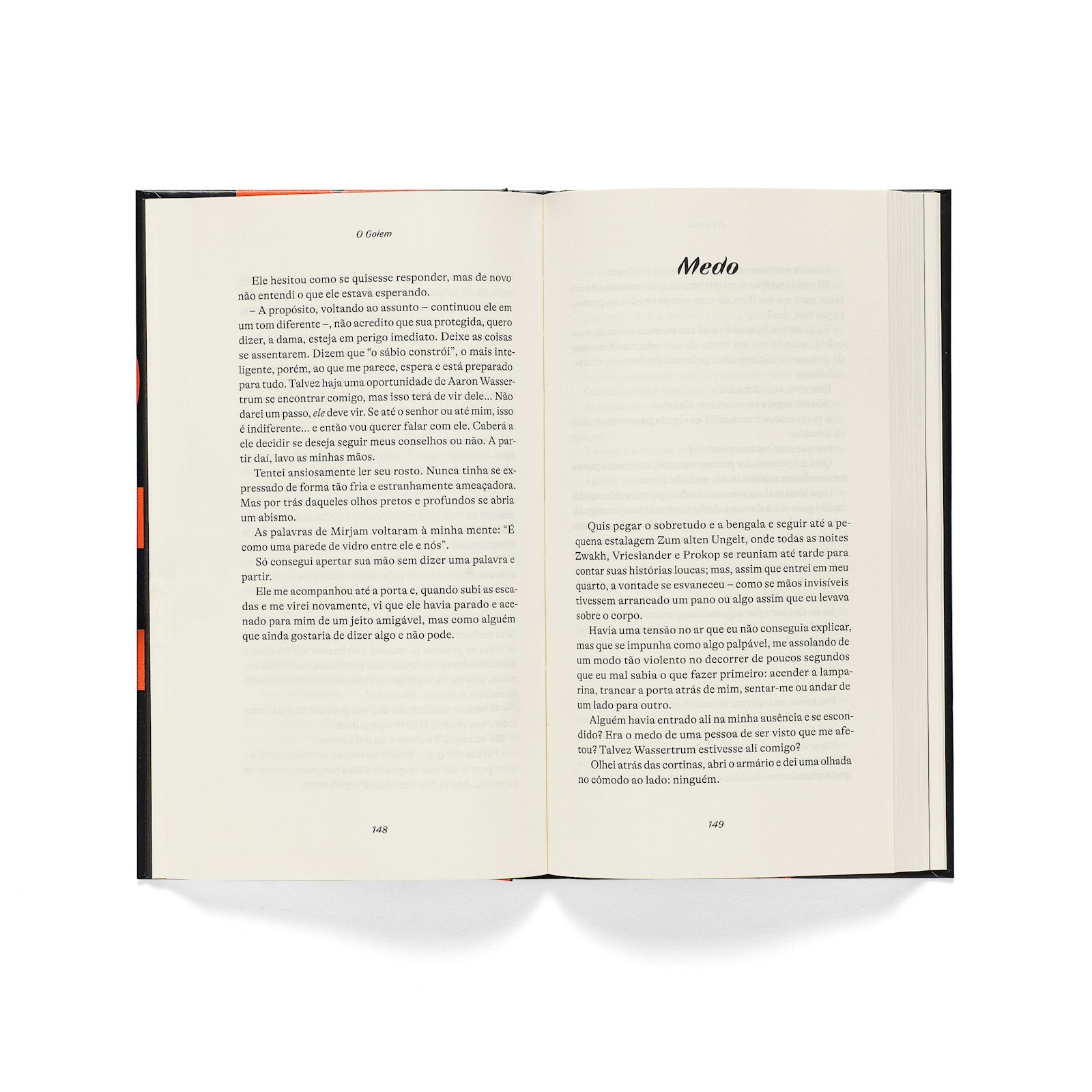
The book it's a new edition of Gustav Meyrink’s famous novel Der Golem (English: The Golem), translated into Portuguese.
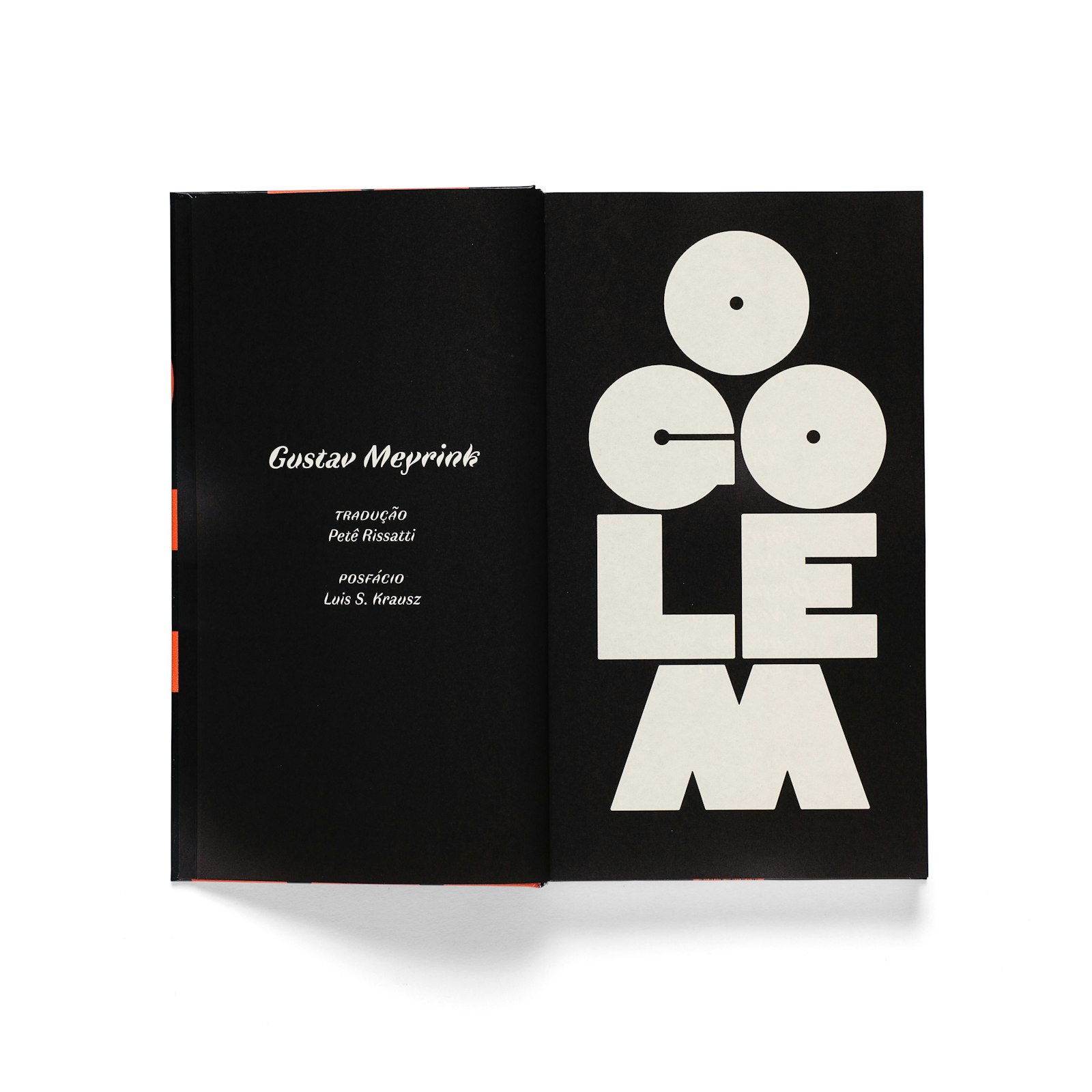
The design makes typographic references to the Plakatstil movement and German expressionism poster design, which mark the aesthetics of Central Europe at the time of the novel. On the cover, the title was composed in order to represent the creature that gives name to the book, a man of clay of great proportions.
Dida by Jérémy Schneider, with its robust geometric design, allows this graphic approach. The second font, used in the chapter titles, is Faune. Its design, according to its creator Alice Savoie, “claims a complementary and atypical voice”, and “its strangeness allows it to fully assume its role of disturbing the rhythm”, descriptions that dialogue with the idea of double and the strangeness present in Gustav Meyrink’s fantastic literature. The story is typeset in the distinct GT Alpina by Reto Moser.
- designer
- Gabriela Castro (Bloco Gráfico)
- designer
- Gustavo Marchetti (Bloco Gráfico)
- designer
- Paulo Chagas (Bloco Gráfico)
