LaFarge recreates the look of the delicate, handmade mosaic tile caps used in early-20th century New York City Subway stations, while remaining a readable typeface for both display and text in modern usage.
Named for Christopher Grant LaFarge, one of the original architects of the New York City Subway, the LaFarge typeface takes inspiration from the handmade, historic signage in a modern digital typeface. In addition to caps and figures inspired directly by the original source material, I added an evenly readable lowercase inspired by late-19th and early-20th century typefaces like Della Robbia, Windsor, and Cheltenham. The result is an elegant serif typeface with a historic industrial sensibility.
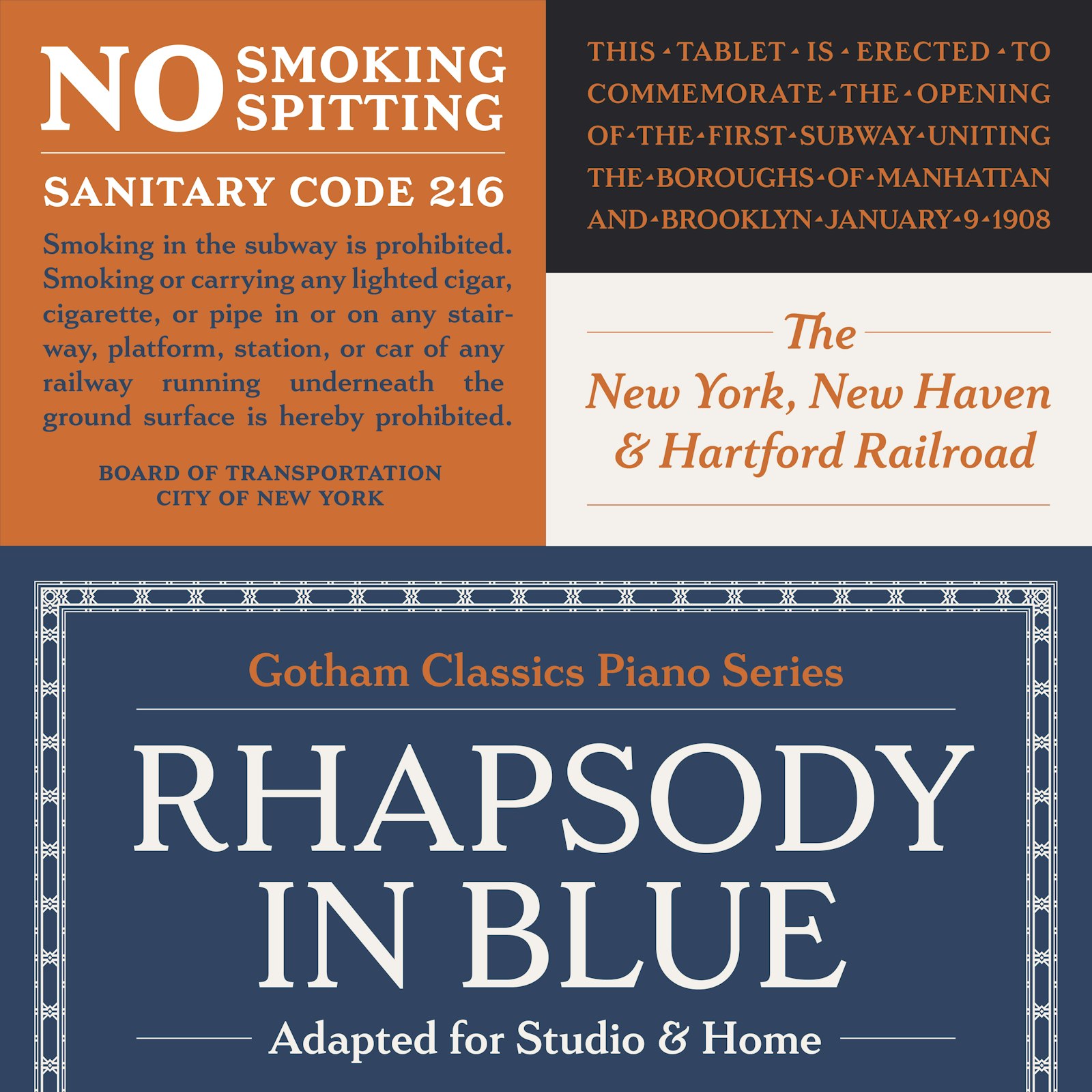
LaFarge can be used at both text and display sizes, but is ideal for architectural use, specifically historic preservation projects that require lettering that mimics that used on buildings, memorials, and plaques from the late-19th and early-20th century. Many architectural restoration projects — including some undertaken by the New York City Subway itself — use text typefaces like Times New Roman or Bookman that look out of place in historic signage.
- Typeface Designer
- Gregory Shutters