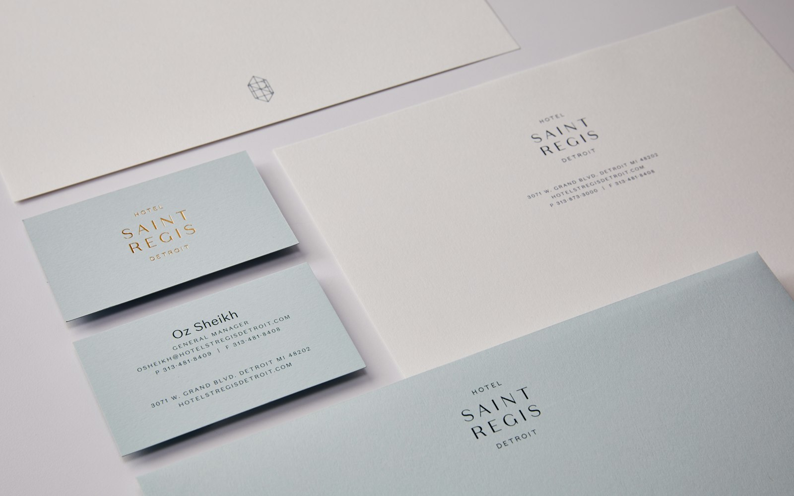
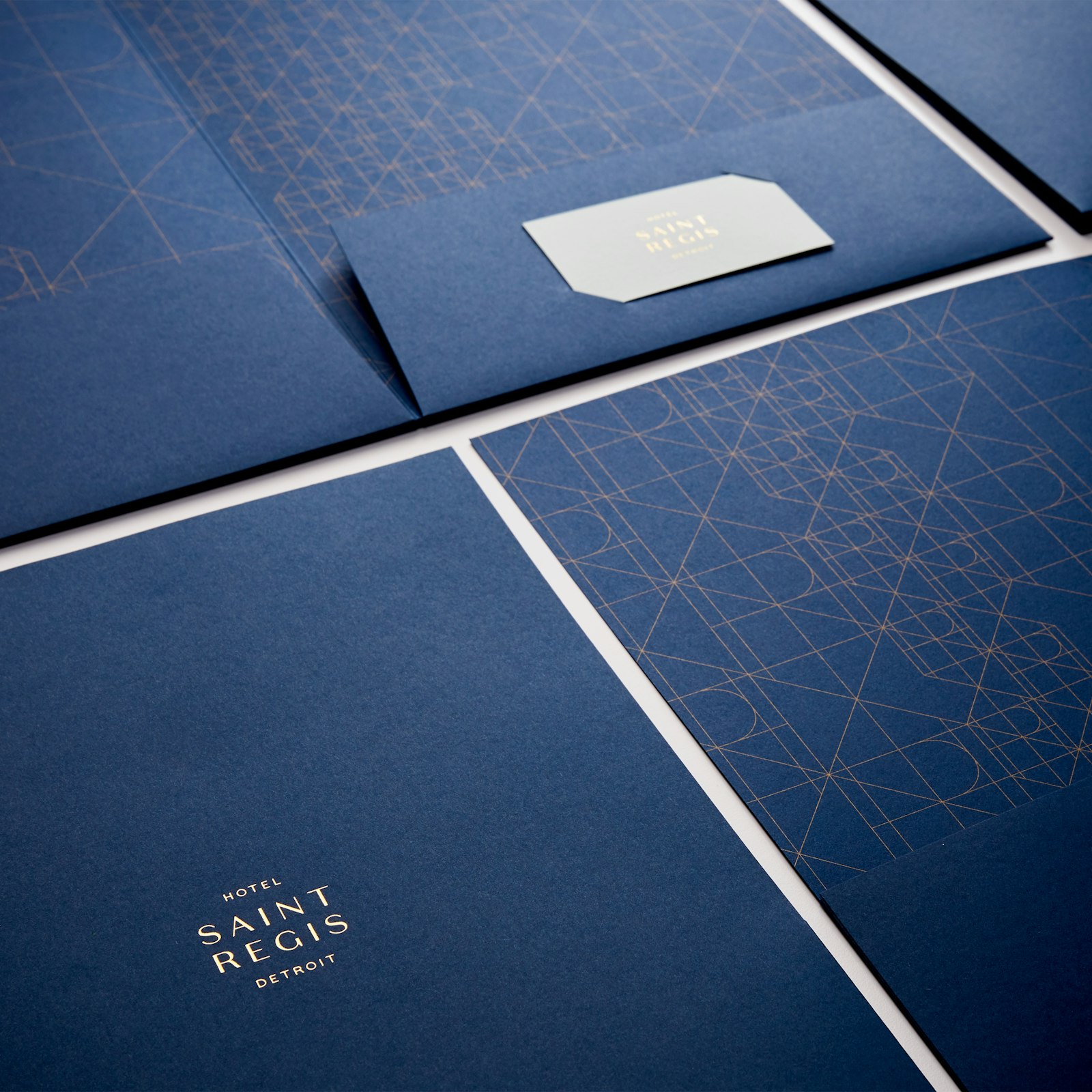
Hotel Saint Regis Detroit was looking to refresh their brand to align with a massive restoration project and bring them back to their masterpiece landmark status. The challenge was to balance the 1930’s French Regency style of the hotel with a design that is authentically Detroit. We looked to vintage French sign typography and the geometric tilework of the neighboring Fisher building for reference. The result is an era-appropriate type mark and geometric monogram with a brand that exudes a sense of modern luxury at every touchpoint.
- Creative Director
- John O'Neill
- Senior Designer
- Jessica Meade
- Senior Designer
- Ryan Mitchell
