Though beloved by a loyal cult following, FLOR was eager to expand its audience and—for the first time in its 13-year history—undergo an intensive branding process. In addition to an inconsistent (though consistently nondescript) brand, the company faced another major struggle; no one understood the offering. Many failed to get the product—custom-designed rugs made from modular, eco-friendly tiles. Others found the design process overwhelming and intimidating. After conducting ethnographic, in-store research, a language audit and company survey, the Firebelly team realized that while internal staff loved the product, even they struggled to articulate it.
Our work was comprehensive, empathetic and ecological, with a clear focus on storytelling and internal buy-in. We mapped the ideal consumer journey—keeping staff’s interests in mind—and refined the company’s highest level messaging, beginning with a clear, evergreen tagline: Custom Rug Design.
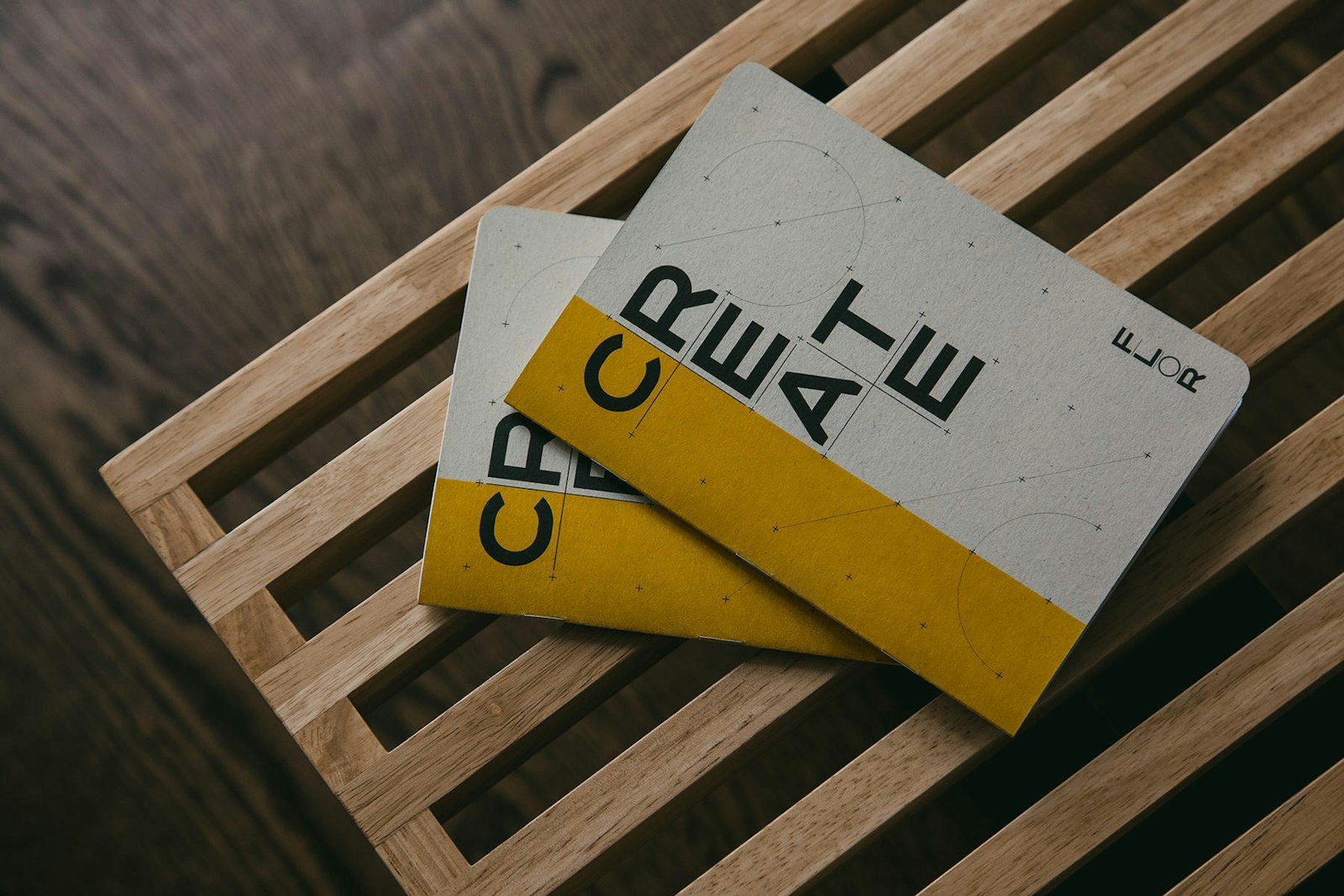
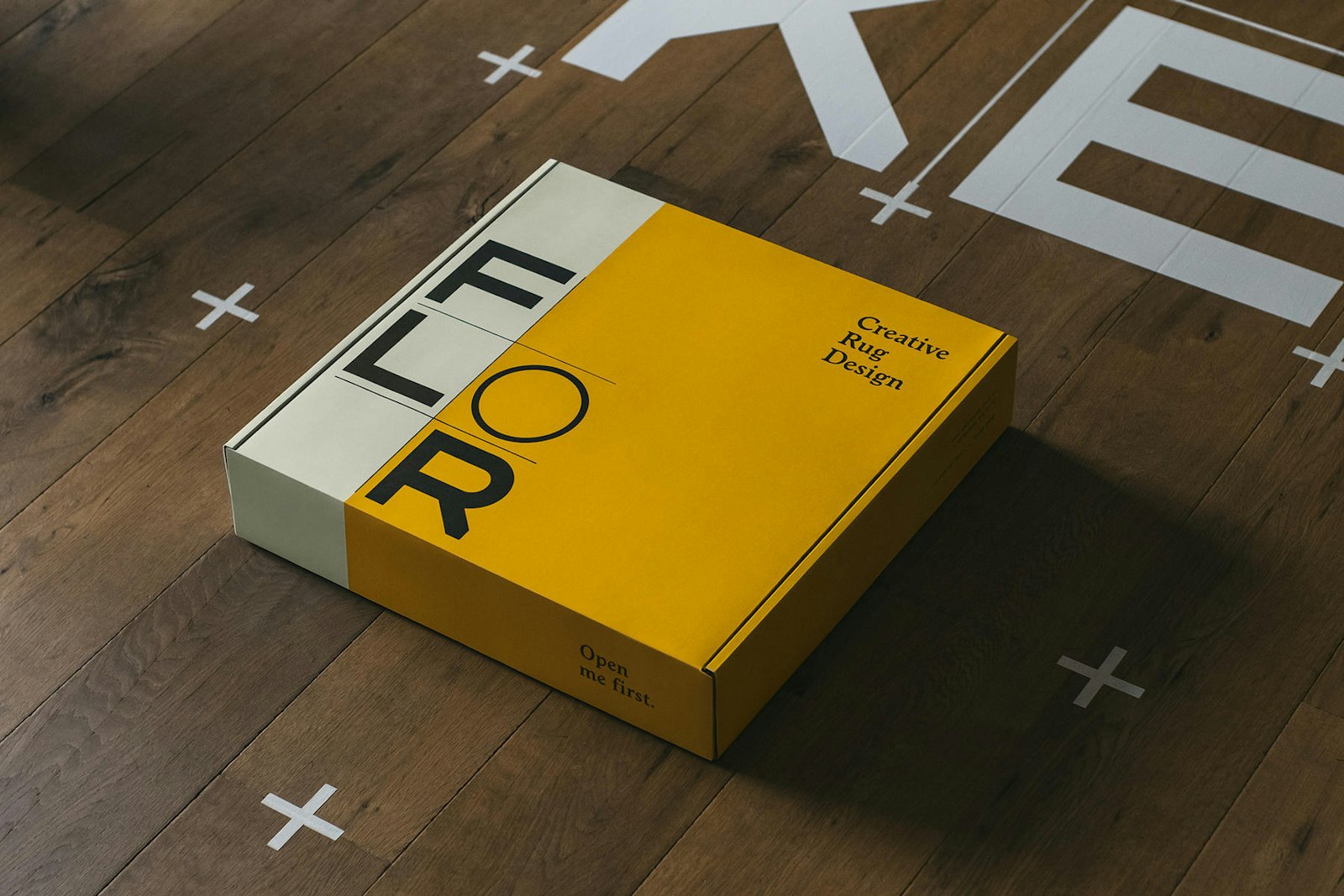
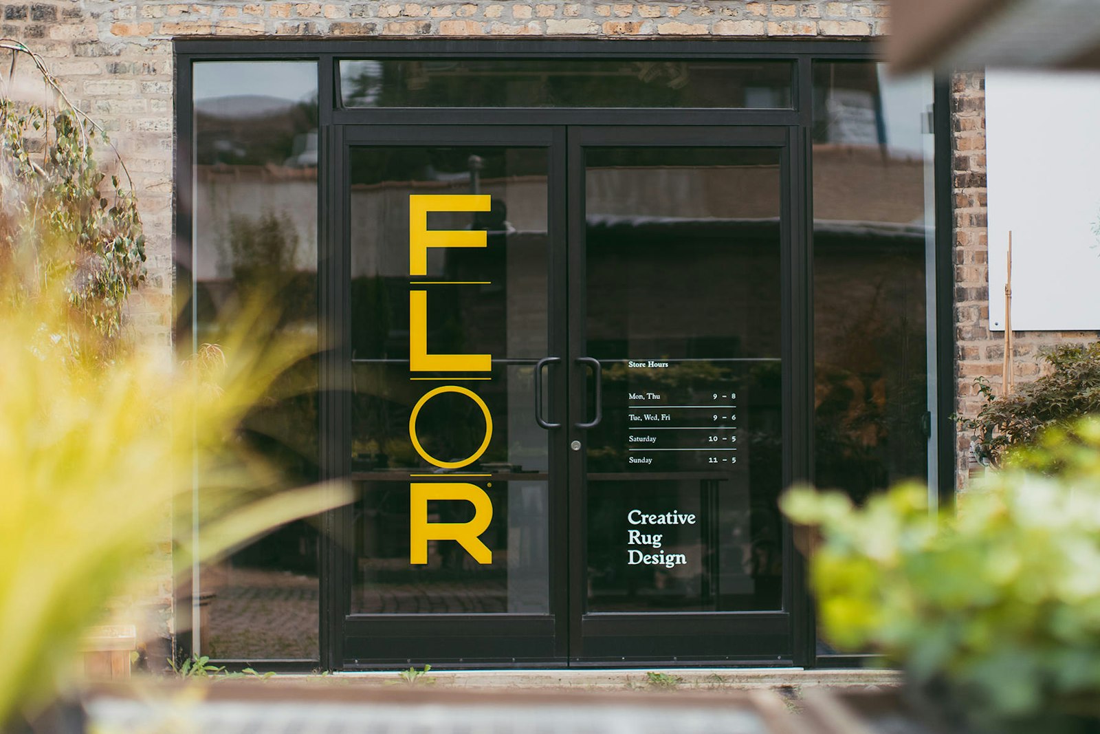
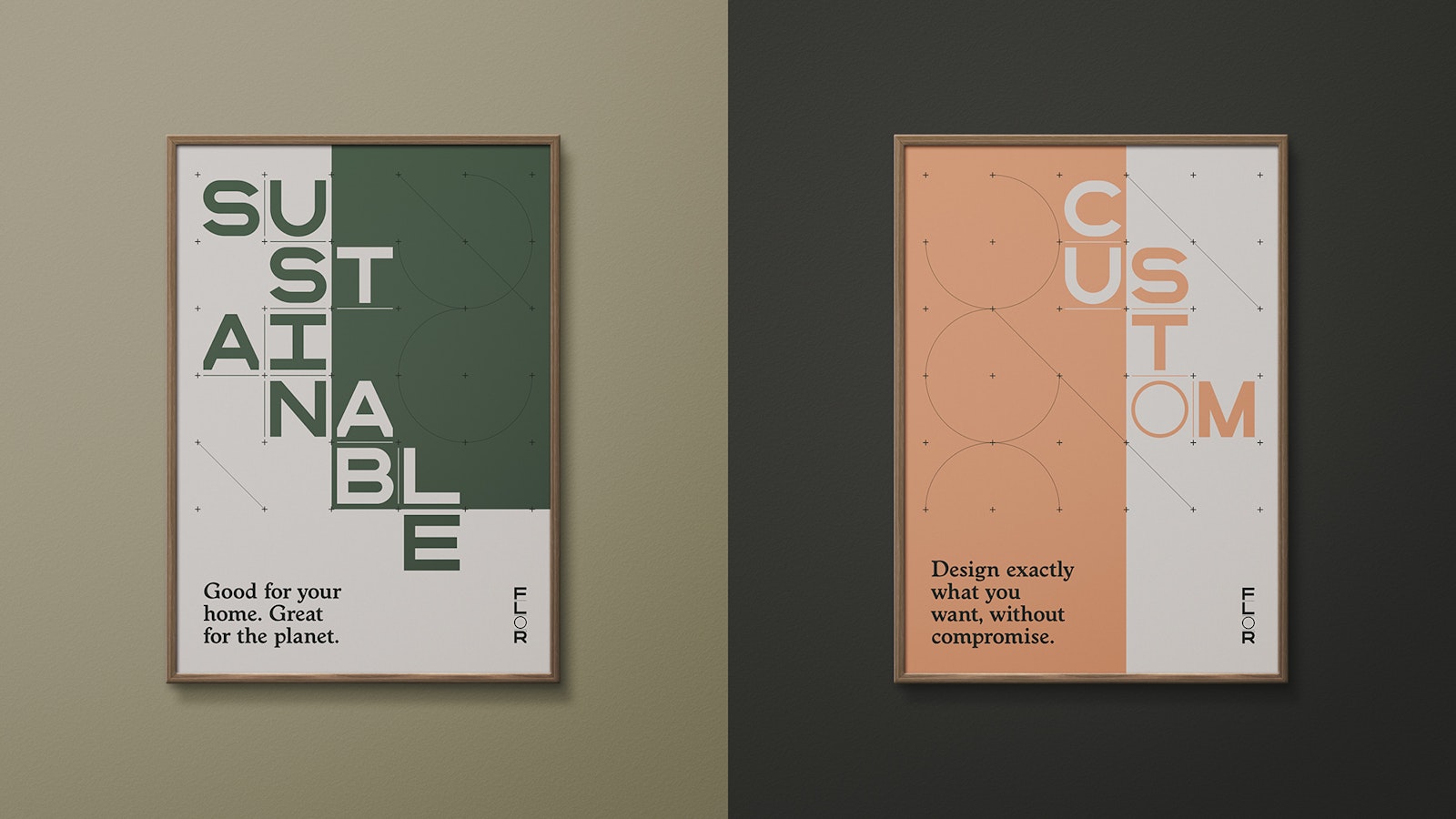
Next, we developed a visual identity system that encompassed FLOR’s philosophy of Good Design while anticipating consumers’ practical needs and questions at every touchpoint. It skews modern and aspirational, yet friendly and inarguably functional, with well-timed hints of humor and wit. The system is also wonderfully simple, built on a modular grid with a square—the centerpiece of FLOR’s rug design process—at its heart. This strict geometric approach allows for pleasing cohesion, even while inviting variety, for an overall sense of versatility and play.
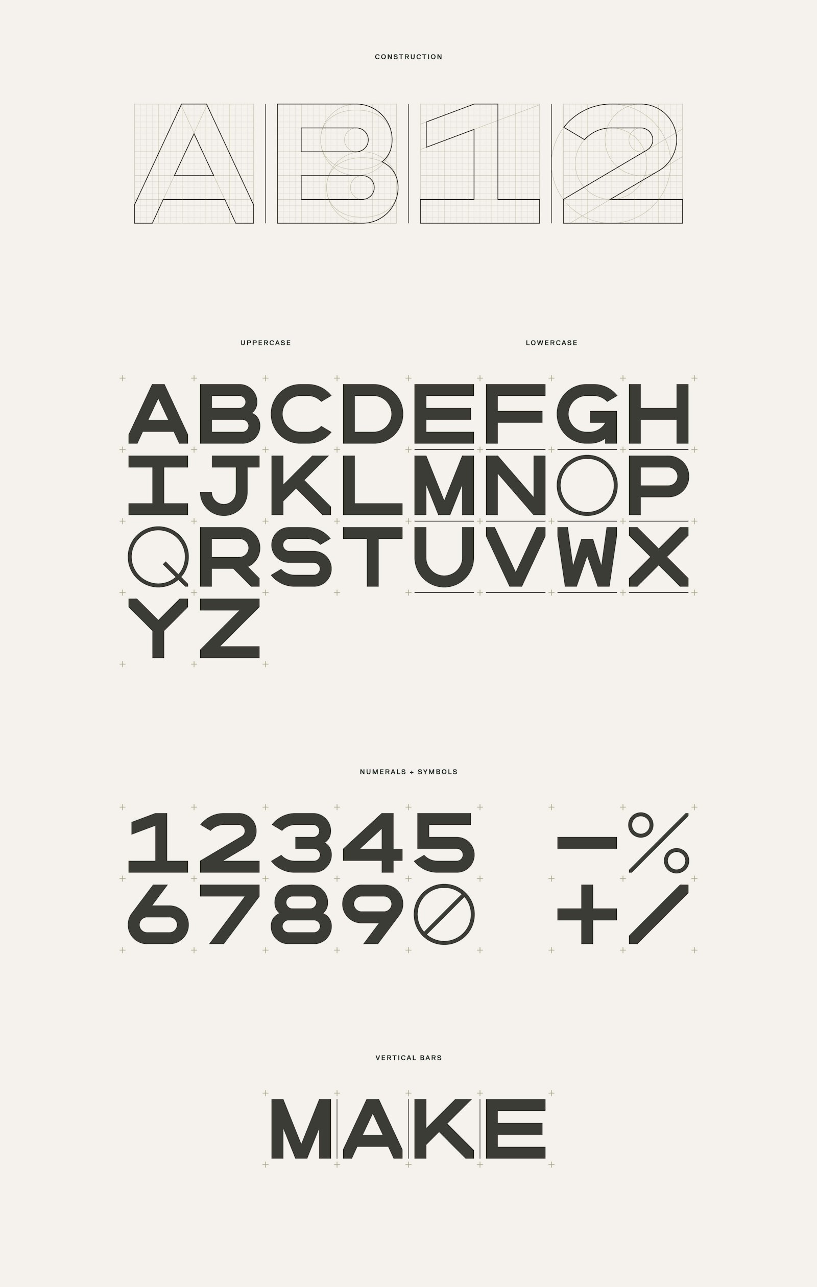
The type system and corresponding hierarchy centers on an ultra-kinetic custom alphabet, FLOR Mono. Rounded letterforms are purposefully struck at lighter weights to call out the importance of the “dot” in the FLOR rug system—tiles are held together by unobtrusive, adhesive circular stickers.
Complementing the signature type is a trifecta of fonts sourced from independent, well-regarded foundries, consistent with FLOR’s core belief in quality and independence. Worchester EF, the principal type, infuses core copy with warmth, confidence and humanity. Replica Pro, a highly legible, sans serif option, is perfectly suited to supporting details, while pairing nicely with FLOR Mono and Worchester. And finally Pitch, pragmatic and diagrammatical, is ideal for technical details and numerical specifications.
Rounding things out are a collection of diagrammatical marks, a broad palette, flexible layouts, photo treatments and a modern type system designed to hit the right tone at the right time, given where consumers are in the process.
Our work for FLOR is some of our most rewarding to date. With this project, we found our sweet spot, leveraging in-depth research to create a viable strategy that could translate seamlessly into a thoughtful, flexible and user-friendly visual identity system that, like the company itself, allows for unique expression. It grants users the same freedom and flexibility—the permission to create—that FLOR extends to its customers.
- Design Director
- Will Miller
- Designer
- Ross Burwell
- Designer
- Tom Tian
- Researcher + UX Strategist
- Alibaster McDonald
- Content Strategist + Copywriter
- Kristin Lueke
Project link