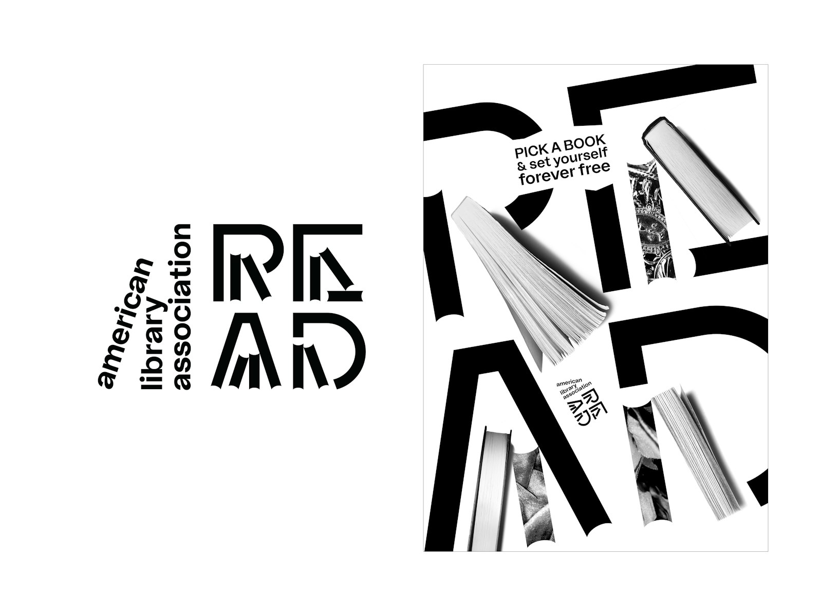
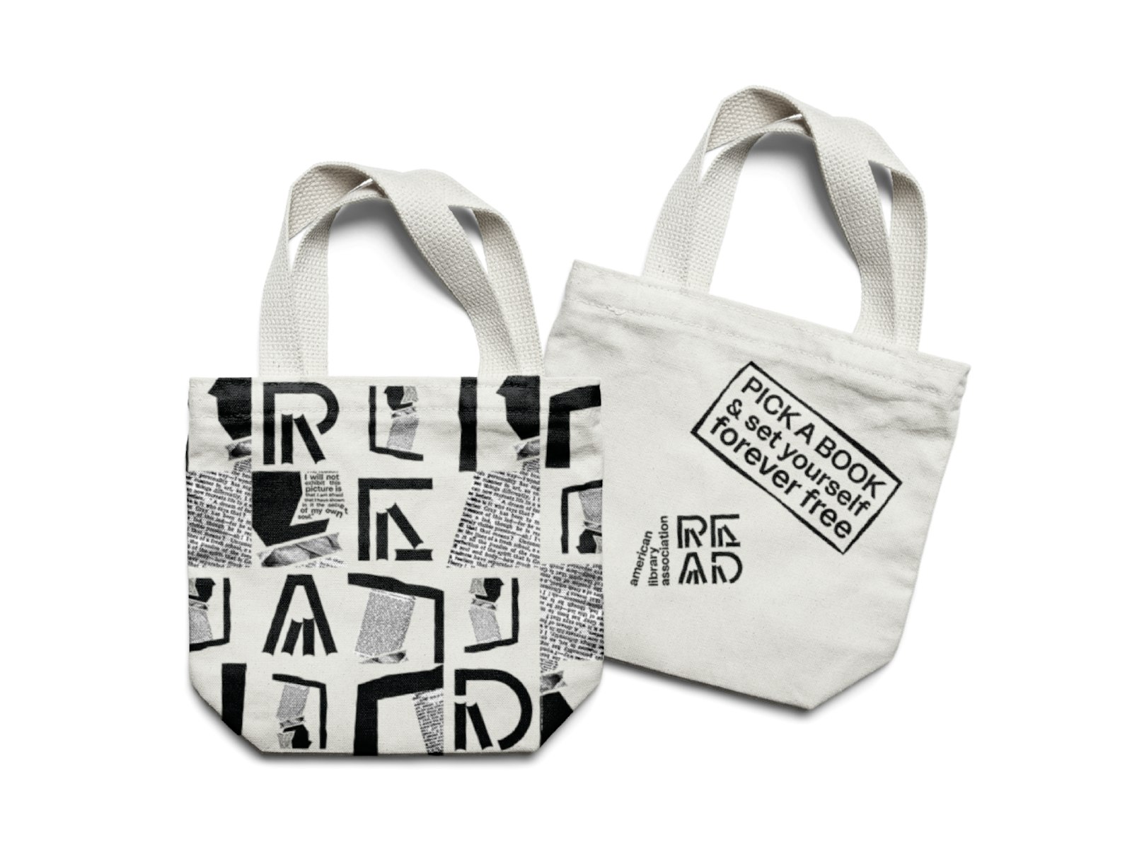
'read' is a campaign launched by the american library association. my redesign highlights the entertaining and mysterious aspects of reading to a target audience of adults.
reading is an individual experience because each reader imagines the text differently. however, when the reader tries to picture the images they imagined in a concrete form, they will find that the images are mostly abstract and incomplete.
the content of this campaign was designed to create curiosity by emphasizing this diversity and abstraction.
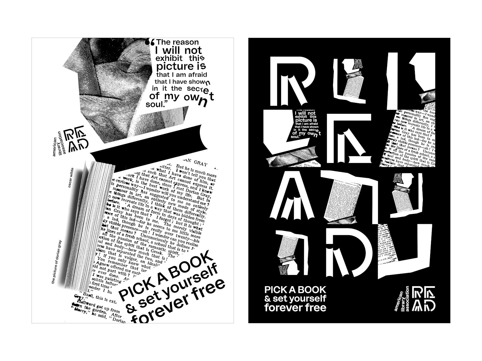
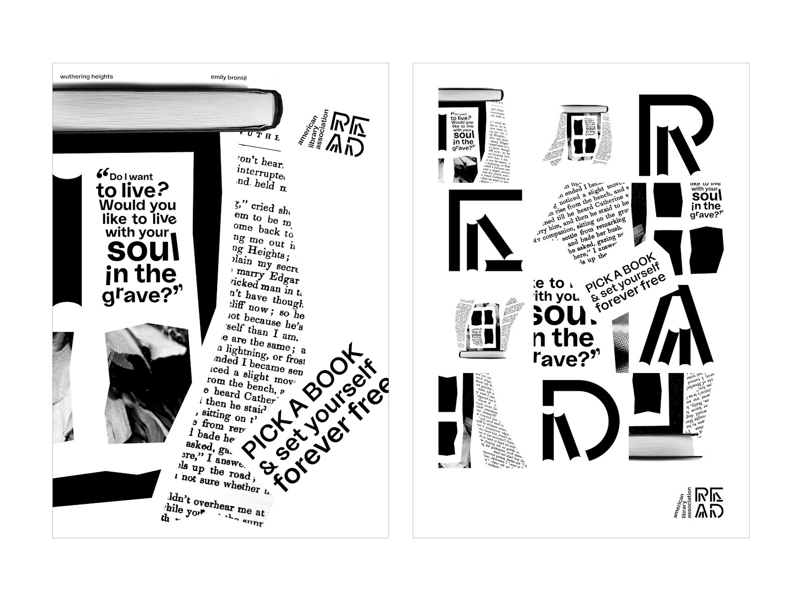
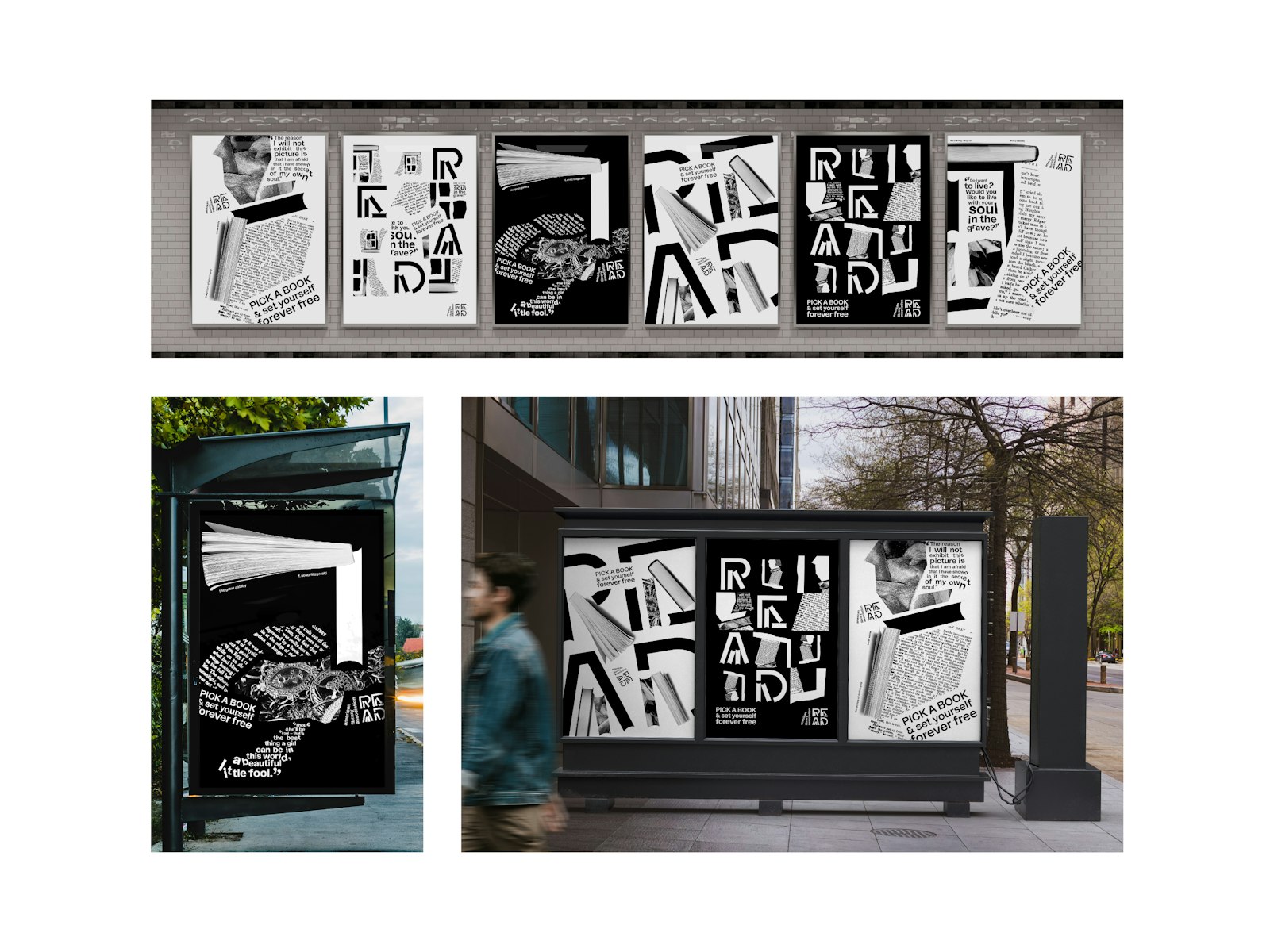
i created a logo and six posters to rebrand the 'read' project. i expanded the system with social media and merchandising designs. a motion piece activated the posters for social media.
each poster is inspired by a specific text – for example, the picture of dorian gray, great gatsby, and wuthering heights.
bookshelves are a direct metaphor, and throughout this design system, i effectively incorporated the book forms used in the logo to ensure continuity. the slogan attracts attention and describes how a book can take readers to other worlds.
to emphasize the sense of wonder that readers experience, i used a visual approach comprising abstract, ambiguous shapes and collages. i blended them with dynamic typography to give engaging life to the text. the use of physical materials references the depth of feeling in a story.
as a whole, this campaign celebrates the joy and wonder of reading and fulfills the mission of encouraging adults to read.
- Koprululu
- Ipek
