To commemorate new leadership and the launch of its next initiative, Center for the Arts in Society (CAS) — a faculty research center within Carnegie Mellon University — commissioned a new visual identity through a suite of modular marks.
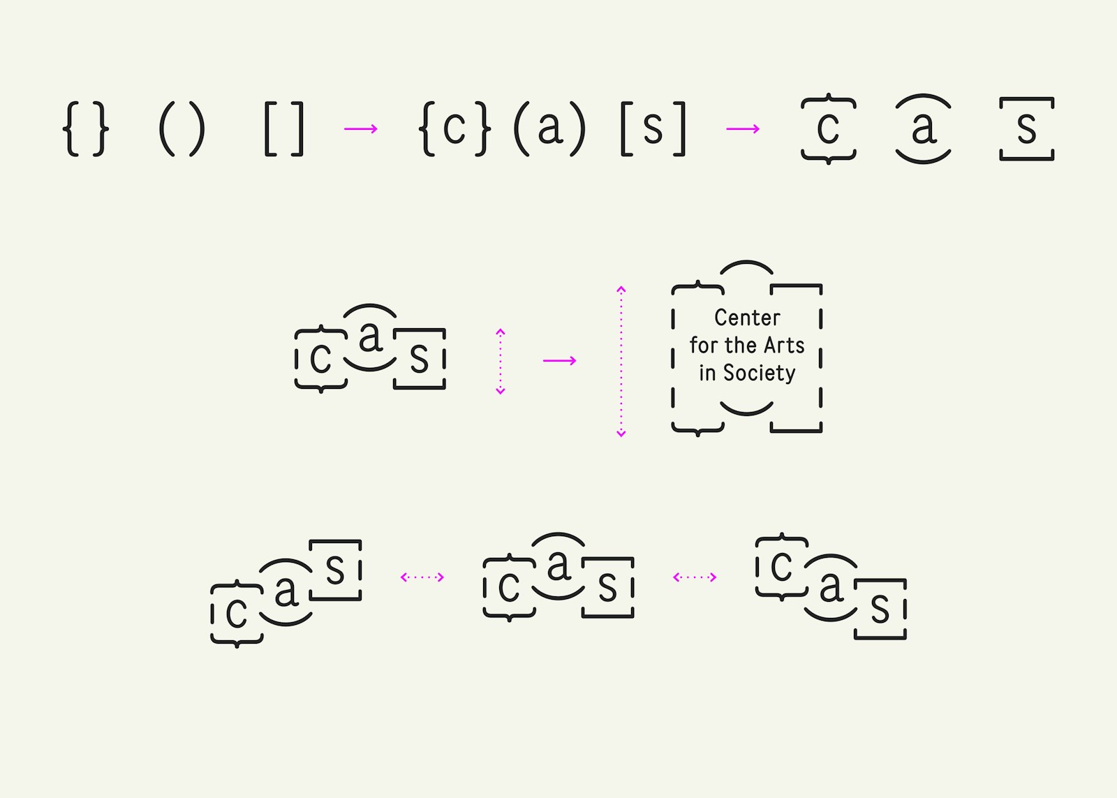
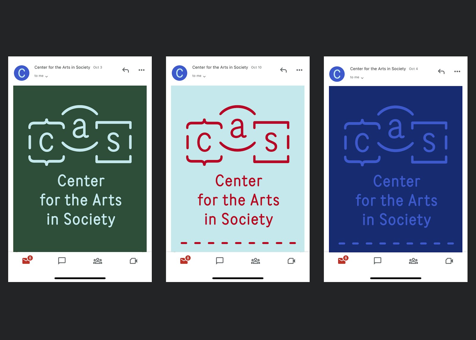
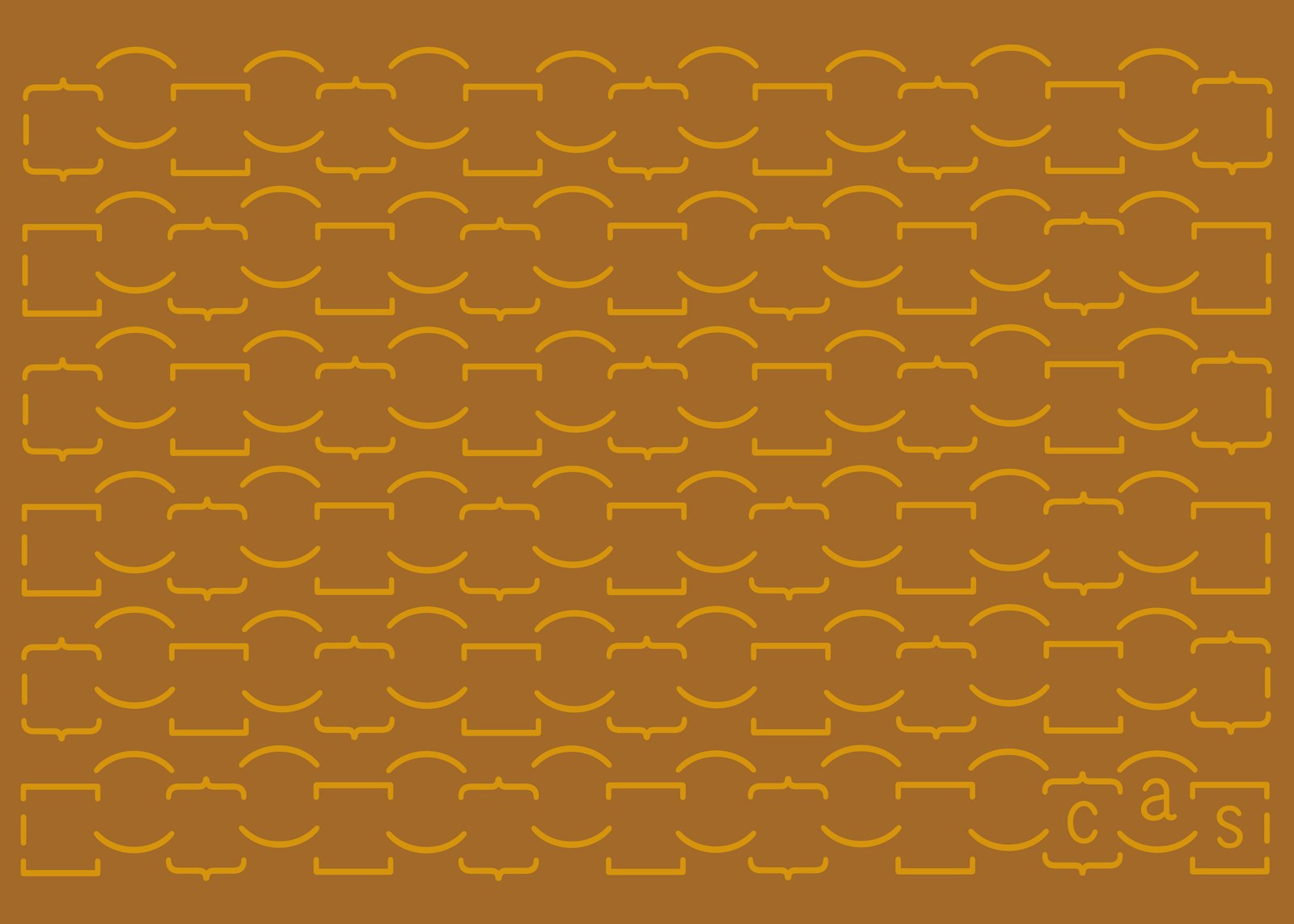
This visual identity uses Pantograph by Colophon Foundry, and makes use of the three types of parentheticals found on a QWERTY keyboard as its graphic marks: braces, parenthesis, and brackets. The use of easily recognizable characters offers approachability and a friendly personality, while their alternative orientation (rotated 90º) and interlinked arrangement suggests an opening of space, emergence of ideas, and intrinsic interdependence.
Every three years CAS reinvents itself with a new themed initiative to fund and produce new works. The use of three types of parentheticals gives nod to the three-year length of every initiative, along with the three projects each initiative supports. The slight interlink suggests the inherent connection between projects, initiatives, and CAS community members across initiatives.
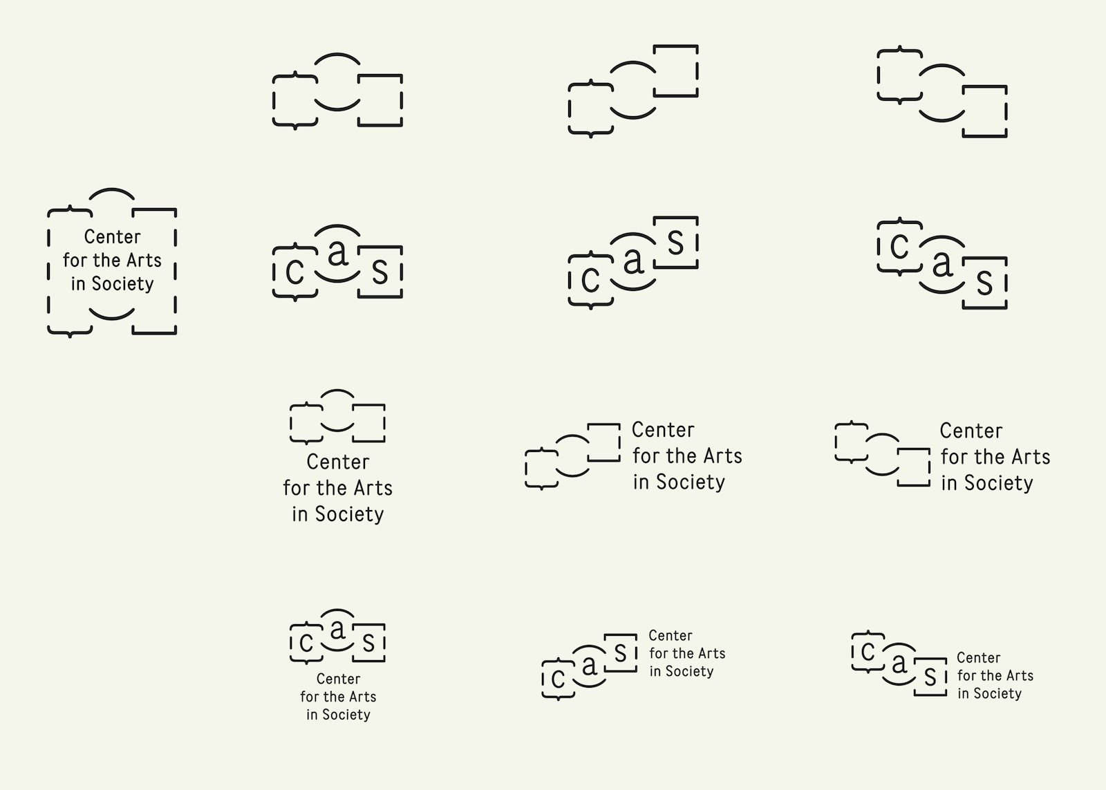
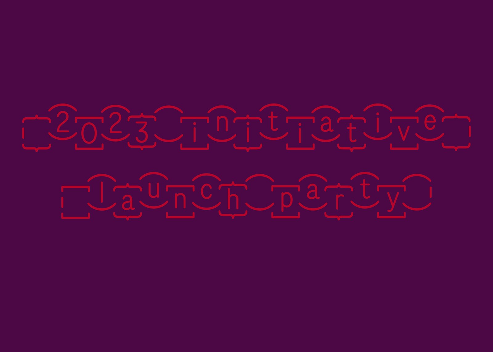
Expanding beyond the marks, the parentheticals can be used in isolation or new arrangements to create containers for housing content (such as paragraphs or images), borders or patterning for special instances.
- Kelsey Dusenka
Judges Choice: Jon Sueda
Honorable Mention