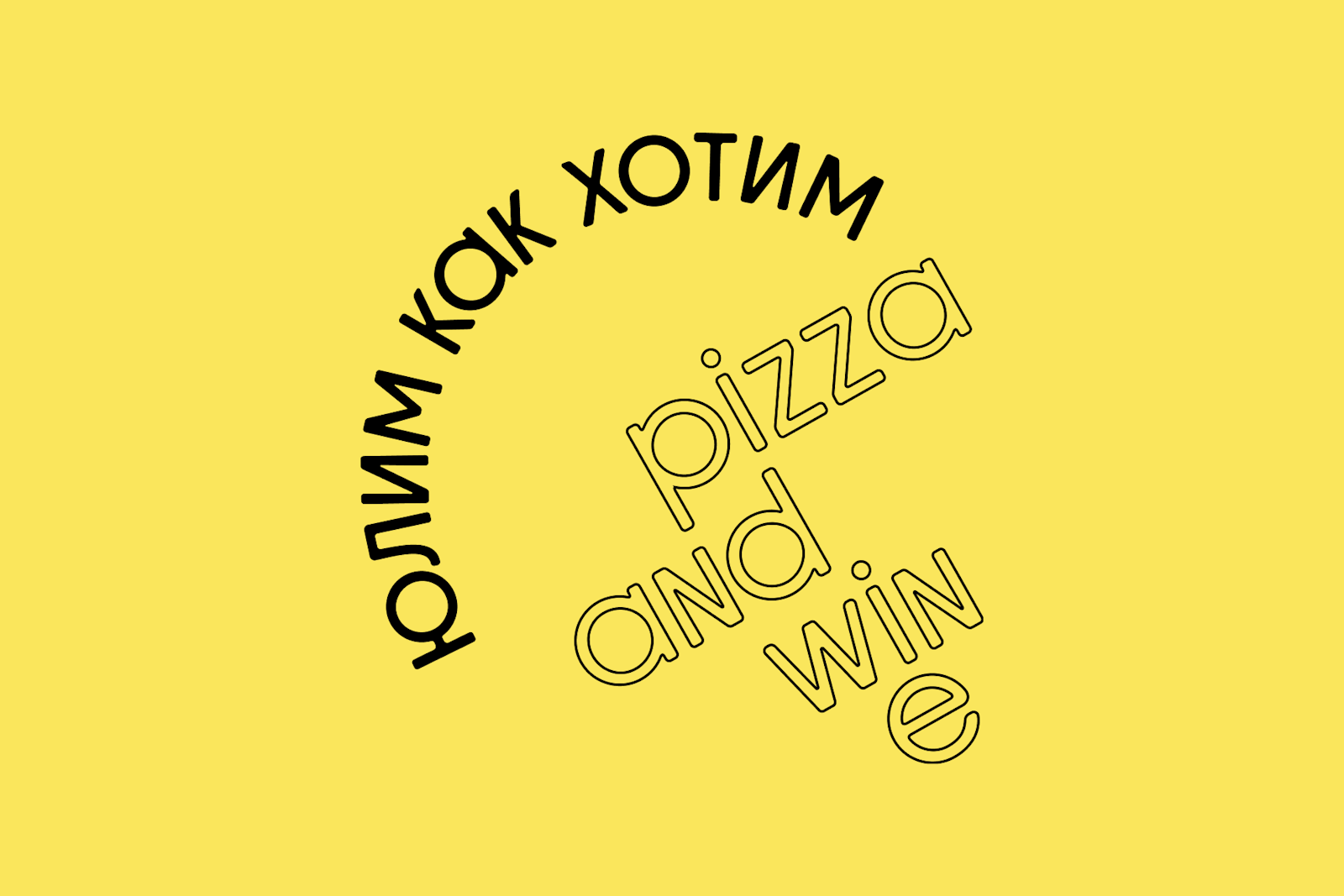
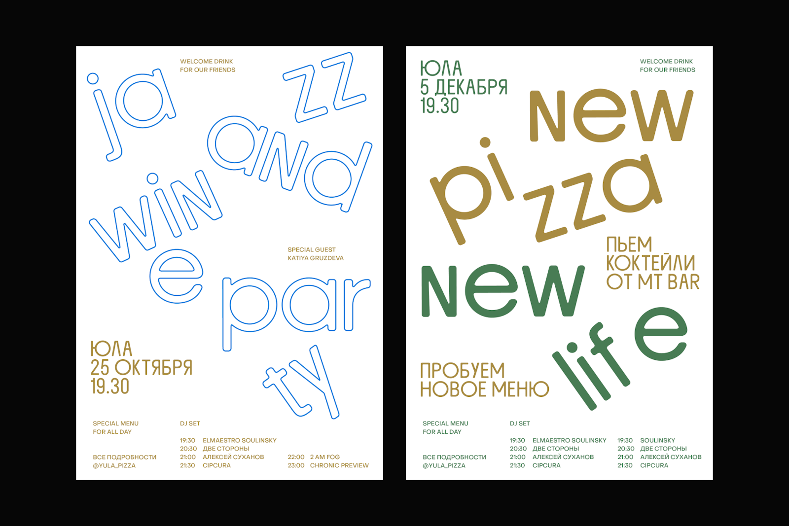
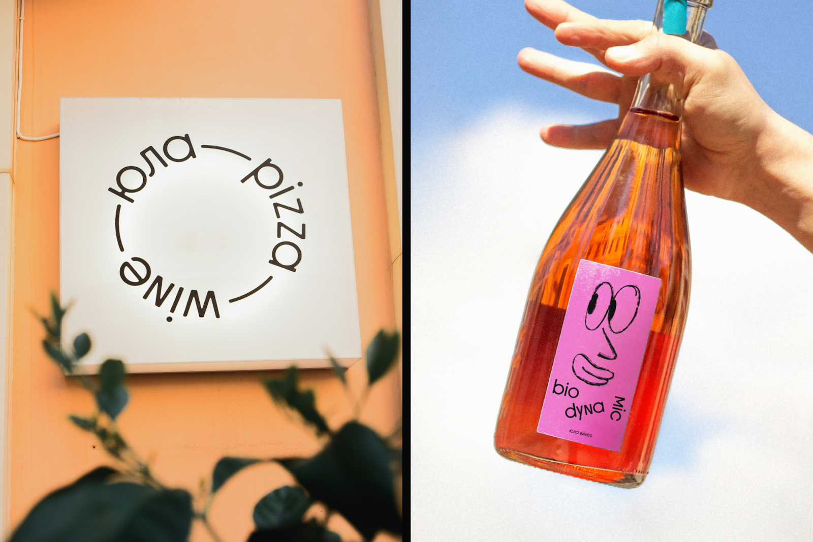
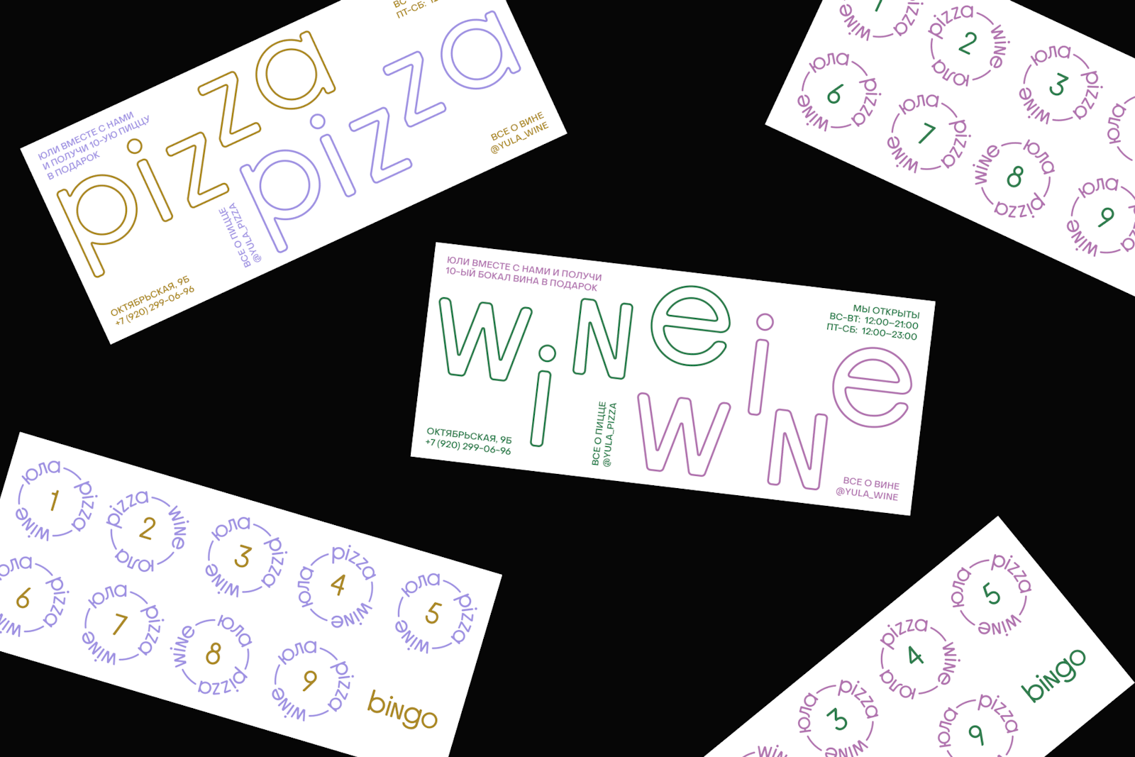
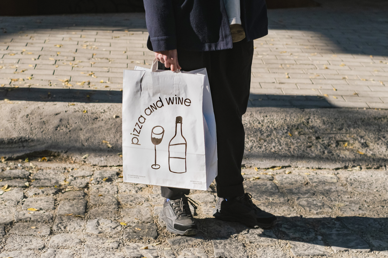
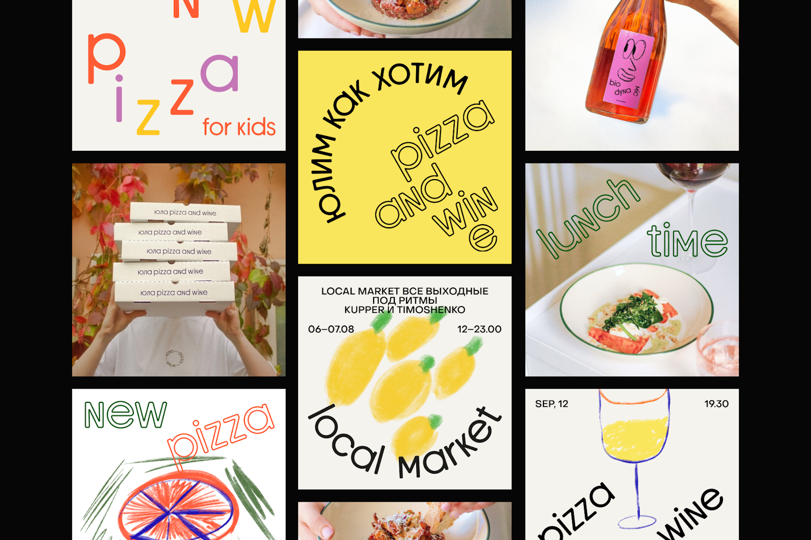
Identity for a central city café with Neapolitan pizza and wine bar. Ula in translation means “whirligig” a children’s toy with a playful spinning character and a bright look. These features formed the basis of the brand’s visual communication. We have developed a custom font, a set of bright illustrations, and all the elements of corporate identity.
- Art Director / Designer
- Jenya Shtein
- Art Director / Type designer
- Roman Shtein
- Project Manager
- Egor Shaklunov
- Designer
- Yana Igonina