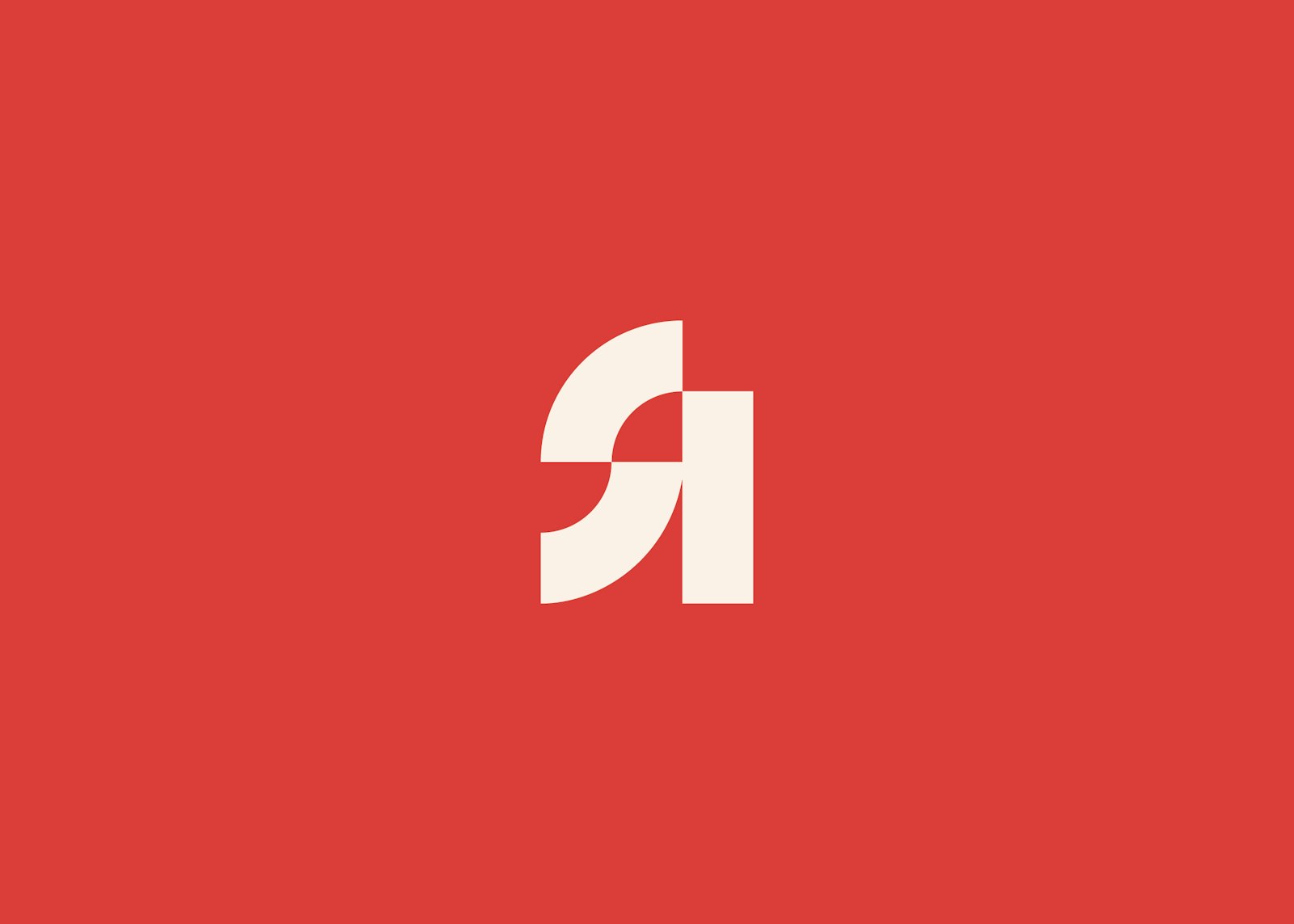
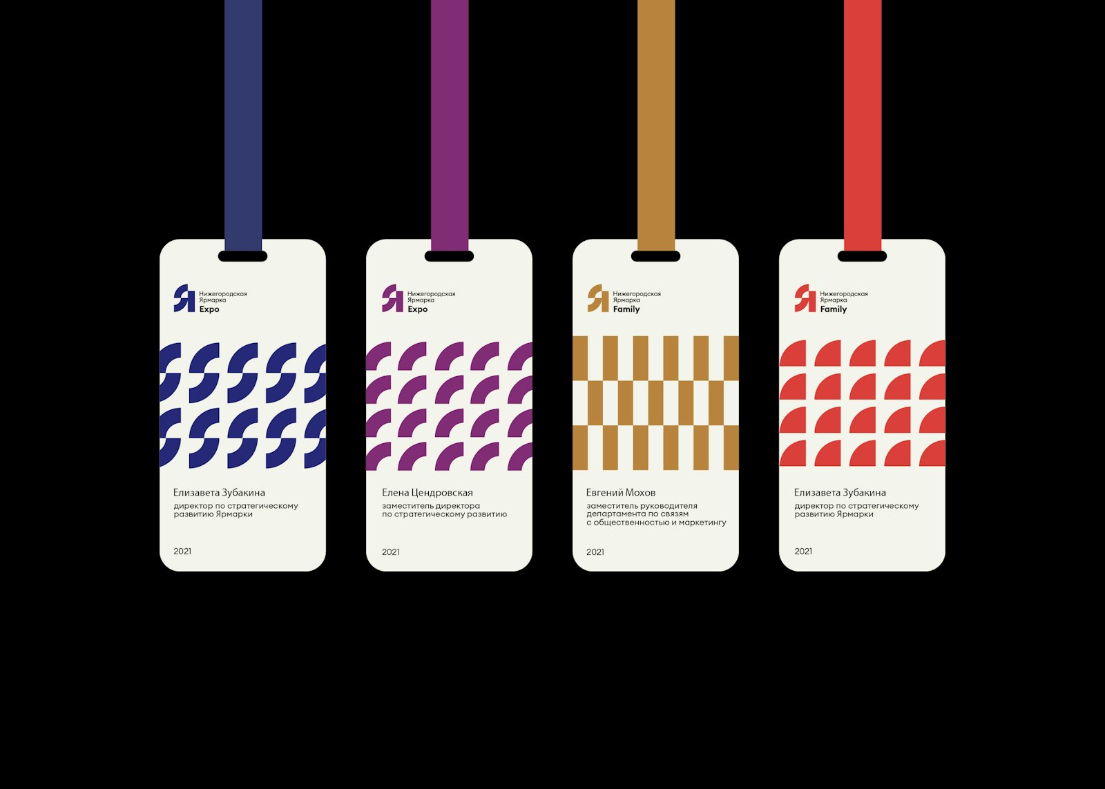
The Nizhny Novgorod Fair is undergoing a renovation phase, within which it will become an attractive multi-format area for holding international and federal congress and exhibition events. Kurt studio have developed logotype for the oldest fair in Nizhny Novgorod, Russia.
The plastic of the logo inherits the architectural forms of the buildings of the Fair and its location:
1. Historic building, arched vaults
2. The confluence of two great rivers
3. New pavilions and new architecture
It was a great honor and great responsibility for us to work on the logo of this institution. The Nizhny Novgorod Fair is a visiting card of the city. We wanted to highlight the historical heritage and at the same time create something modern and recognizable. The final version of the logo allows you to adapt communication depending on the context. Within the walls of the fair, a historical festival or a high-tech conference can be held, and in either case the logo works great.
- Art Director / Designer
- Jenya Shtein
- Art Director / Designer
- Roman Shtein
- Project Manager / Designer
- Egor Shaklunov
- Designer
- Yana Igonina