Hot Chi is a Chicago-style, Nashville-inspired, hip-hop-loving, hot chicken and ice cream restaurant In Chicago’s Chatham neighborhood. Life-long South-siders, restaurateurs and family Amer, Mutaz, and Kinan have long had a passion to feed communities. When Chatham (a neighborhood considered to be a food desert) lost what was widely considered the best fried chicken franchise in Chicago, the brothers decided to step up.
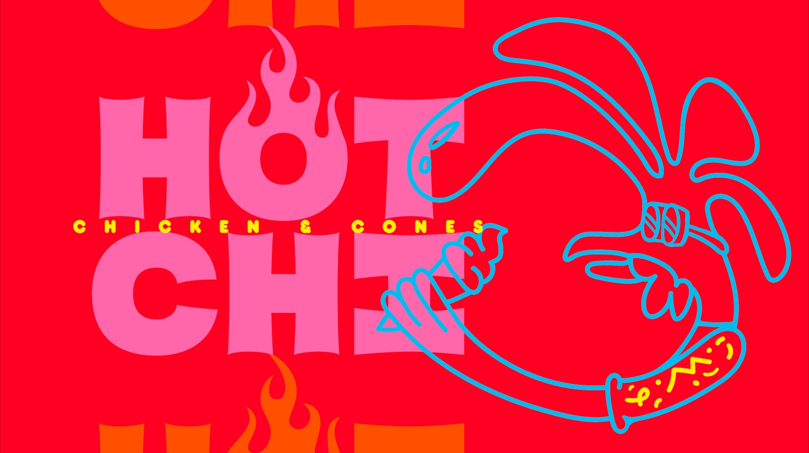
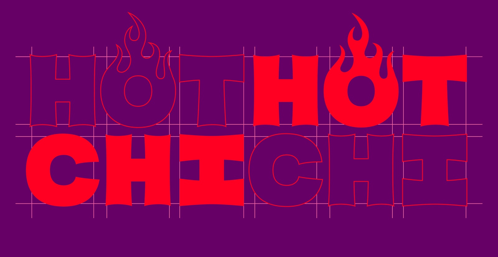
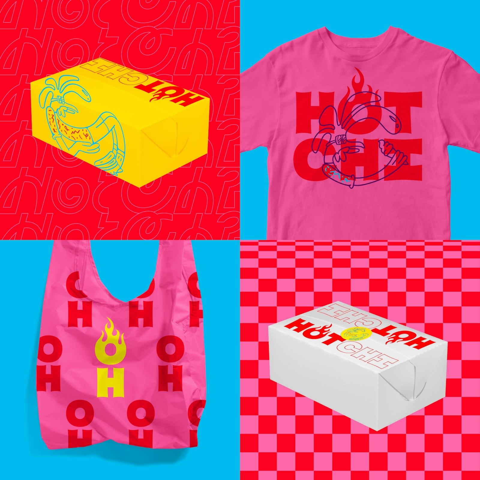
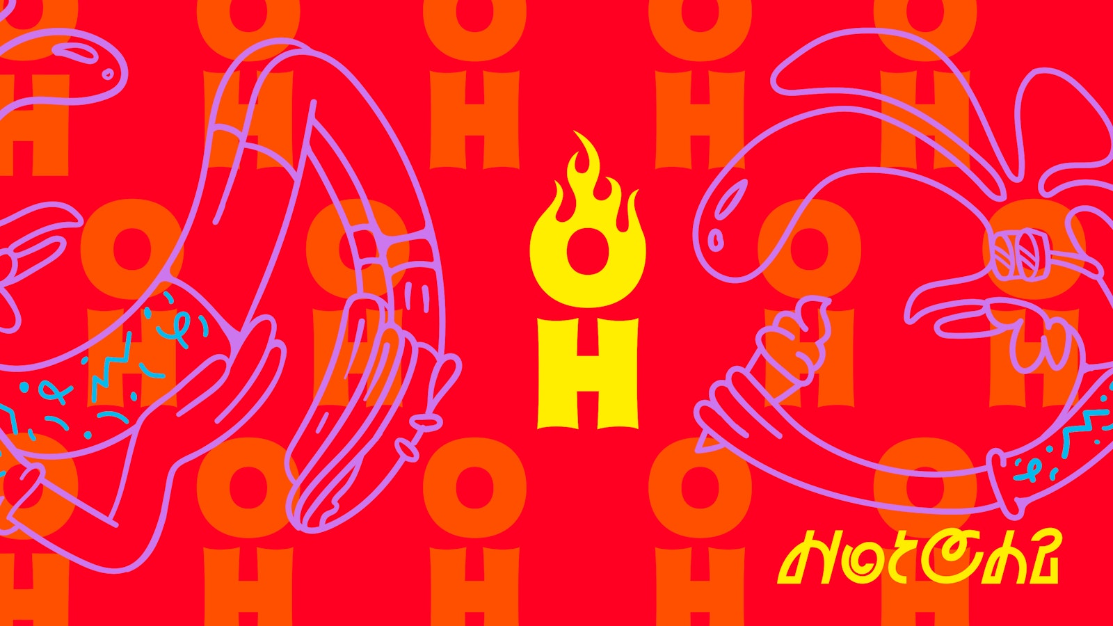
We named the restaurant Hot Chi, a play on their specialty, hot chicken, while at the same time embracing Chicago’s nick-name Chi-Town. Hot Chi is simple, memorable, and screams Chicago-style Hot Chicken. Made up of two 3-letter words, the name itself is intentionally embedded with a graphic strategy making the two terms to perfectly stack.
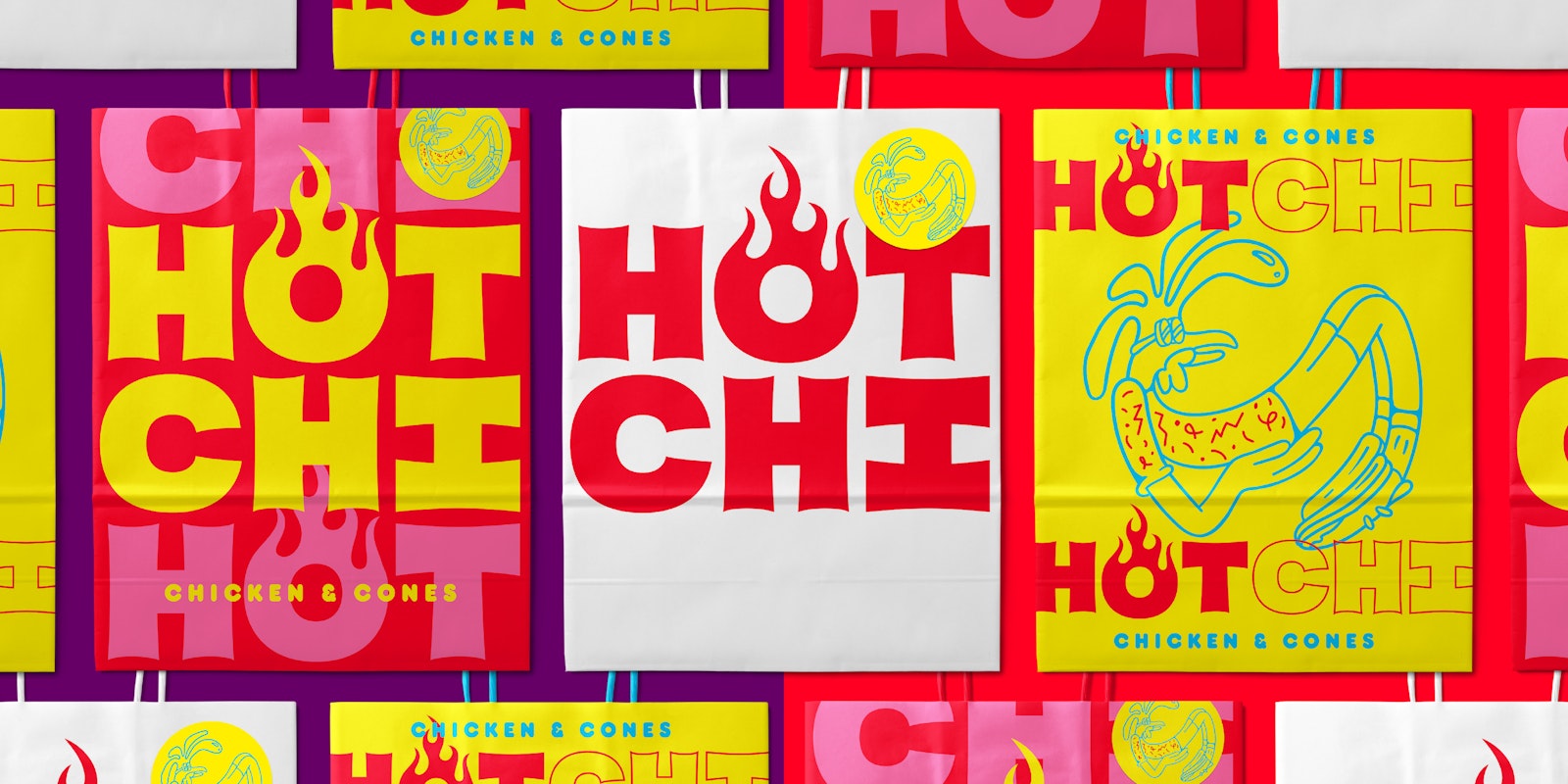
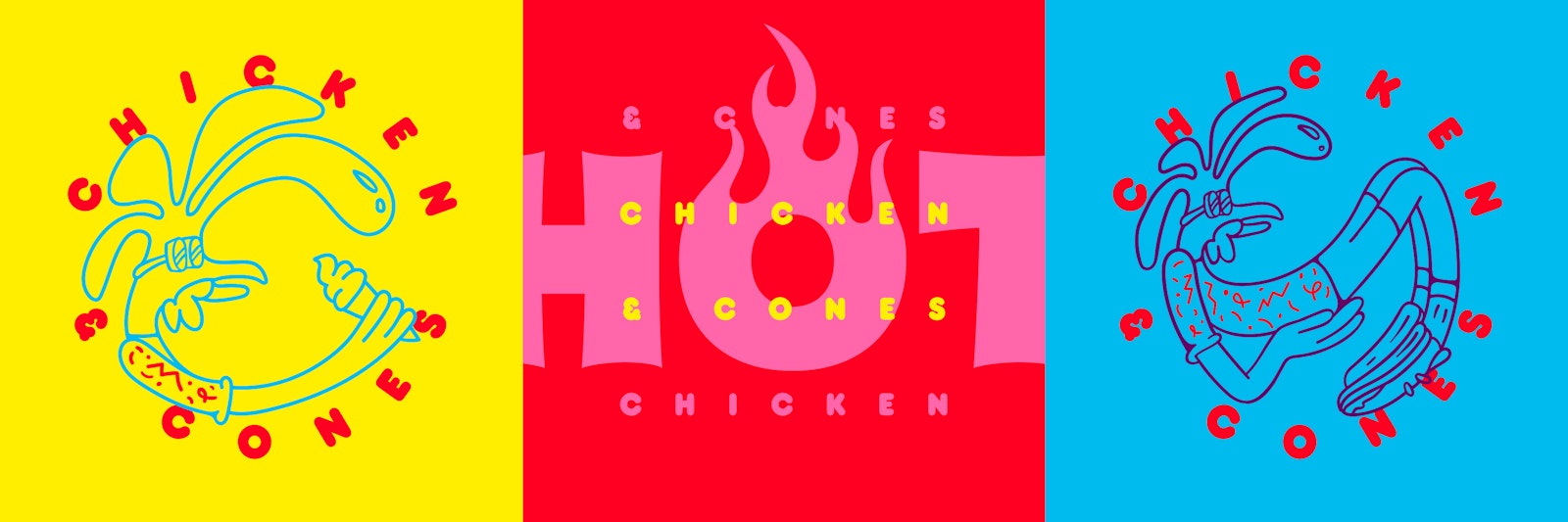
We drew the custom lettering of the Hot Chi logo to embrace the aesthetics of homestyle cooking and the urban landscape with sign-painter lettering styles. Each letter was drawn with equal widths centering the ‘O’ in the word ‘Hot’ and igniting it with an iconic flame treatment. Our visual approach transformed the typographic to iconographic. We created a mascot to emphasize a fun and approachable personality. The mascot is often seen eating an ice cream cone, a direct rendering of the restaurant’s offerings — Chicken and Cones.
- Concept, Design Direction, Strategy, Design
- Nick Adam
- Design, Illustration
- Avery Branen