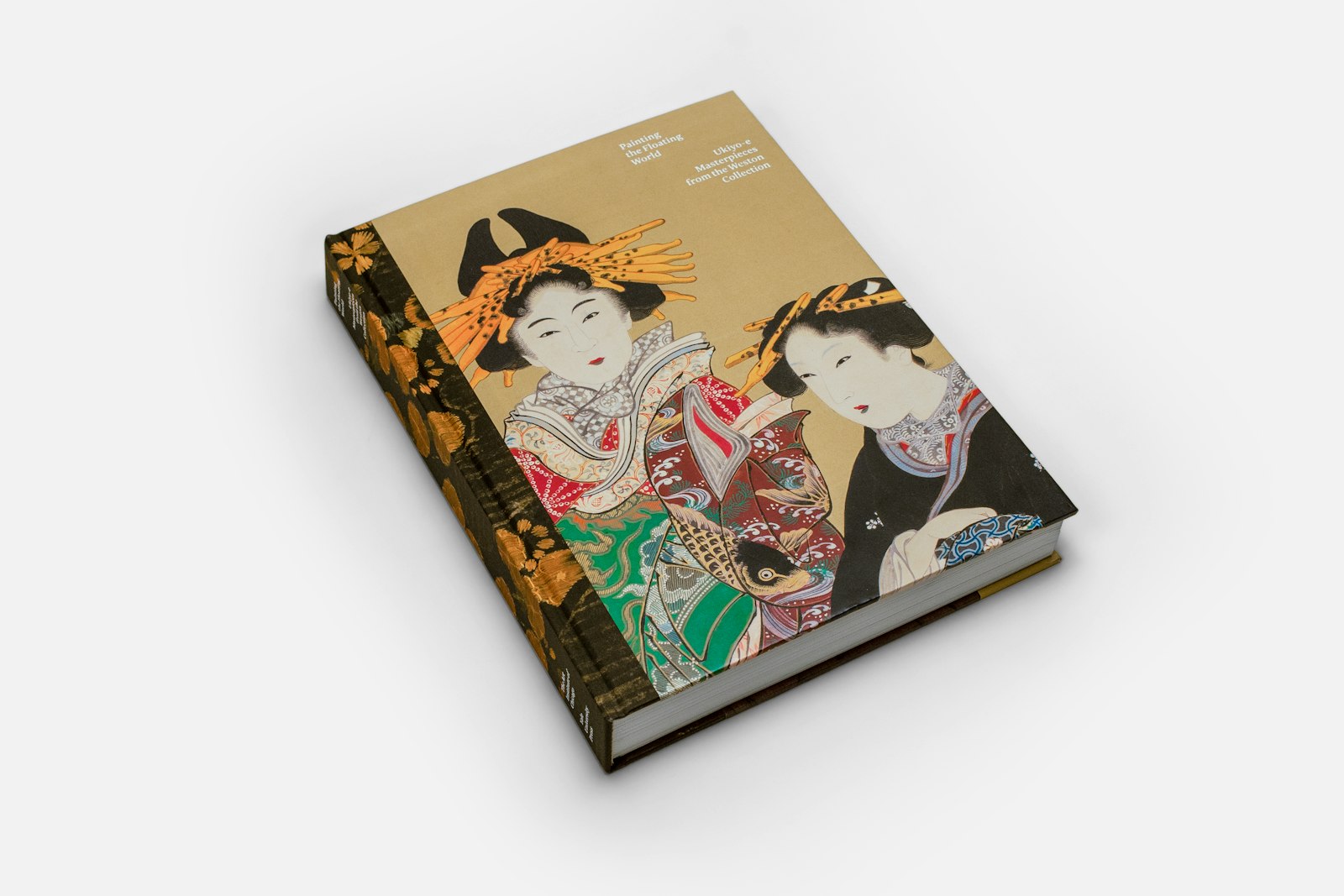
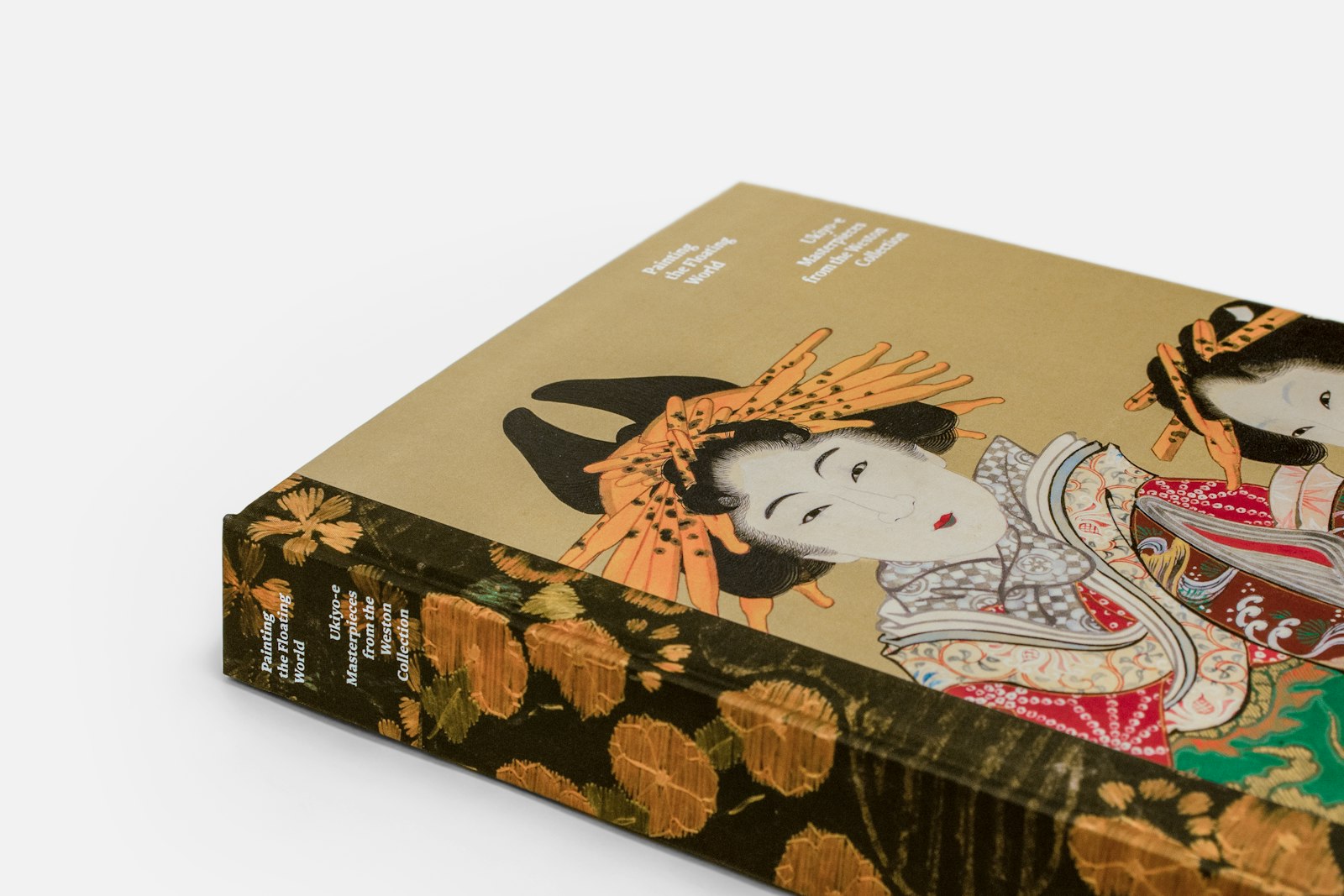
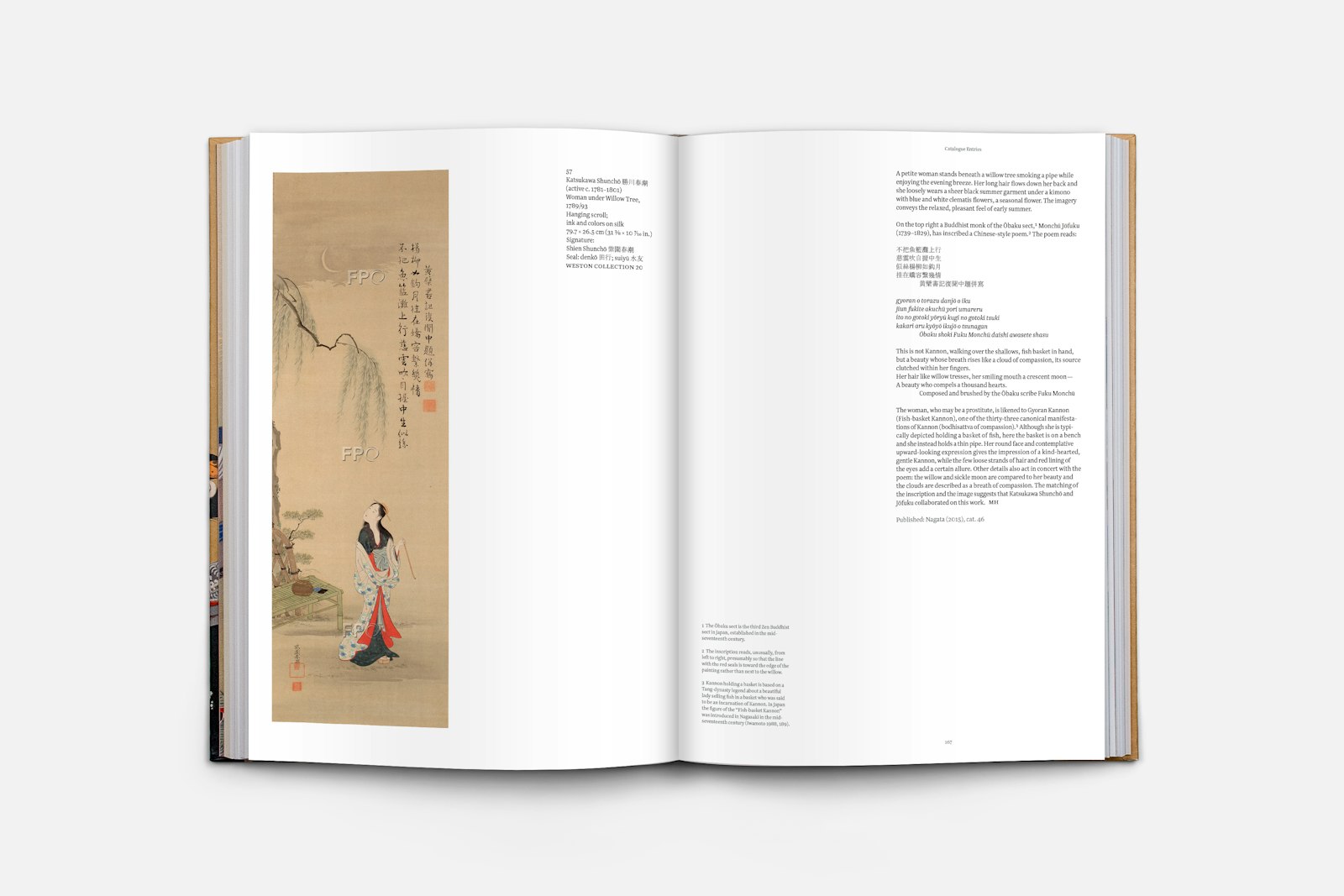
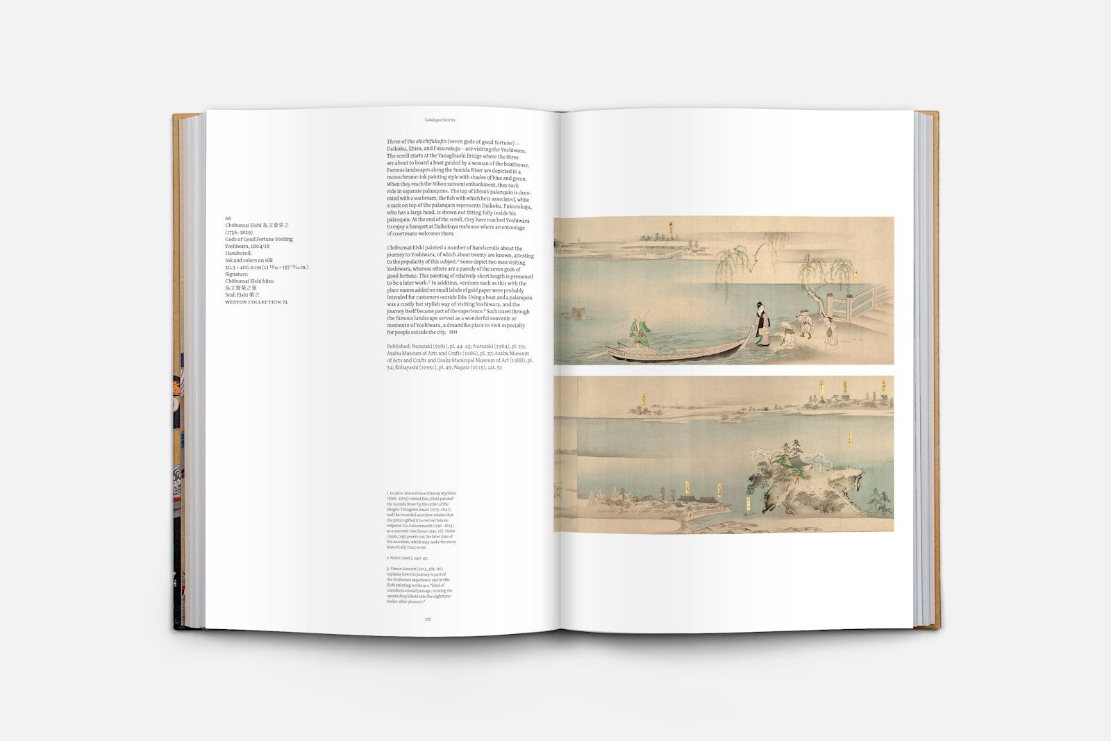
Several metaphors helped us define the project’s design direction:
– Ukiyo–e: the impermanence of everyday life.
– Artworks that were sacred, yet common: attainable, relatable works that reflected the world of ordinary people, as they wanted to see it.
– The Tadao Ando room in the Art Institute of Chicago’s Weston Wing: accessible everyday materials put together in transformative ways; unassuming, minimal, uplifting.
– Collector Roger Weston’s suggestion: “Mami (co-curator of the exhibition) and I want it to look clean and simple, like Japan.”
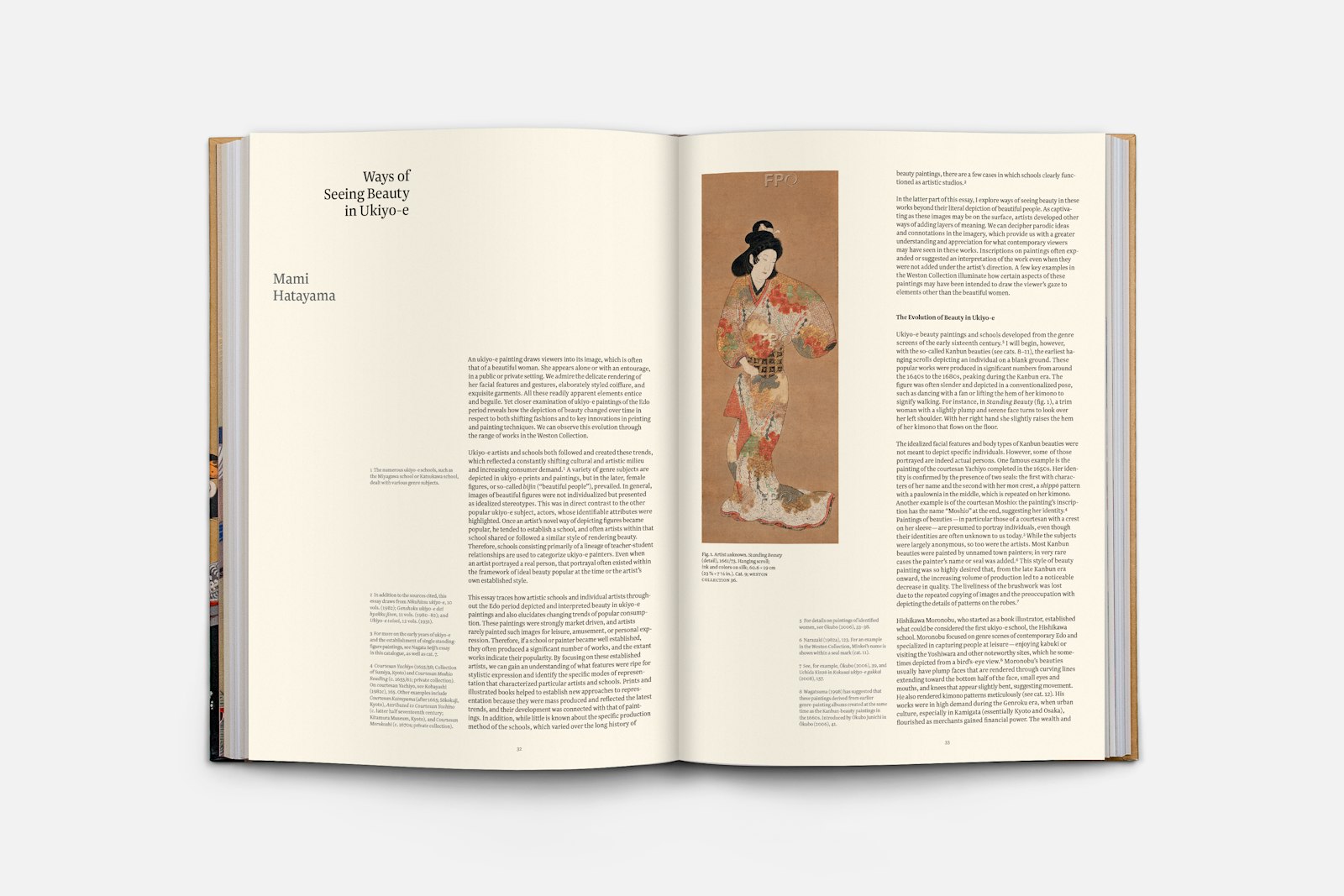
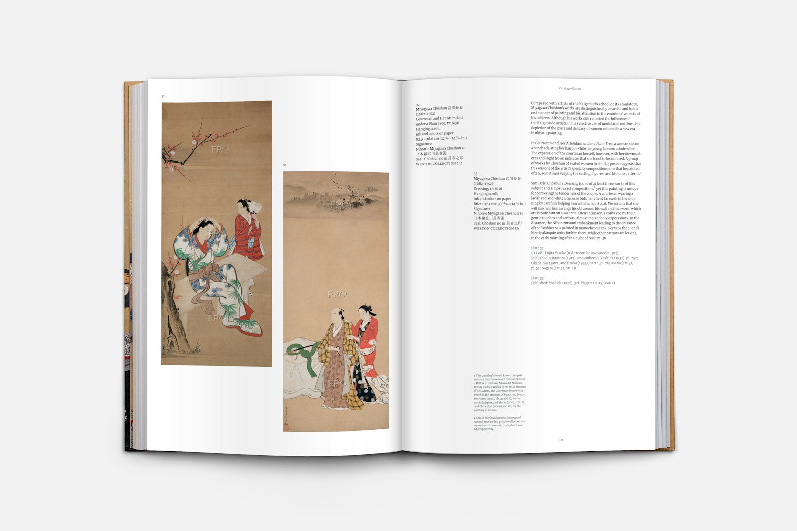
We tried to develop formats that would be easily navigable by scholars, yet also accessible to the general public. We considered how best to organize a wide variety of content on the catalogue entry pages, while keeping the text clear and legible. And we tried to establish means that allowed readers to choose whether or not to view the shunga (spring pictures) works.
- Collector
- Roger Weston
- Editor
- Janice Katz
- Editor
- Mami Hatayama
- Publisher
- The Art Institute of Chicago, Chicago, IL
- Creative director, Studio Blue
- Cheryl Towler Weese
- Designer, Studio Blue
- Tuan Pham
- Designer, Studio Blue
- Emma Magidson
- Designer, Studio Blue
- Joel De Leon
- Designer, Studio Blue
- Cheryl Towler Weese
- Executive Director of Publishing, The Art Institute of Chicago
- Gregory Nosan
- Editorial Director, The Art Institute of Chicago
- Lisa Meyerowitz
- Director of Production, The Art Institute of Chicago
- Joseph Mohan
- Assistant Director of Production, The Art Institute of Chicago
- Lauren Makholm
- Editor, The Art Institute of Chicago
- Elissa Park
- Printer
- Conti Tipocolor, Florence, Italy
- Color separations
- Prographics, Rockford, Illinois
