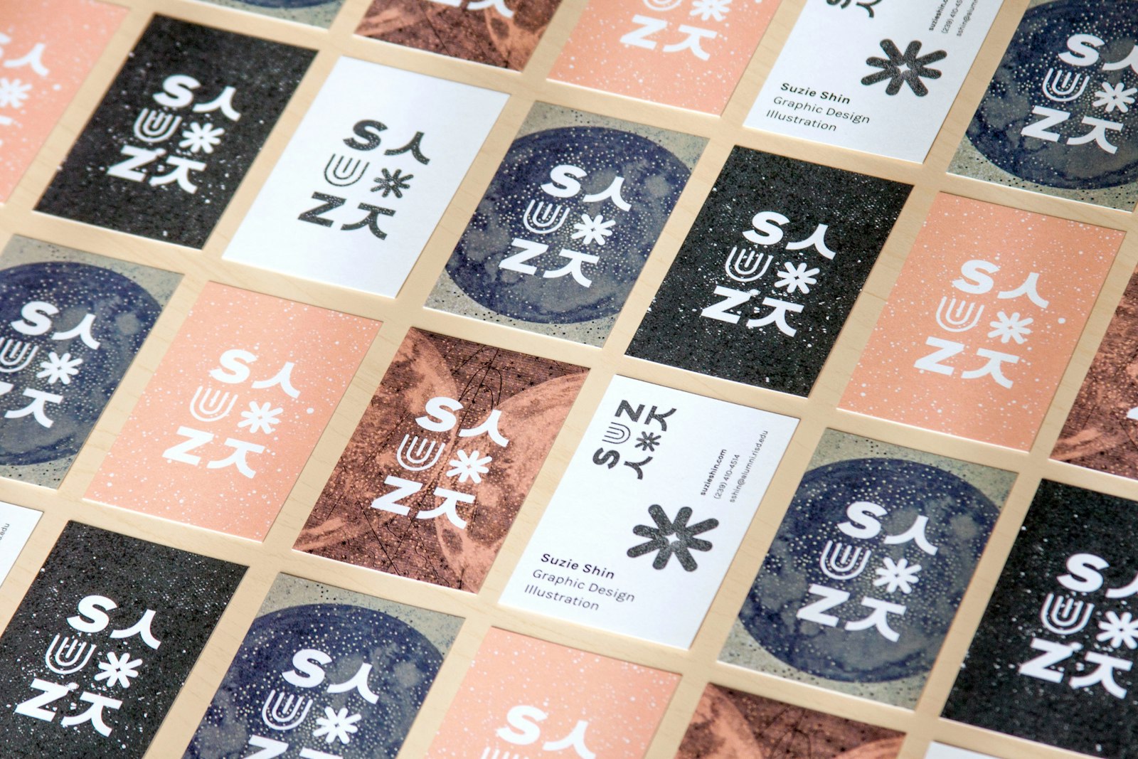
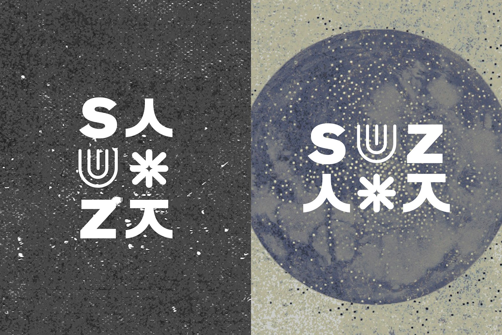
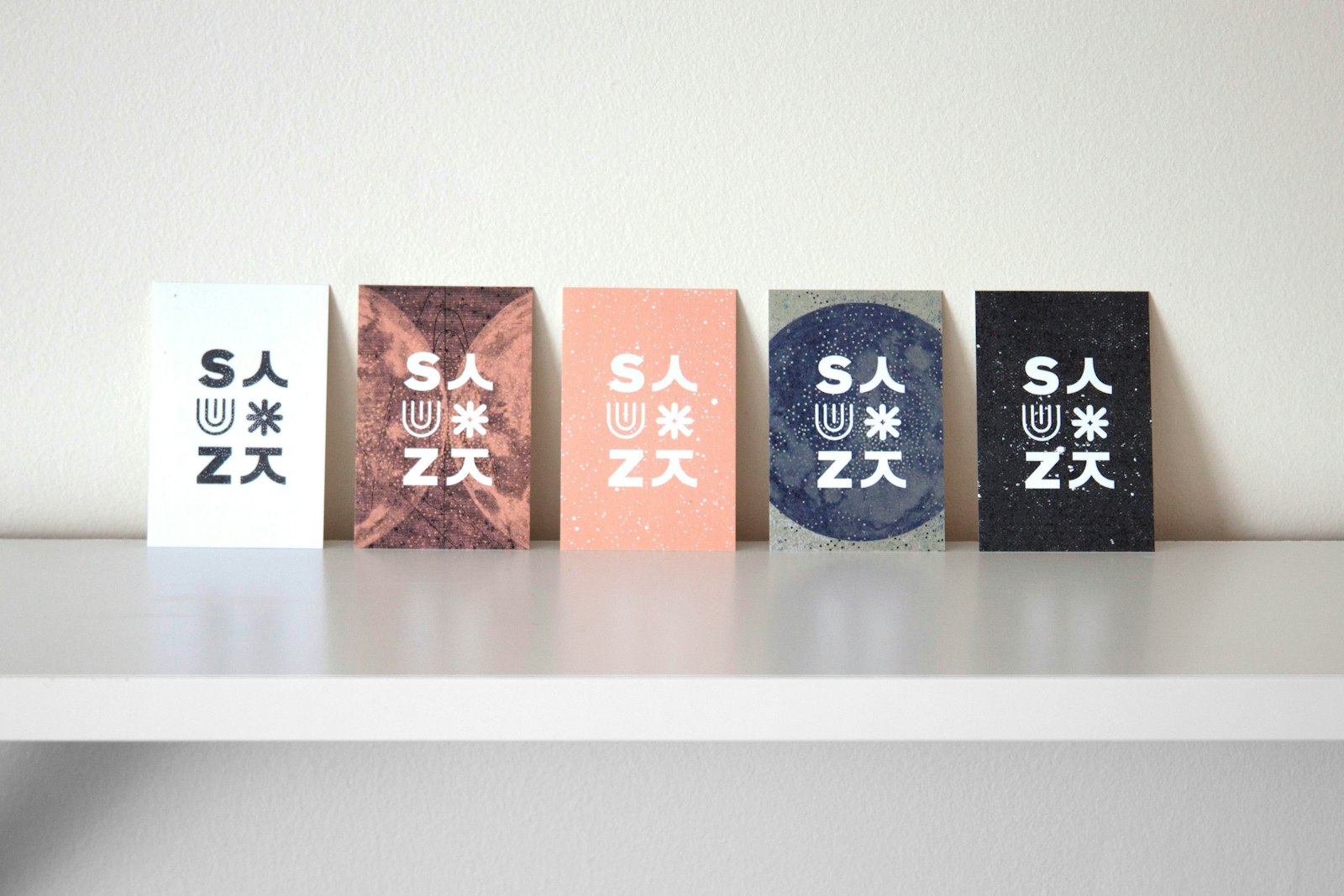
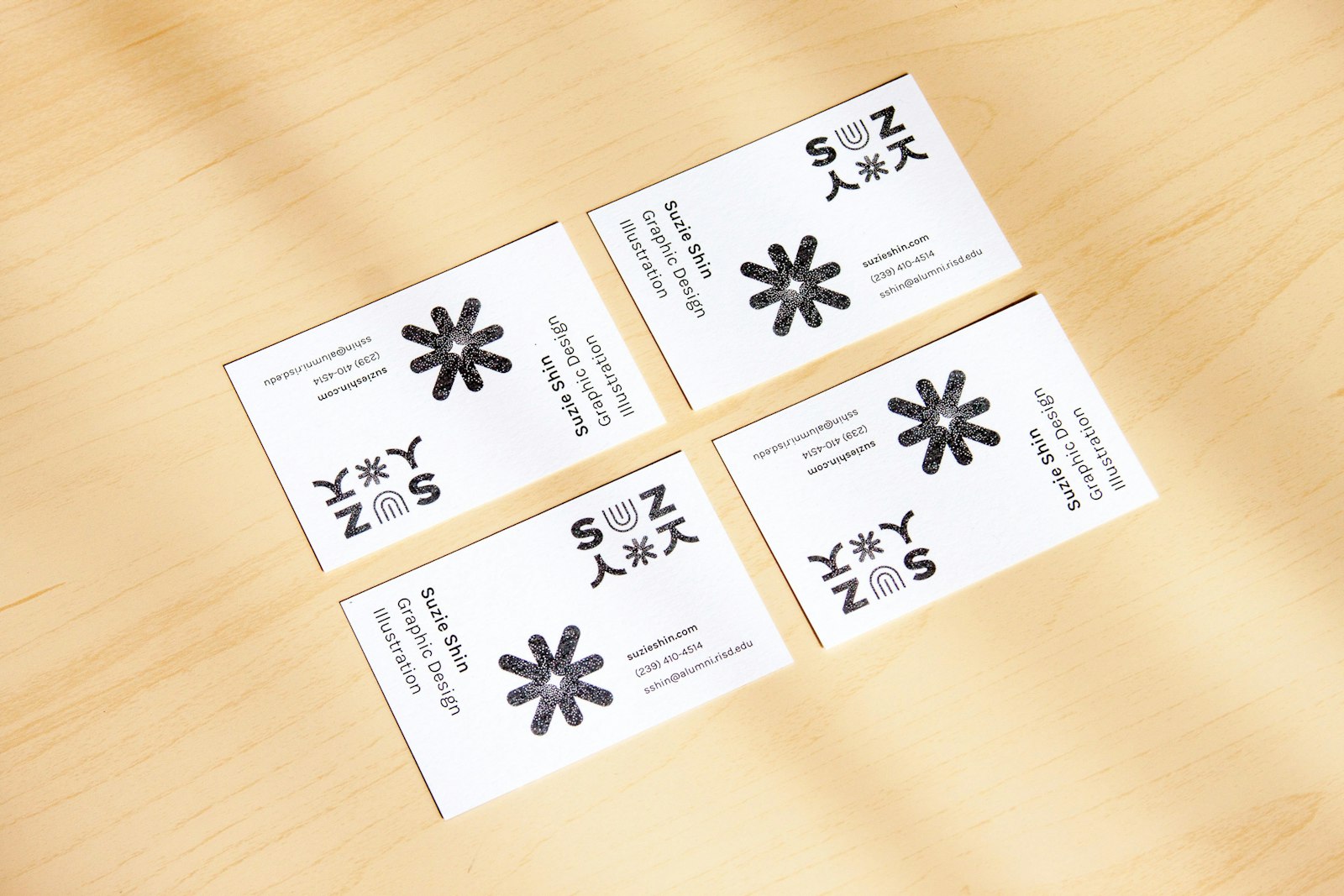
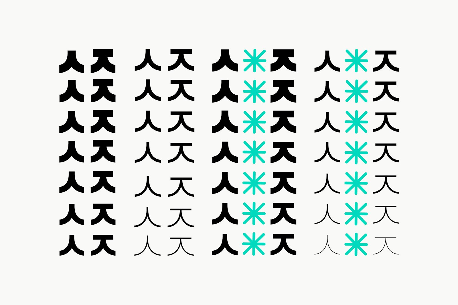
My parents immigrated from South Korea to America in the late 1980's, and had three children. Like most immigrants, they had to decide on two names: one from our culture, and one we could easily use in English. I was named Suzie (not short for anything), and 수지 (pronounced "Sooji") out of the purpose of convenience. In homage to my deeply integrated Korean-American upbringing, I developed this logo that features my short nickname "SUZ," alongside glyphs and the beginning characters of my name in Korean.
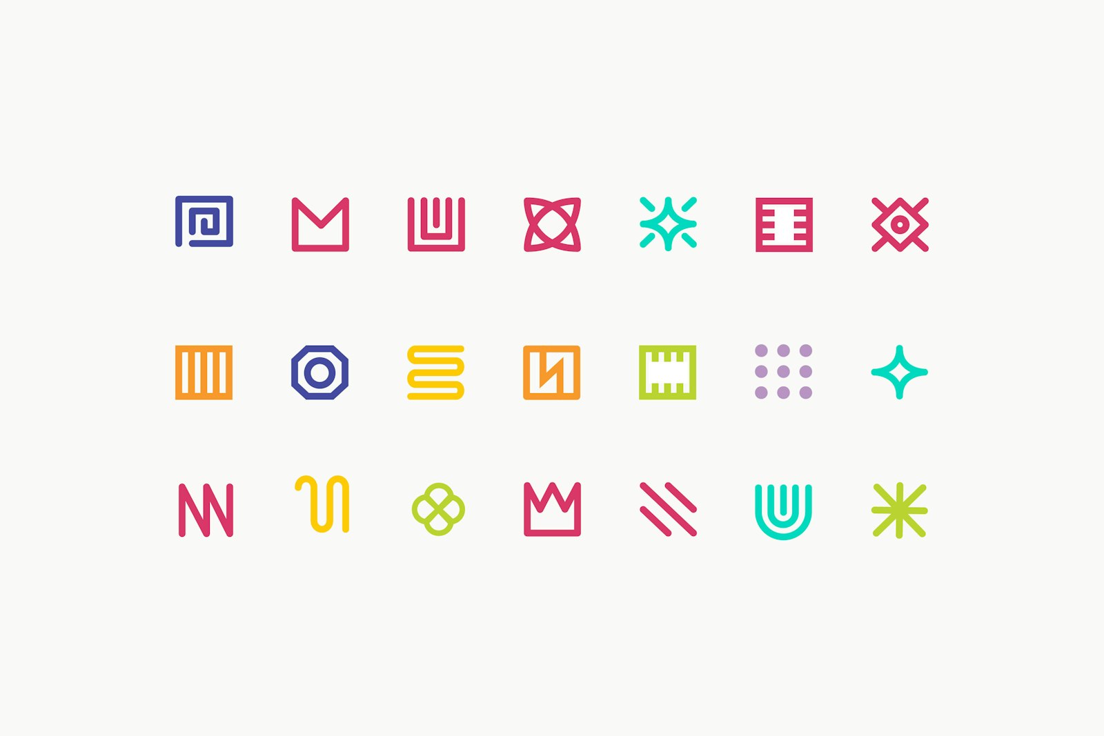
The Korean characters were custom designed to match the S & Z in Akzidenz-Grotesk BQ Bold. The glyphs were made to contrast the characters while providing modular opportunities and variable usage. The imagery/textures came from altering scans from the 'Space & SciFi' gallery of the British Library's Mechanical Curator Collection.
- Designer
- Suzie Shin