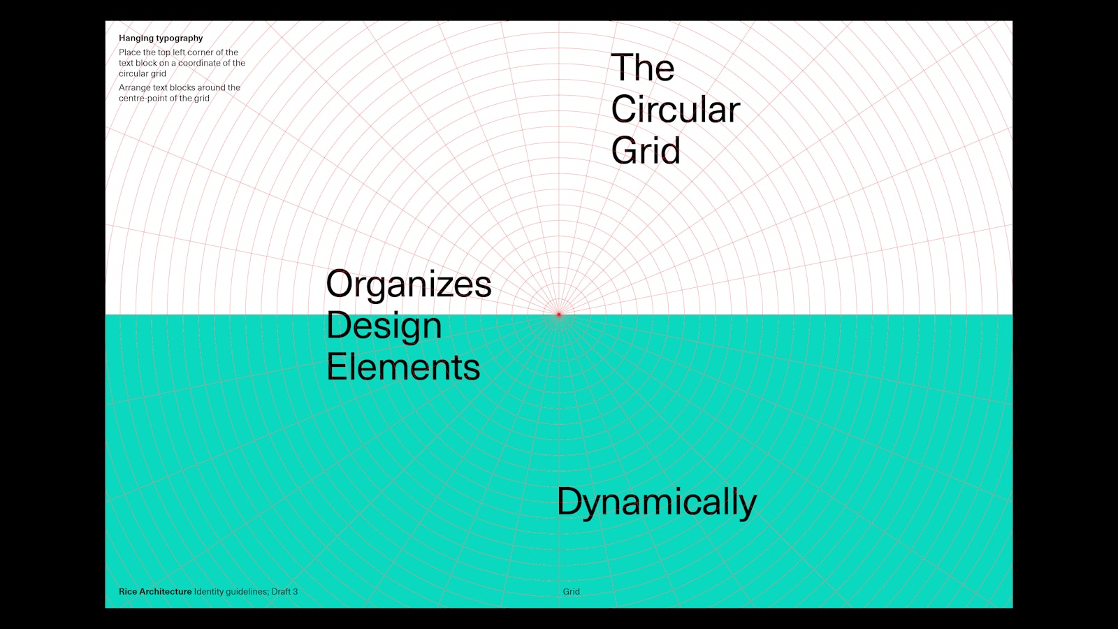
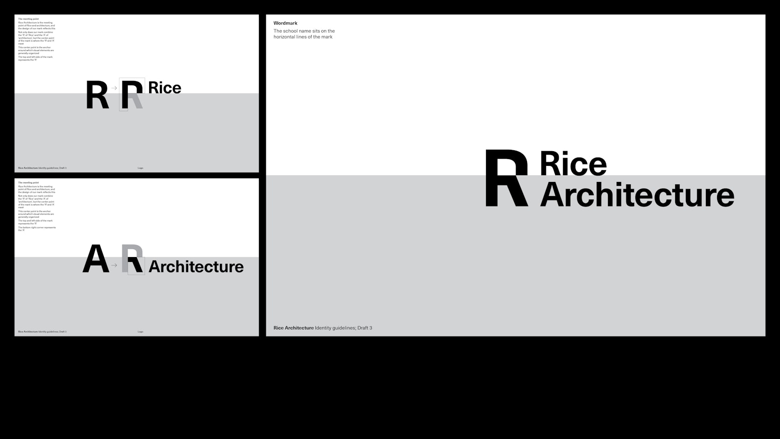
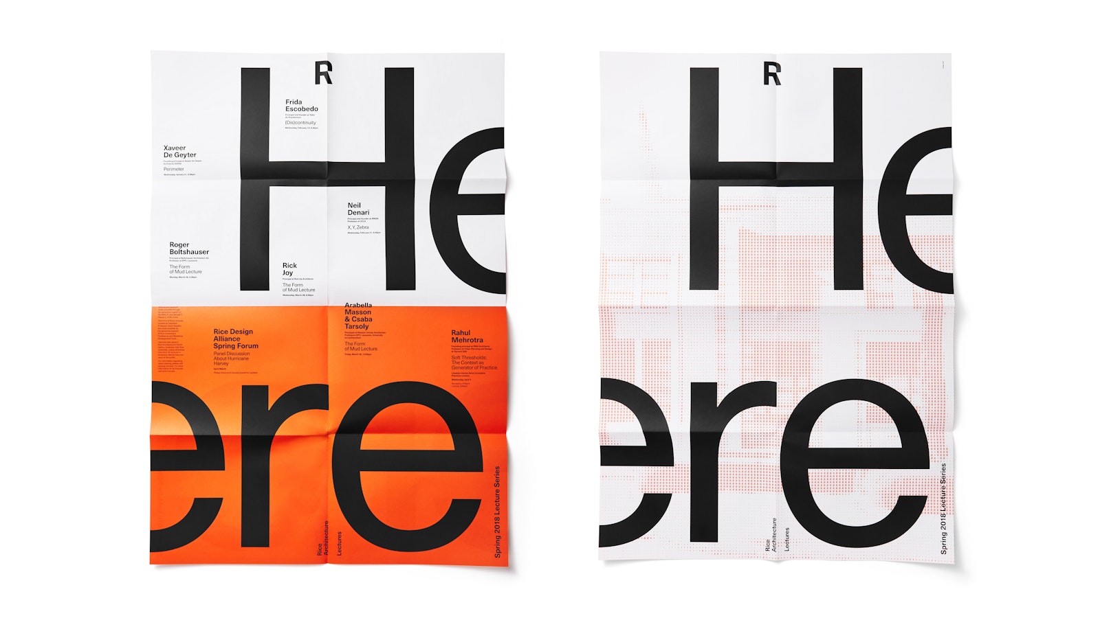
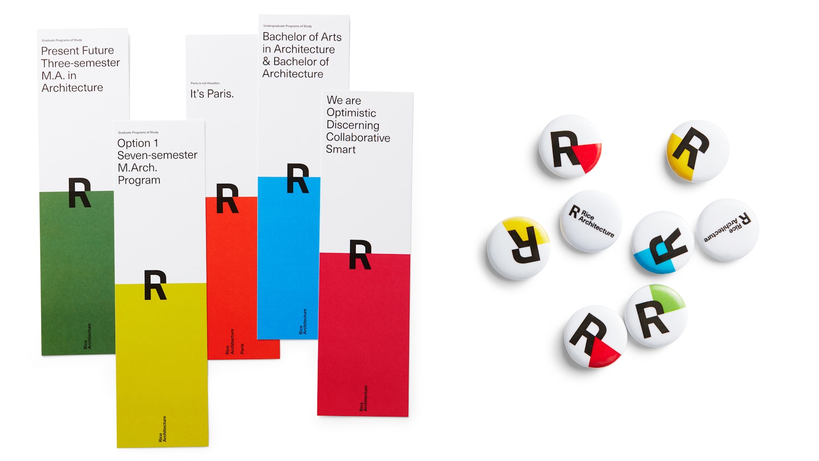
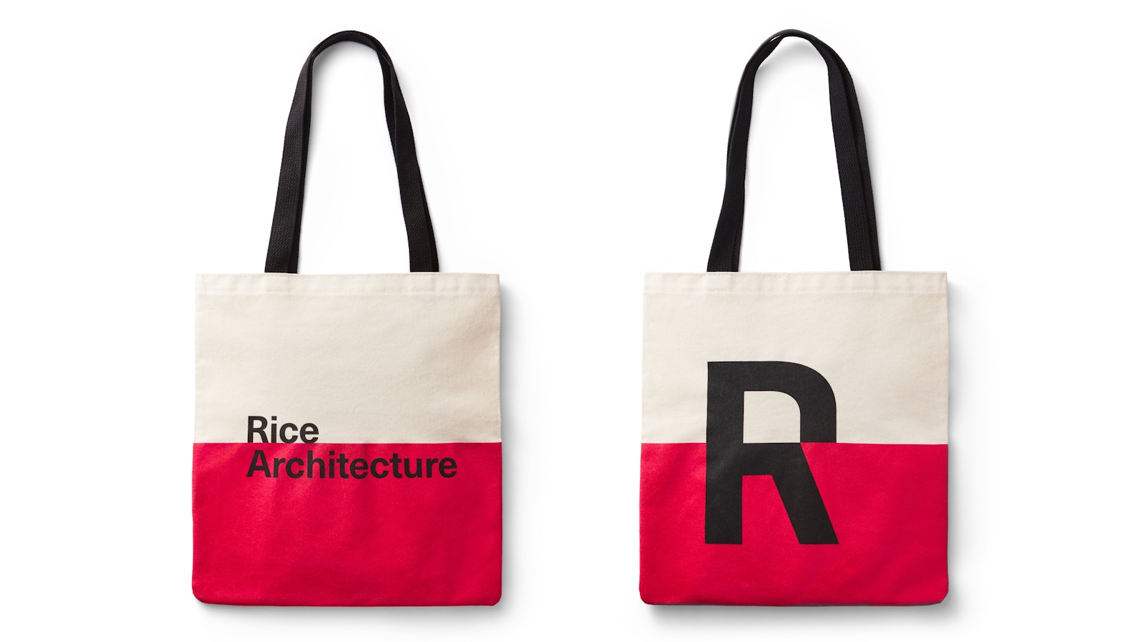
The Rice Architecture logo is made up of a combination of the R and the A deliberately crafted to form a distinctive laser like focus.A unique circular grid was developed using concentric circles with rigorous mathematical spacing. The circular grid organizes design elements in a dynamic and collaborative way. Type and images encircle content to provide a laser-like focus on Rice AEach lecture series poster utilizes the circular grid to organize messaging and other design elements dynamically.‟Rice Architecture is a think tank: a container for possibilities,” says Dean Sarah Whiting. That optimism is brought to life throughout the visual identity with a broad palette of colors that can be used interchangeably from semester to semester. The identity isn't done until it's on a tote.