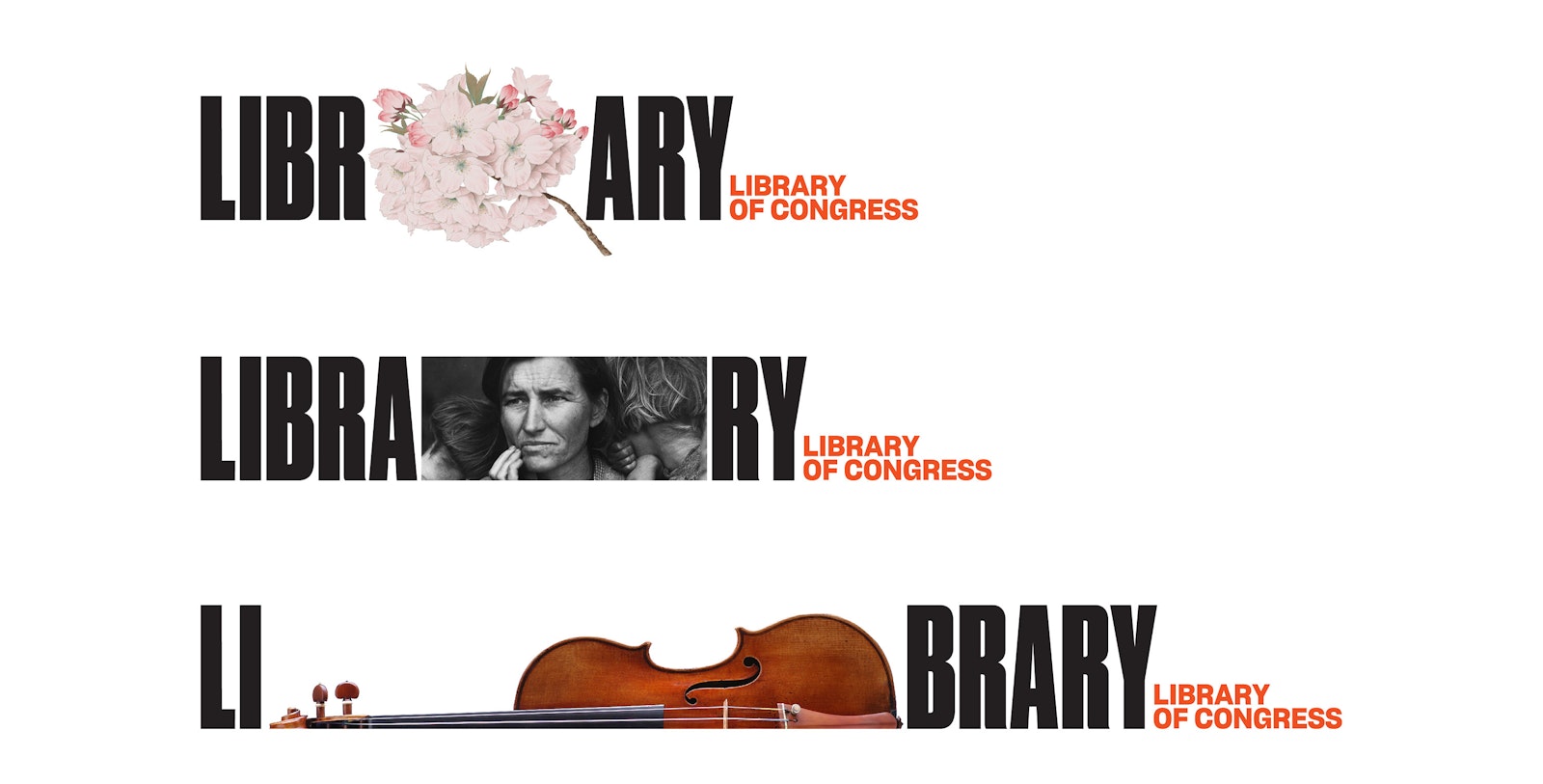
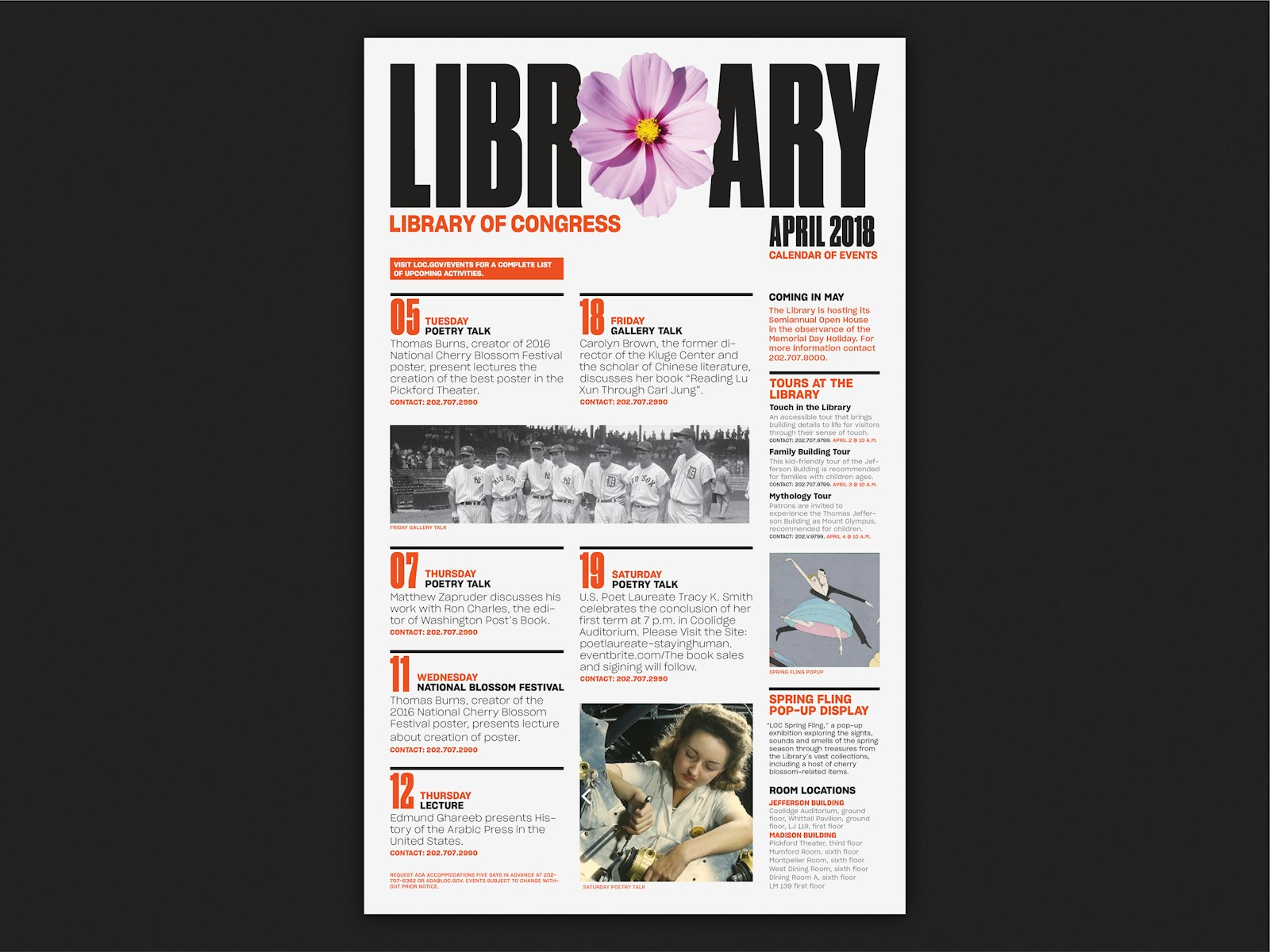
The Library of Congress in Washington, DC, is the world’s largest library, offering access to the creative record of the United States and materials from around the globe. Pentagram has designed a new brand identity that captures the spirit of the Library and its universal collections in a dynamic logotype that is a metaphor for a bookshelf or bookcase―a place to collect things―and can hold images and typography. The institutional identity touches on every aspect of the Library, including its publishing program, environmental graphics and signage, and website. The system will be implemented over the coming months, with the first elements launching with the 2018 National Book Festival.
“The Library of Congress is the largest library in the world that serves Congress and the American public,” says Dr. Carla Hayden, Librarian of Congress. “It is a treasure chest, filled with limitless information and services, ready to explore and amaze if you open it up. The new visual identity is bold, contemporary and embodies the Library’s global scale in making the collection accessible to all.”
The Library of Congress holds more than 32 million catalogued books and other print materials in 470 languages, including books, recordings, photographs, newspapers, maps and manuscripts, along with audio recordings, films, fine art and even typefaces. The collections are housed in three buildings across Capitol Hill―the Thomas Jefferson Building, including its iconic Main Reading Room, the James Madison Memorial Building, and the John Adams Building―which are remarkable public spaces and public works of art in their own right. Many of the holdings are available in digital collections online.
While it officially serves Congress and the federal government, the Library also serves as the national library of the American people. Its central mission is to provide a rich, diverse and enduring source of knowledge that can be relied upon to inform, inspire and engage. The breadth and power of its collections should be easily understood, and be coupled with an invitation for all to visit physically or virtually to take advantage of all the treasures within.
“All of us are living in a period of massive change in the creation, analysis, and use of information and libraries have an important role to play as collectors, curators, educators, and experts,” says David S. Mandel, Director, Center for Exhibits and Interpretation, Library of Congress. “As the world’s largest library, we were drawn towards a bold direction that emphasizes the library as a vital cultural institution.”
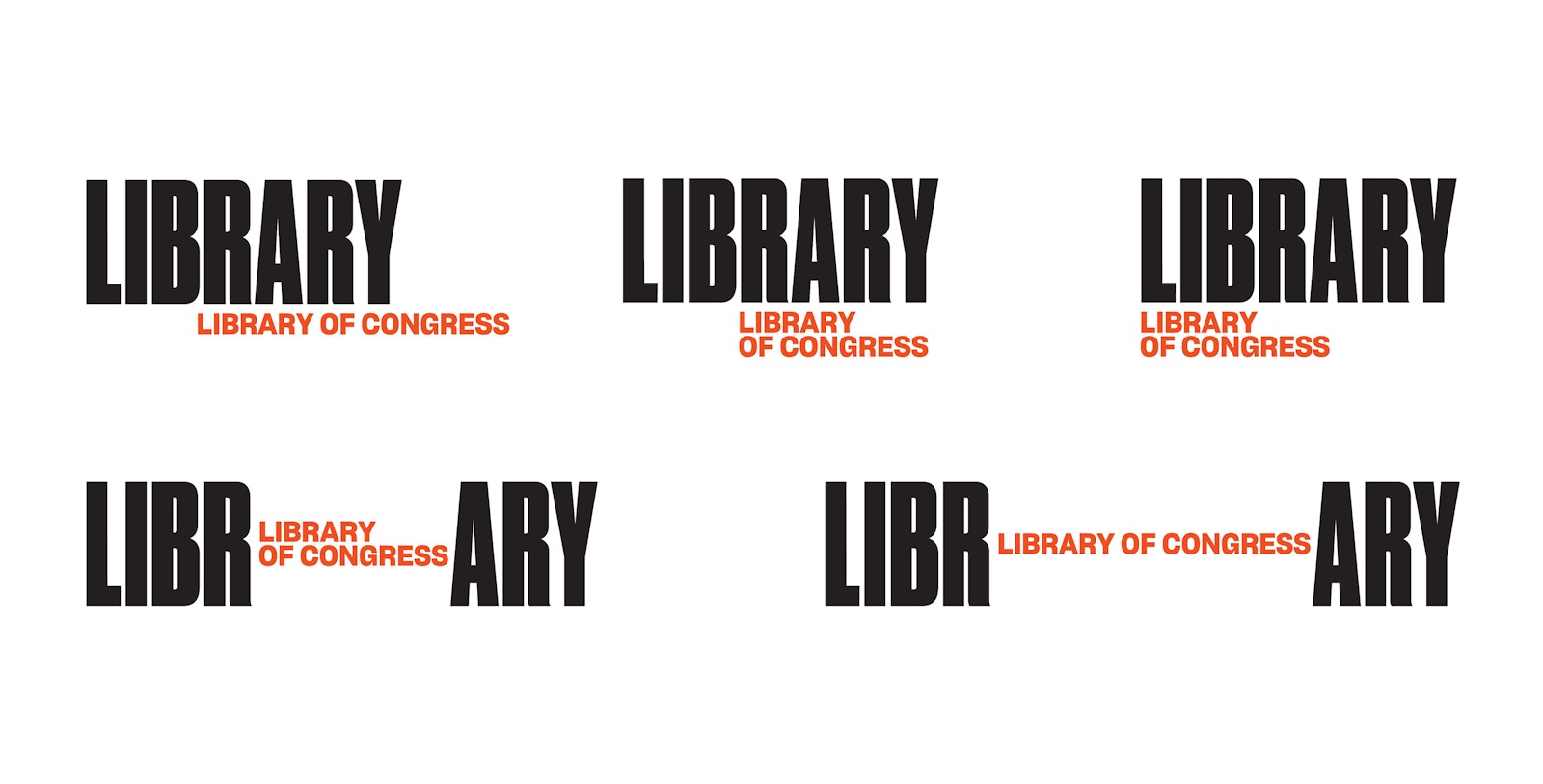
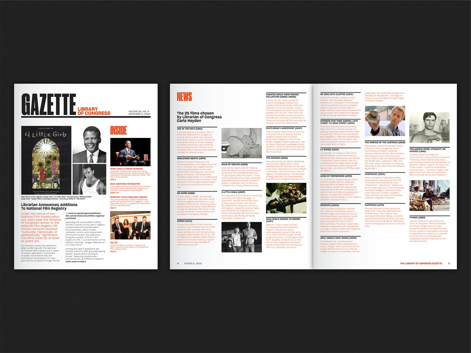
The logo combines the condensed name (“Library”) set in Druk Condensed Super and the full name in Sharp Grotesk 20, all in one lockup that can appear in various configurations. The versatile arrangement is the basis for a cohesive system for the Library’s many sub-brands and affiliate programs. The identity will be implemented across all Library communications, including books, the bimonthly LCM magazine, institutional brochures and newsletters, signage and exhibition graphics, and the website.
- Partner in charge
- Paula Scher
- Designer
- Jeff Close
Project link
