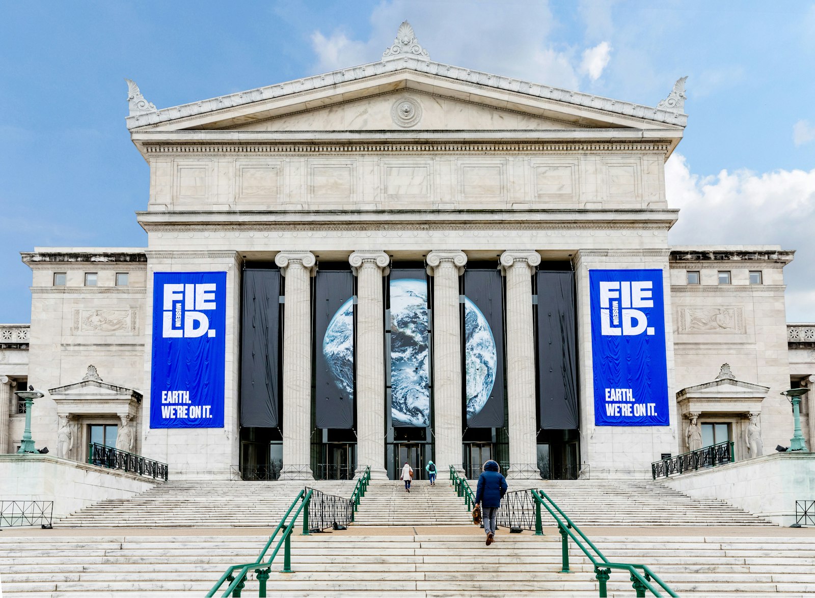
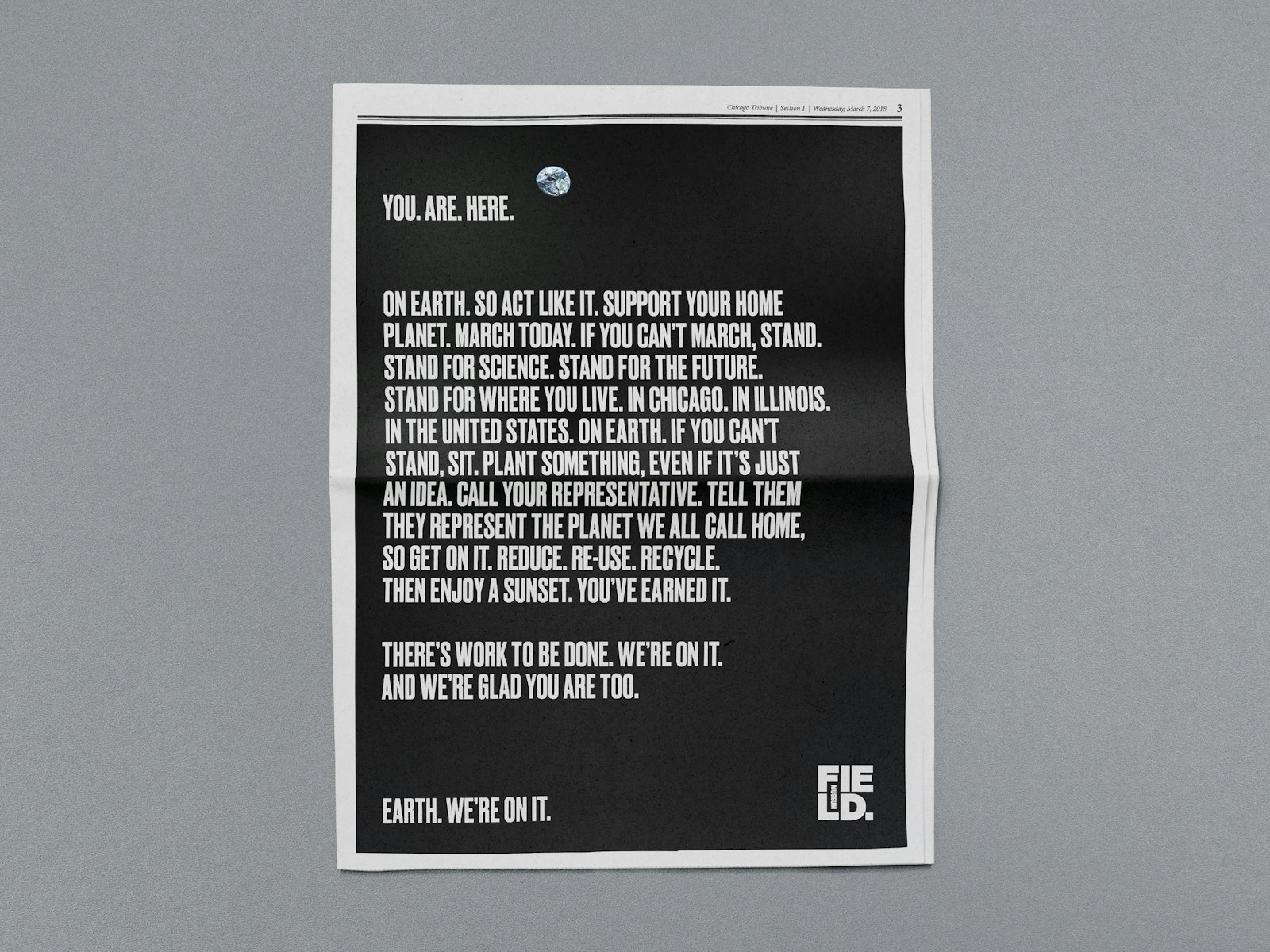
The introduction of a new Field Museum brand comes at an important time. This year, the museum’s 125th anniversary, is a galvanizing moment to clarify who we are, what we do and what we stand for. At a time when people are coming together to acknowledge the importance of the scientific community, the Field is putting a stake in the ground as a forward-thinking leader in scientific discovery. The new wordmark illustrates a purposeful change, helping transform the brand’s image from passive to active and strong.
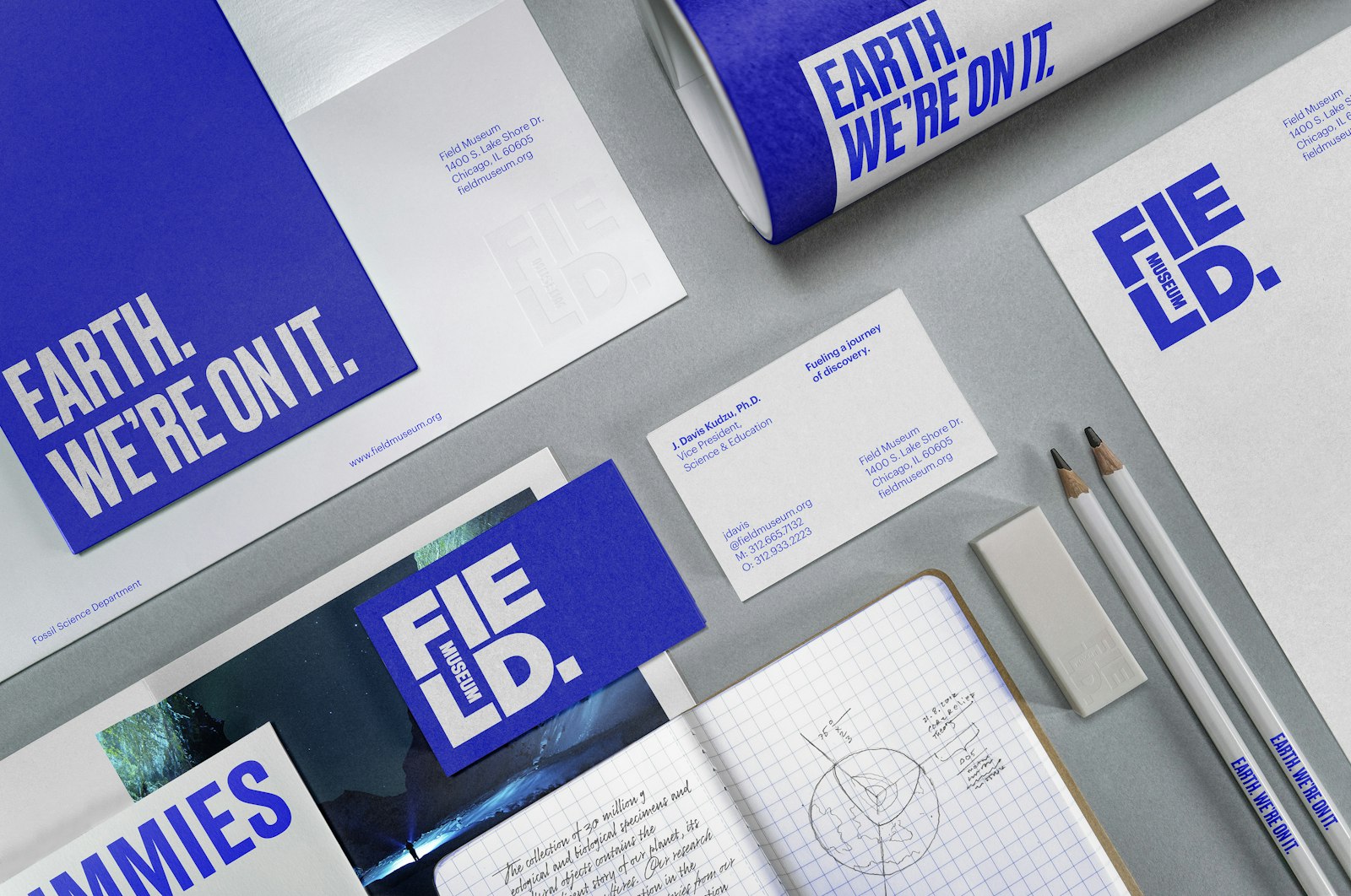
It all begins with the logo, rooted in one of the most reoccurring shapes found in our natural world: the square. It’s reminiscent of everything from archaeological excavation sites to the architectural details of the Field Museum building itself. Our logo includes two squares: the small square represents the fraction of the Museum’s collection on display, while the large square, the logo itself, represents the museum’s massive collection as a whole. Its boldness conveys the massive impact the Museum has had on the community, city and world. Like the Earth, our color is blue. Blue embodies optimism and our constant effort to uncover solutions for a better world.
- EVP Head of Design
- Alisa Wolfson
- Design Director
- Rob Schellenberg
- Senior Designer
- Scott Cress
- Design Director
- Kyle Poff
- Design Director
- Natalia Kowaleczko
Project link