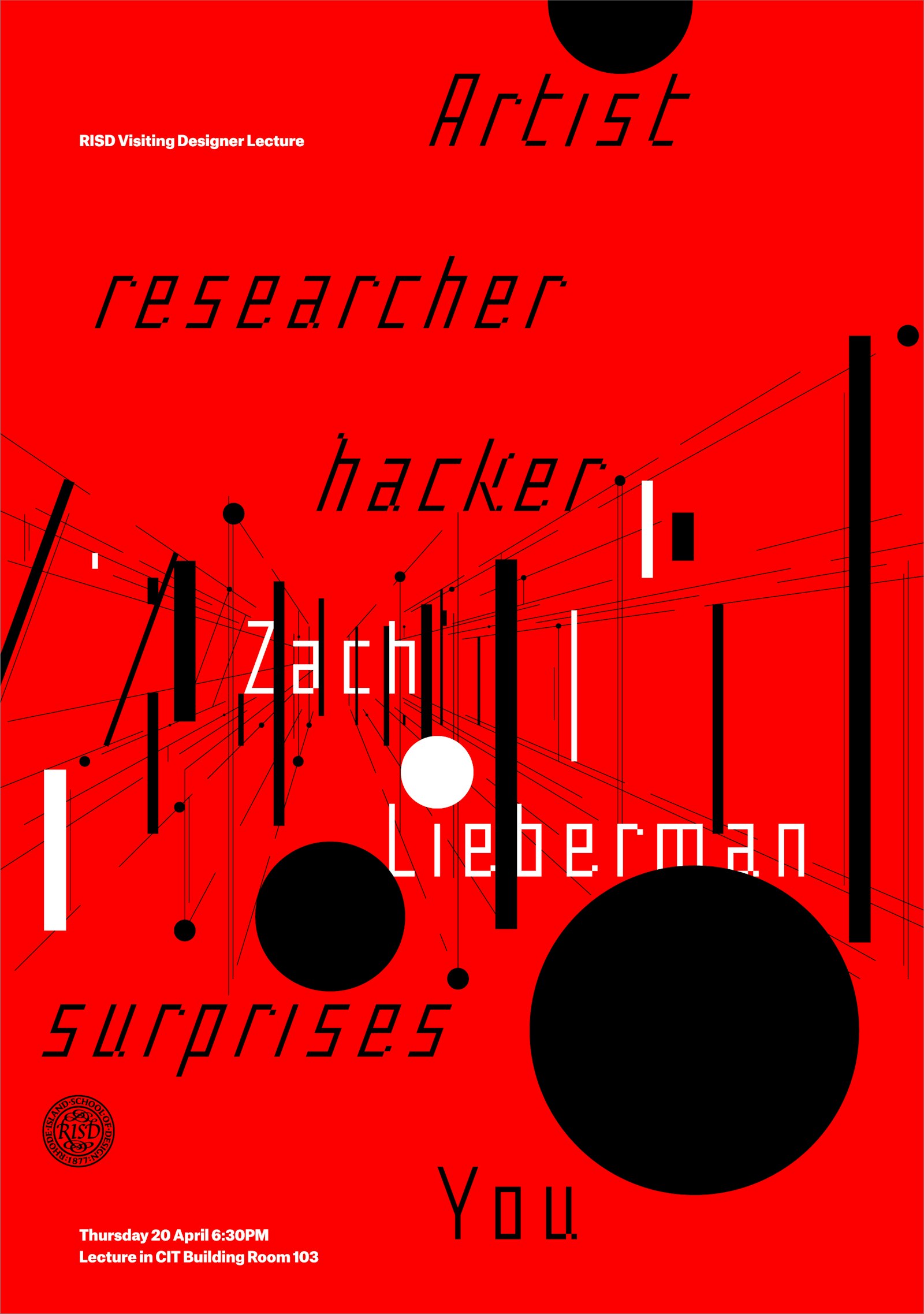
In the Spring I was commissioned to design a weltformat poster for RISD’s graduate program in Graphic Design. The poster would be used to promote the visiting designer workshop and public lecture with Zach Lieberman.
Lieberman’s work focuses on experimental transformations from computation in what he describes as visual poetics. His animated, dimensional constructions, defy reality while embody the spirit of life. This work is created through the custom software, Open Frameworks he developed using the coding language C++.
The concept and formal execution of the poster responds to Zach Lieberman’s philosophical idea, visual poetics, and open-source approach to work that has yielding the 100’s of daily sketches he produces to advance his understanding and capabilities of visual ideas. Along with the sketches, Lieberman too shares the code, thoughts, and inspirations so that anyone following can not only appreciate the knowledge, but so they can build on top what has already been accomplished.
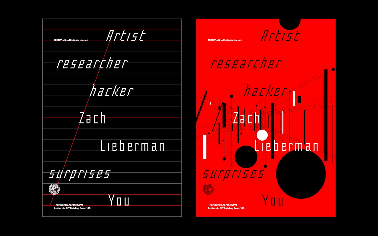
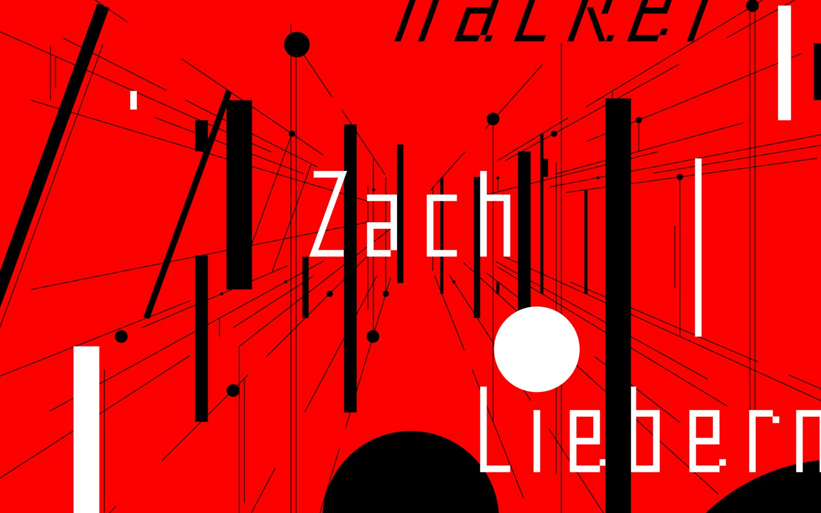
The copy from the poster was lifted from his bio. His first name is set vertically-center on the poster. The dimensional perspective of the name Zach is built from typographic, structural forms that float in z-space based upon a one-point perspective. This centering, and one-point perspective offers a tactile instruction — center Zach at eye-level — to make installation easy and purposeful. Within a design focused institution posters fill many of the hallways, an eye-level, centered installation of a weltfromat poster commands attention. At the same moment it allows the one-point perspective to operate optically-appropriate creating an illusion of depth and movement while keeping production cost down using standard inks and 2d production.
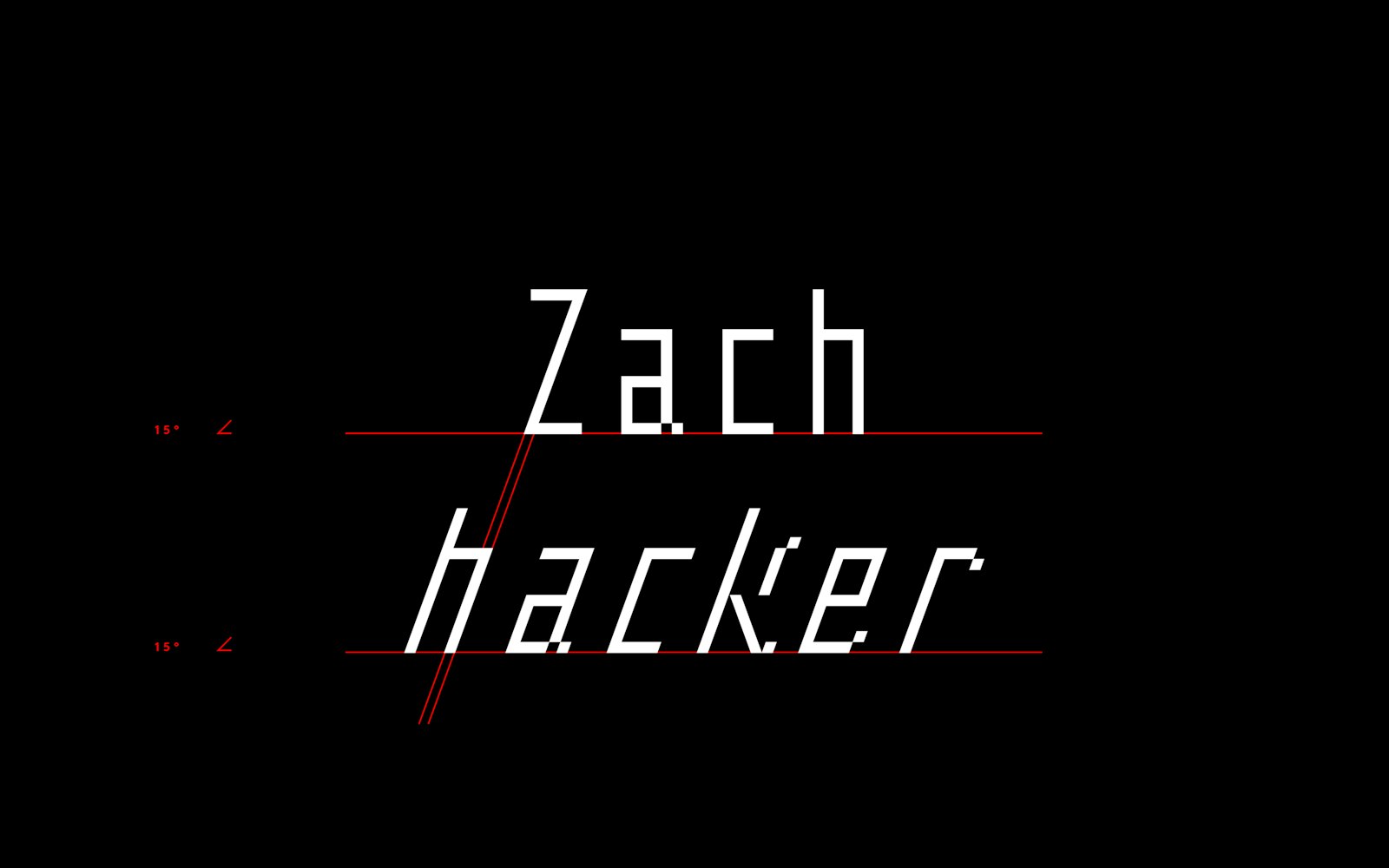
The structural forms that build off the name “Zach” are set intentionally within the z-space are based upon a Fibonacci sequence. This sequence controls not solely the size but the weight in a regulated manner that creates a optically truthfulness to the dimension. The primary type is a custom design I created for this use to offer a computational feel related to Lieberman’s tools. The italic is derived from the diagonal of the Z. The tittles of the lowercase i have been drawn as circles to offer contrast. Their size continues the Fibonacci sequence allowing a greater sense of depth, scale, and a harmonious setting of type and image.
- Designer
- Nick Adam