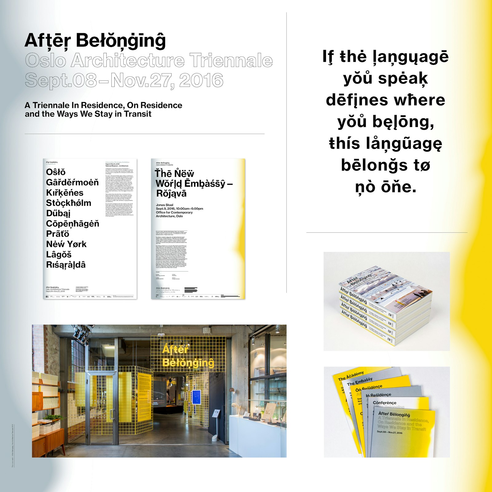
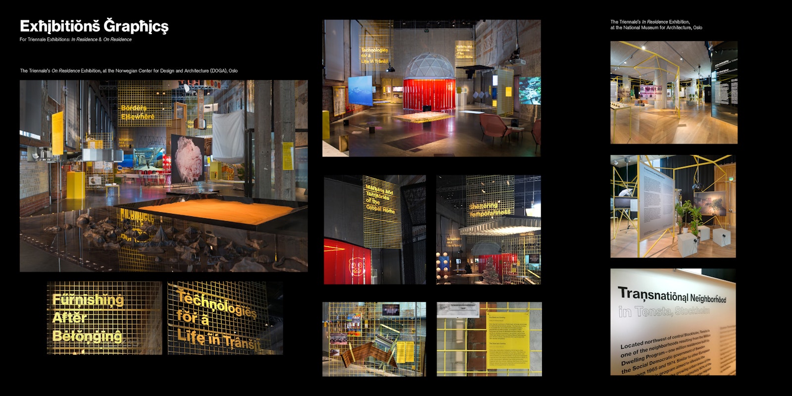
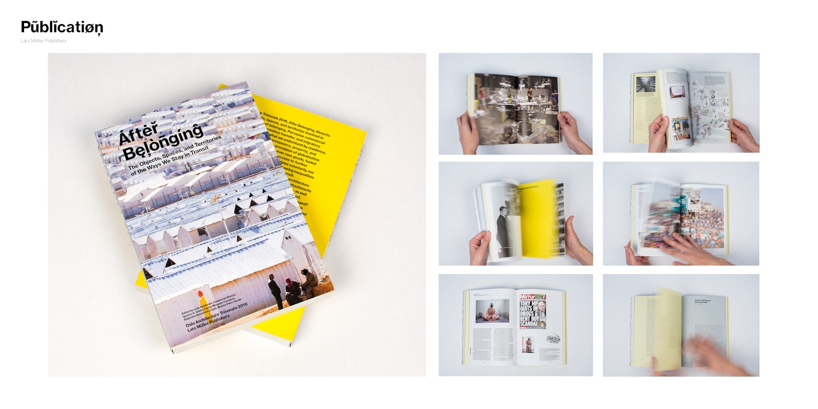
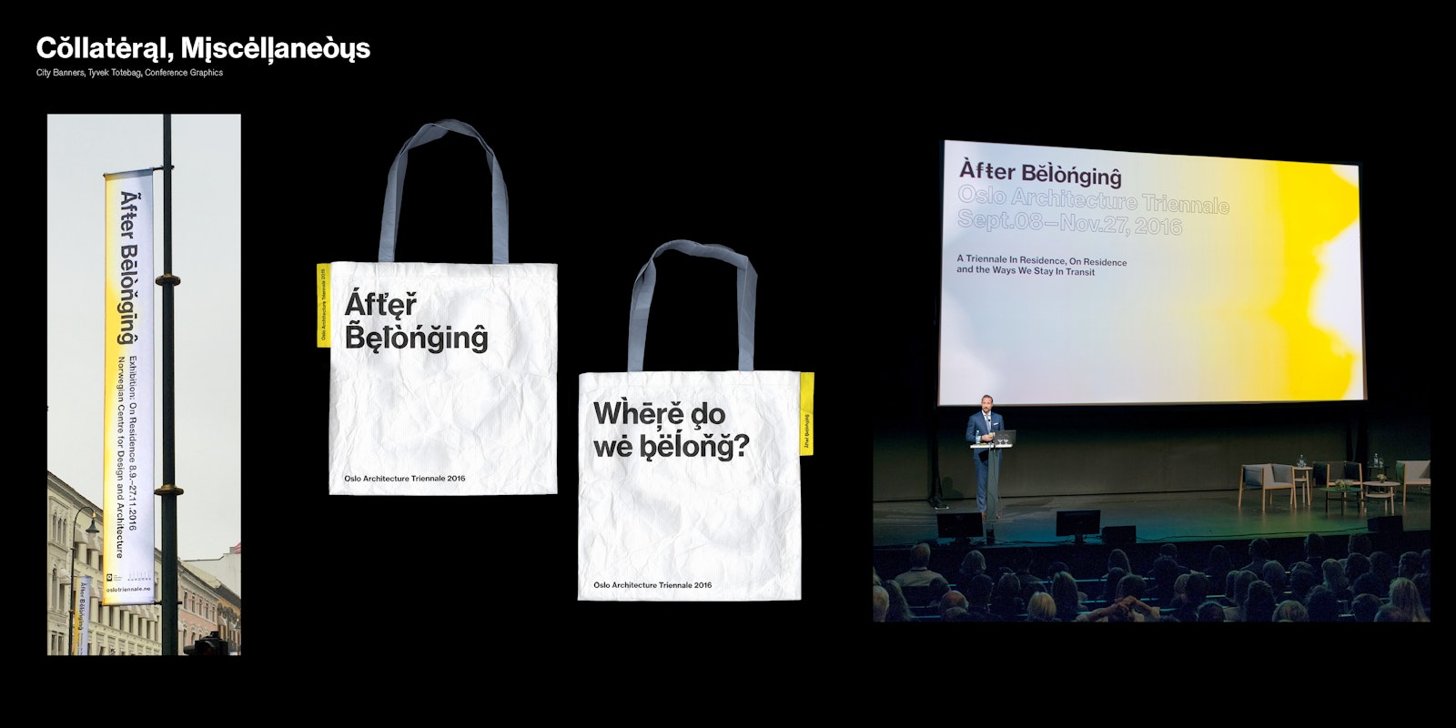
In Sept. 2016, After Belonging, the Oslo Architecture Triennale opened to the public, with 2 exhibitions, a publication, and 3 months of programming in Oslo.
The curatorial idea of ‘After Belonging’ looks at the architectural concept of ‘residence’ in the current state global transitions — from cruise ships as floating cities, to refugee housing and displaced populations — in essense, the condition of not belonging to one place.
For the graphic identity, we created a typographic world that would be at once universally recognizable and yet unfamiliar. If language you speak defines where you belong, this language belongs to no place.
The identity employs a modernist typographic base, and uses all of the diacritical marks in the font. We created a script that randomly selects each glyph to maximize combinations. The diacritical marks are the primary identity marker for the triennale, there was no 'logotype' file or branded mark. Colors appear as gradient flushes of yellow and grey, highlighting the different components of the triennale programming.
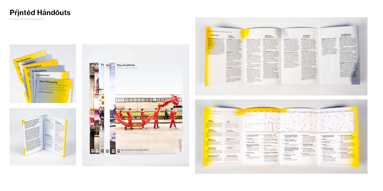
The identity was deployed over the triennale’s multiple formats — exhibition graphics, signage, print collateral, totebag, and a 400-pg catalog and archive of the triennale with original work and essays.
- Director
- Megan Feehan
- Designer
- Lukas Eigler-Harding
- Designer
- Yo-e Ryou
- Designer
- Cem Eskinazi
