In the contemporary culture of graphic design, an identity is commonly understood to mean much more than a logo. An identity is in fact, a system, often built in response to a form, generally a logo. Though a logo can be a powerful tool that can immediately convey meaning, it’s only one piece of the kit that makes up an identity. Identities can be established lacking this piece.
The work for the 2016 Typeforce 7 started in my usual manner: scouring semiotics for significant, dramatic meaning. Where better to look than a number with known recognition: seven. Beyond being the lucky number, it too symbolizes the deadly sins. These capital vices inspire a wealth of imagery and could make for a system with legs—here, toads represent greed, snakes depict envy. Lions portray wrath, snails illustrate sloth, pigs come to stand for gluttony. The goat constitutes lust, and the plumage perfect peacock personifies pride. Meaning, visual play, energy that has been around for nearly 1800 years, and who doesn’t want an opportunity to explore ‘wrath’ in their work? I’m certain we could have made a fantastic identity based on sin, (I’d love to), though this did not feel right for an event that historically has served as a welcoming and safe place for people’s creative expression.
So, what about making as exploration, as pure fun. Making not out of requirement, but because we have a mind, hands and tools? Making for the love of design and achieving something pure, something that elicits aesthetic pleasure? Scrapping everything, pushing around shapes and colors, fun emerged and I had little idea where it was going. It felt guilty.
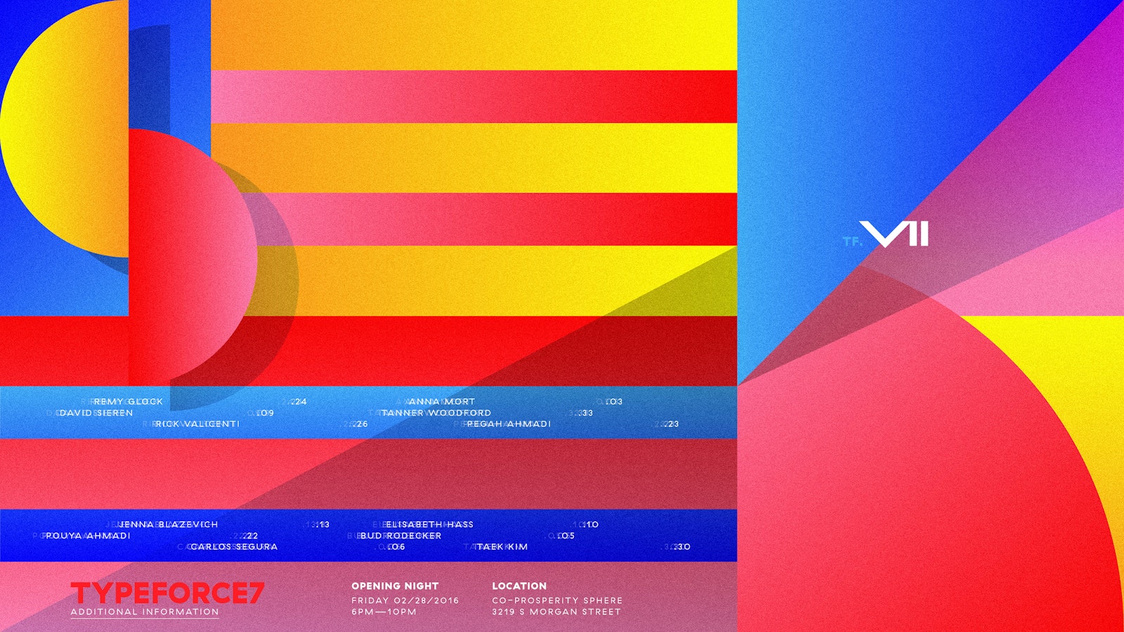
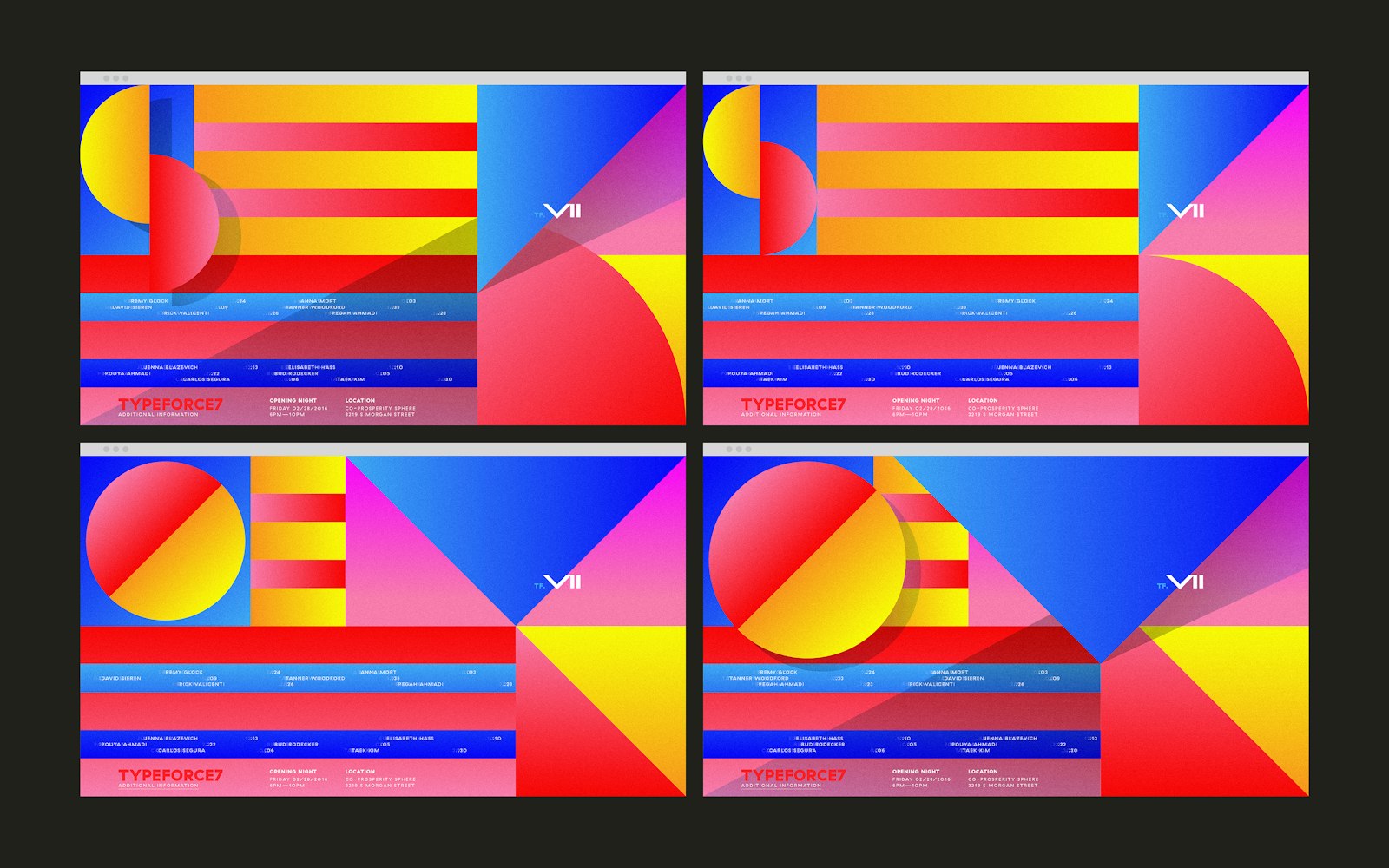
This idea began to put the first lines on the paper, letters returned to their geometric roots. This geometry began to shape the composition and then could be defined digitally by viewport height, where the horizontal attributes are determined by a responsive expanding and anchoring angular elements.
This idea takes the responsive nature and need for all things and puts it in the forefront, but rendering this graphically means there is no final form. A sans-logo identity of the kit of parts. By designing variant styles and sizes for the shapes that represent consonants, the identity became something ever-changing, influenced by user interaction.
In this is a hyper post-internet framework for an identity, we built this e built this with straight CSS, no assets (no SVG, JPG, PGN) other than two font files for a black and regular cuts.
- Nick Adam
- Matt Soria
- Bryant Smith