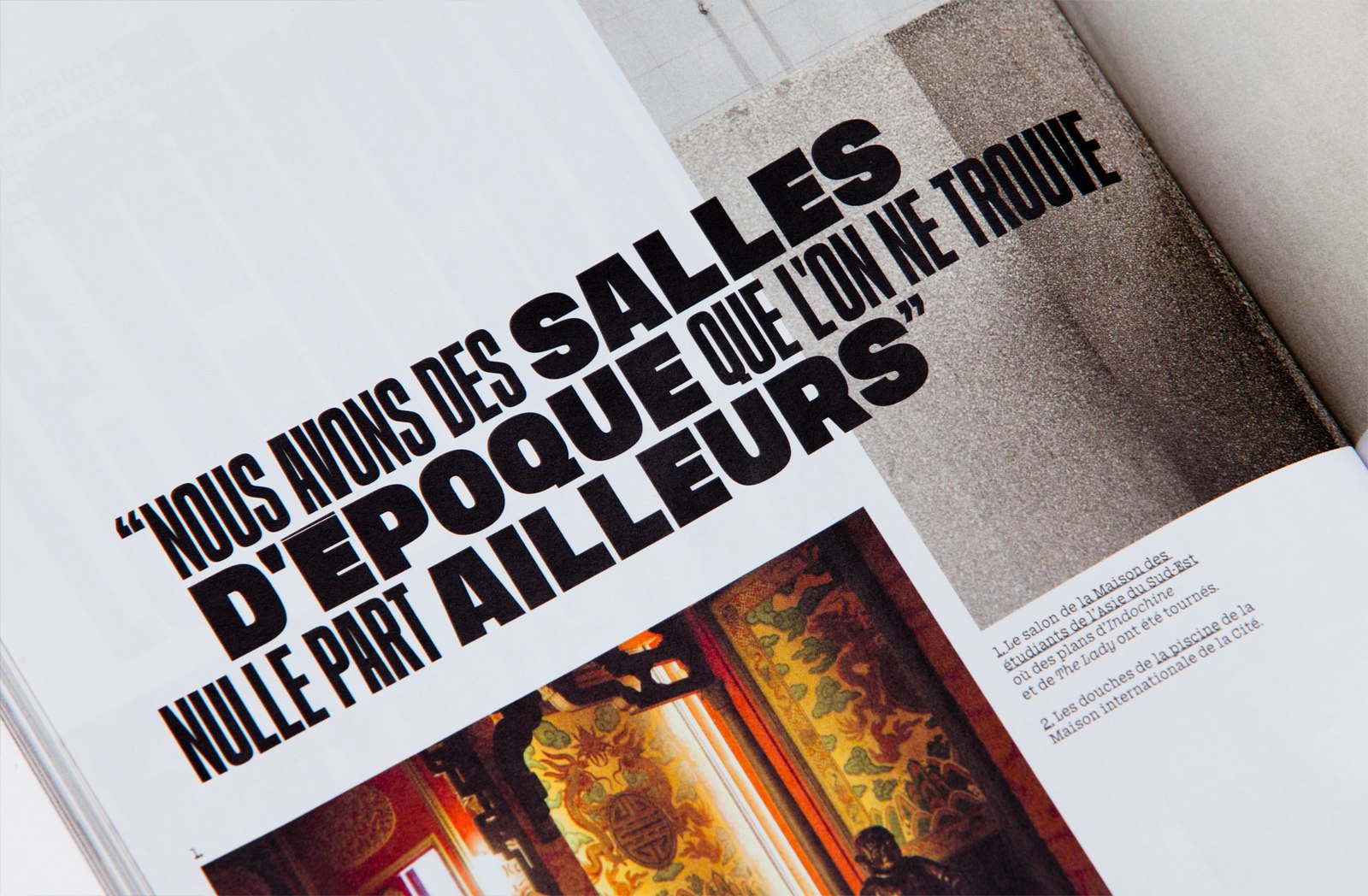
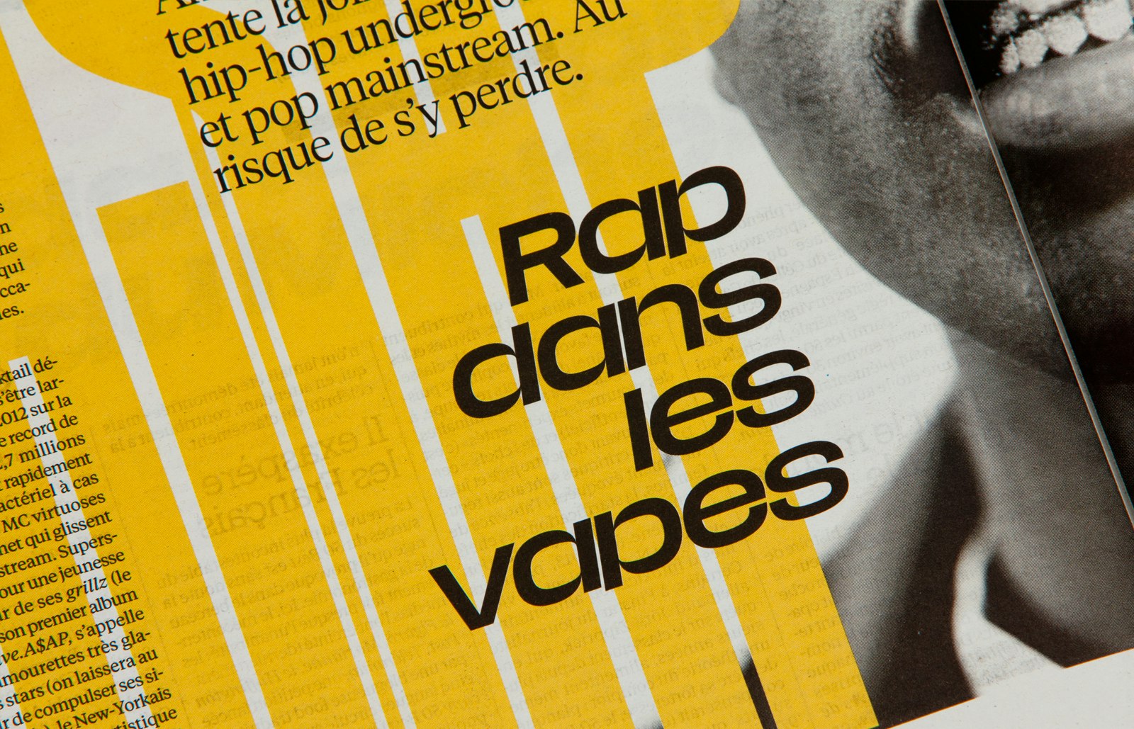
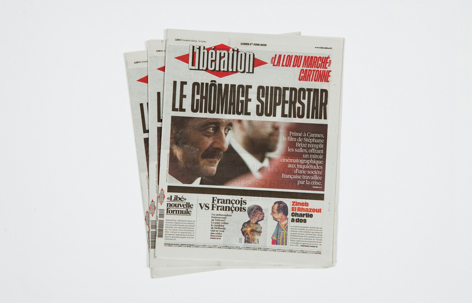
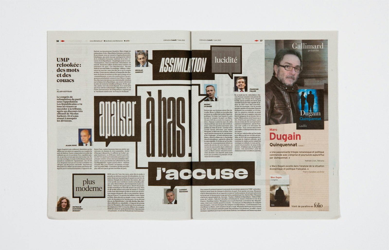
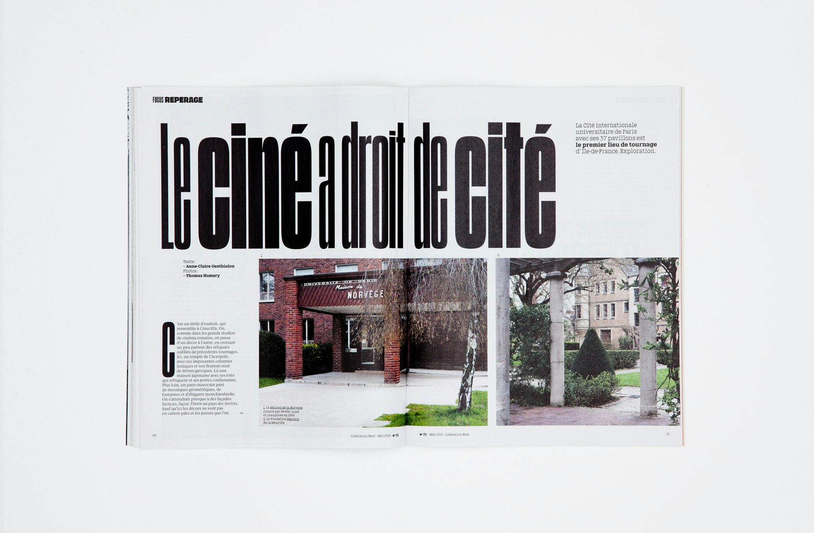
Libé Sans and Libé Typewriter are comprehensive font families designed for the French daily newspaper Libération.
For the redesign of Libération, art directors Yorgo Tloupas and Javier Errea requested ultra-condensed, tall and flat-sided sans serifs in the vein of Compacta and the American Gothics (e.g. Trade, Franklin, News). However, none of these typefaces were a match for the complex specifications of the new Libération: a wide palette of expressions across a set of weights and widths, a very dense texture and space efficiency, a stacking system, and an automatic underline system — all of them referencing the typography of the newspaper when it launched in 1973. Beyond that, a tribute to Libération’s design history would not be complete without the influence of 1970s French faces.
Overall, Libé Sans is a compact design, with a colossal lowercase. Where large x-heights are usually incorporated for small text readability, in Libé Sans it is conceived as a display feature. The family proves most functional at large sizes where horizontal space is scarce, thus forcing the letters to occupy any space allowed. That is why the collection encompasses three different condensed styles, but only one normal width and one extended width. The vertical proportions remain identical throughout all styles so they can be mixed within a line. The very short ascenders and descenders are specifically meant for tight line-fitting in lowercase, creating a dense texture in the newspaper’s page rhythm. What’s more, the “Stacked” accent system offers an alternative design for all-caps setting.
Libé Sans is strongly inspired by Antique Presse, a typeface designed in 1964–65 for newspaper and daily press work. Usually attributed to Ladislas Mandel at Deberny & Peignot in the ’60s, it was later established that Adrian Frutiger, then art director of the foundry, was more likely the mind behind Antique Presse. As further proof, Antique Presse quite blatantly follows Frutiger’s Univers pattern at many levels. Many other influences were taken into account when designing Libé Sans, including features of Libération’s contemporary European typefaces of the ’60s-70s, such as the tight letterspacing of Brasilia, the squarish caps of Eurostile, and the odd contrast of Antique Olive.
Libé Typewriter takes its cue from a offhand remark by Yorgo Tloupas during the preparatory phases of the redesign, where a need for a typewriter face was foreseen. After American Typewriter was the obvious.
- Jean-Baptiste Levée
- Yoann Minet
Project link
