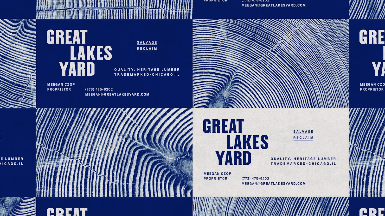
Located in the heart of Chicago, Great Lakes Yard is a reclaimed lumber yard selling the highest quality, cosmetic, heritage building materials. The lumber itself is high-character, high-contrast, old-growth wood that through its characteristics can be traced to where it was grown and how it was processed. Their approach towards salvage preserves the original character that honors the skilled craftsmanship that is evident in our region’s historic building stock.
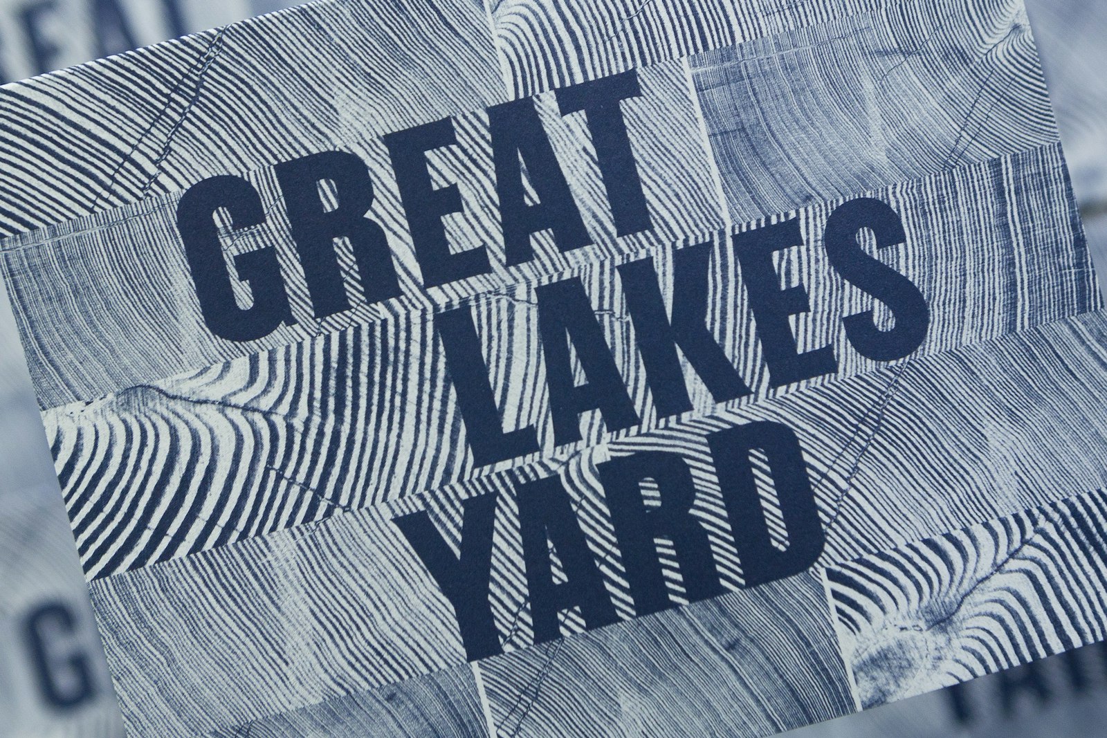
Inspired by the industrial mid-America of 1850–1910 in which the lumber was originally processed, the identity embraces the structural lock-up qualities found across signs and brands of this era.
Knowing the importance of tradition, craft, and region to Great Lakes Yard—turn of the century American printing-type would be a starting point. The forms spanned the 1850’s to 1930’s, crafted with character and visual impact in mind, these letters exemplifying Western culture and American Industrialization.
The type specimens looked to for structural inspiration were of the Gothic classification that informed but predated Grotesque typefaces. These turn of the century Gothic types focused on impactful headlines in adverse conditions, as that was what the era’s technology provided. These factors rendered machined-like qualities in the letters that created a feeling of being time-tested, strong, proven, and again uniquely American.
Railroad Gothic served as the main specimen these forms were historically and structurally based on. Designed in 1906 for American Type Founders, it’s an uppercase-only typeface that is very condensed and heavy, giving it a distinctive 19th century American wood type feeling. Originally designed for use in railroad signage, Railroad Gothic is best used when set really big.
This adaptation works as the original forms did—in large uses cases. Here, winged ends and shifts in weight are a few of the customizations that provide a crafted feel synonymous with that of the skilled journeyman sign painter.
The stacking formation pulls from the visual reality of stacked wood found across lumber yards. The shifts within the stack convey motion and building. This is enhanced through the wave-like negative space within the wordmark’s counters, thus, referencing the story behind the process of lumber. The size relationships of words and letters within the logo are made up of true lumber standards of 2×12, 2×6 and 2×4.
- Nick Adam