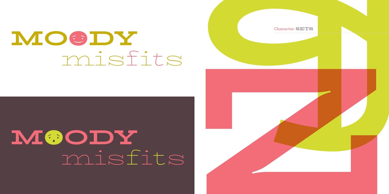
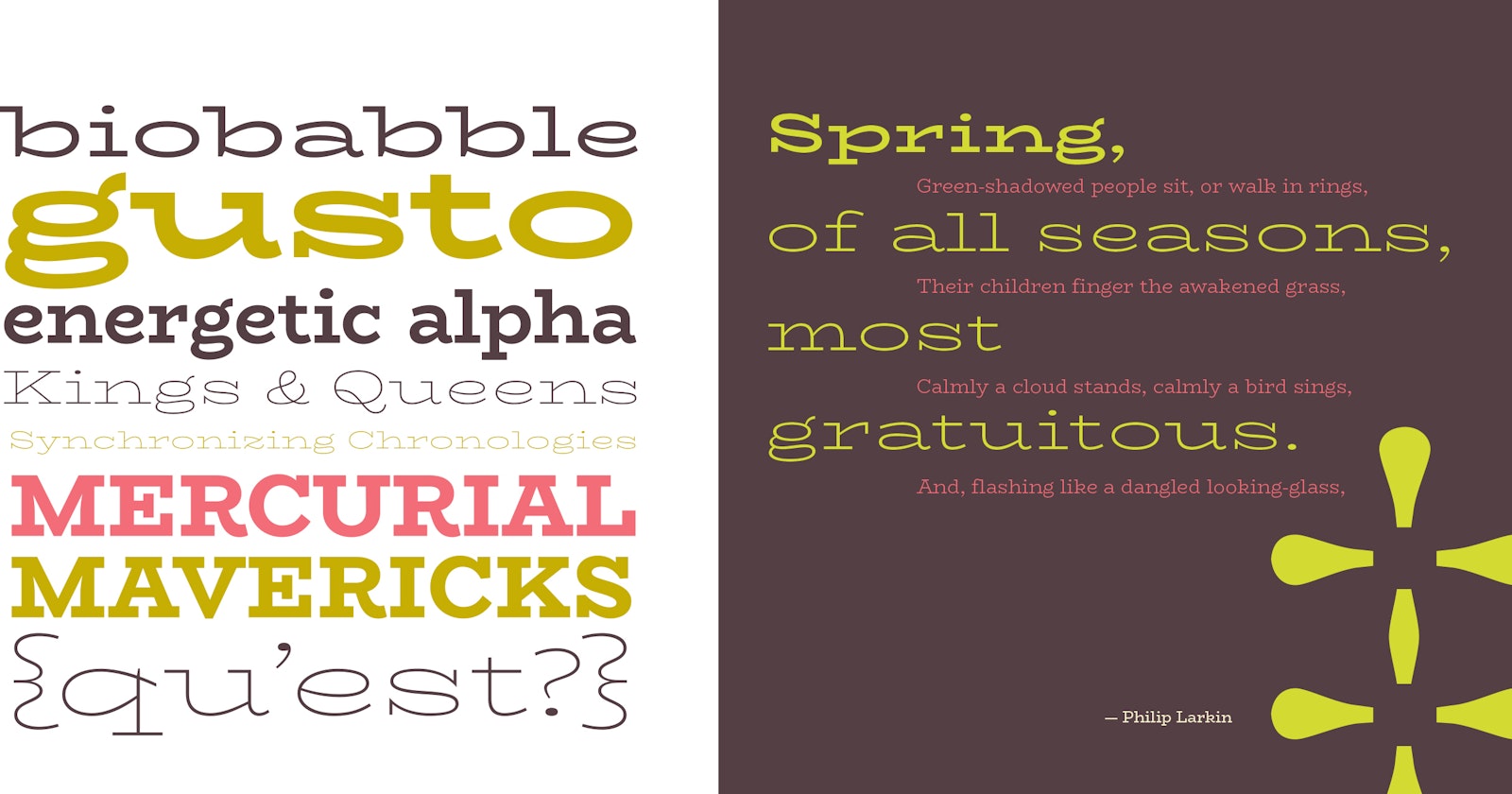
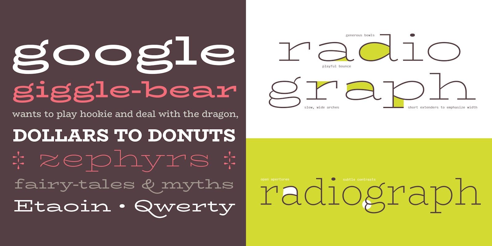
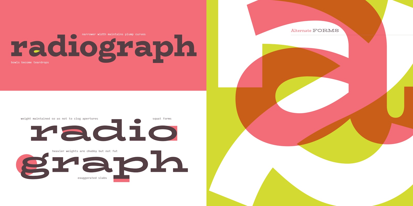
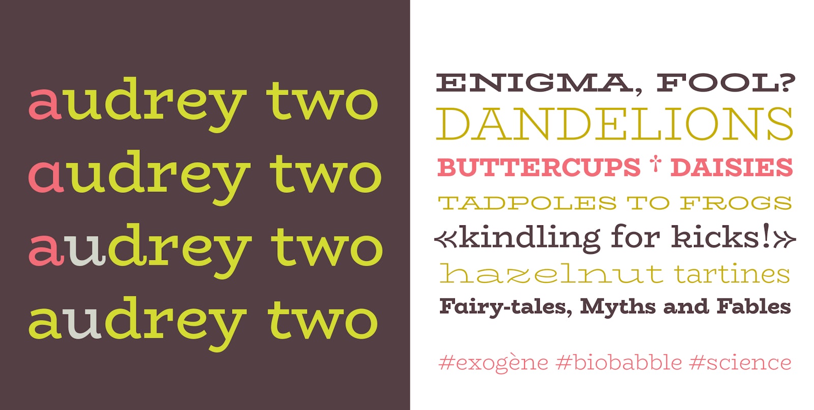
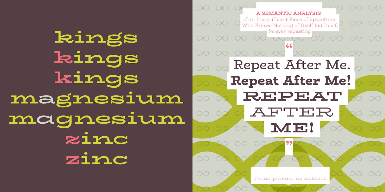
BioRhyme is a display typeface in two widths and 5 weights designed for use at large sizes in branding, expressive typographic settings, editorial layouts. The majority of the project was developed and published through GitHub in 2015, and the fonts launched with the new Google Fonts platform this summer. This typeface is an experiment in typographic expression, designed to span the range from chunky poster type in the regular bold to delicate abstract patterns in the extra light expanded. Fusing influences from ATF’s Boston Breton, and various Clarendons with a ‘typewriter’ sensibility, BioRhyme is designed to provide a range of typographic tones of voice that feel warm, friendly, direct and playful. Equipped with a variety of alternates including a single storey a and g to swashes and pothook alternates for some of the terminals, this typeface is intended to encourage expression and experiment.
- Aoife Mooney
Project link
